
My younger sister and I both got the shopping gene from our mother. We love rummaging through the sales racks or checking out NYC thrift shops. However, we spend even more time scrolling clothing websites.
We bundle our orders to access free shipping. On Cyber Monday, we empty our bank accounts together. We'll even make a joint purchase to share an item if we're feeling generous.
My sister and I aren't the only online shoppers! This year, 2.4 billion people are expected to buy goods on the Internet. Online shopping is a fun, easy way for folks to update their closets without traveling to brick-and-mortar stores.
Avoid These Accessibility Pitfalls on Your E-Commerce Website
As convenient as digital spending is, there are areas for improvement.
I've noticed that my sister and I don't always have the same problems when shopping online. Sure, we both deal with the occasional website failure or faulty coupon code. Yet, as someone with a visual impairment, I come across some things that my sibling never notices.
Like my sister, many clothing companies don't recognize that their websites are inaccessible to some individuals. As e-commerce multiplies in popularity, brands should consider the digital shopping journey of every customer. This means designing online stores that cater to everyone, including those who have disabilities.

Alt-Text: Cash and goods flowing from a computer into a shopping cart
To help confused business owners out, I've compiled a list of the top accessibility issues I see on retail websites and apps. I notice the following things on a regular basis. Luckily, these issues can be easily fixed!
Overly Complex Color Names
Cornflower, rust, heather, sangria, pistachio...these are some colors that I came across during today's shopping journey. Maybe it’s just me but I sure wasn’t taught those colors in kindergarten.
While I applaud the creative effort, obscure color names aren't helpful for people with colorblindness. In fact, they create more work for someone like me! I constantly have to interrupt my shopping sprees with a Google search to figure out what color a name is closest to. Then, I hope I remember this random color name if I ever come across it again.
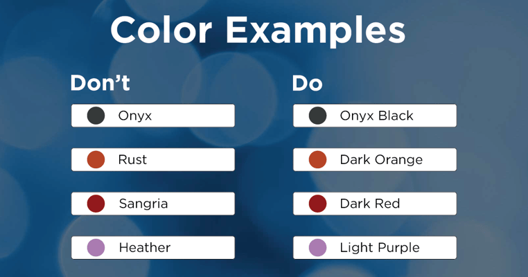 Alt-Text: Examples of color names you should not use and the appropriate name to use.
It's best to stick to the simple, universal names for colors. If you want to list a unique color name, try to pair it with its generic descriptor. Especially for alt text, I would love to see only well-known color names or at least those names indicated beside the fun ones in parentheses.
For example, if you really want to call a shirt "onyx," you could write "onyx black" or "onyx (black)". If you're using a name that represents a certain shade of a color, include that - such as "light blue" or "dark green". This gives users the chance to understand the garment's color, even if they cannot physically see it.
Inadequate Item Descriptions
Every clothing item should include a thorough description that names the product type, brand, color, fabric, style, fit, patterns, size, and any special features. Write about the item as if your customer didn't have any attached picture. After all, many blind customers cannot see the image!
This brings me back to colors for my next digital pet peeve...
Missing Written Color Labels
Clothing websites often place small, colored circles or boxes below item pictures. These icons represent the different colors available for each product. This is great unless the colored buttons aren't labeled with their names.
This is one of the most common annoyances I see when visiting online retail sites. Just last week, I was shopping for my new apartment and looking for blue wall decor. Below is the screenshot of the mobile site I used. It shows fourteen different color options, all without labels. I had no way of knowing which buttons were for which colors!
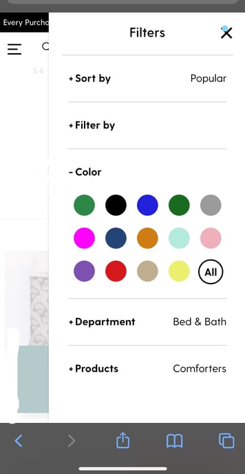
Alt-Text: Screenshot of a mobile retail site featuring unlabeled colored circles in the filter search option
In the second desktop screenshot below, you can see an example where color nametags appear when I hovered my mouse over a circle. However, I have my mouse set to be larger, and the text is blocked. For some people with motor disabilities, they may not even be able to easily keep a mouse over such a small spot.
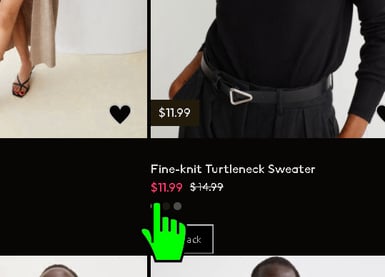
Alt-Text: Desktop screenshot with a large mouse hovered over one of the color options of a sweater
Some websites don't even show those text tooltips when I scroll over color options. In those cases, I have to click through every color option to view the stated color within the product description.
It saves me so much time and effort when color names are written out next to the elements. Then I don't have to click through each color to see its name. It also helps give me full control over my searches. This is a tip I highly recommend!
Flashy Image and Video Slideshows
Bright, flashy colors and image slideshows that move too fast can overwhelm anyone's sensory intake. It can be even more irking when you have a visual, cognitive, or neurological disorder.
If your store has an abundance of pop-up ads or automatically-playing videos, you might need to reconsider your site's accessibility.
My eyes take a few moments to focus on a new setting, so I tend to miss the first few pictures in a clothing slideshow. I prefer that they are automatically slow and use a fade effect if possible. Otherwise, I'd like the ability to manually click through different pictures of an item. Stark jumps in a page's contrast will send my brain into a few seconds of adjustment.
Difficult Navigation

Alt-Text: Computer keyboard with three buttons; one shows a figure in a wheelchair, one shows a figure using a cane, one shows an ear with a hearing aid.
For website navigation, I dislike when menus appear and unfold as I scroll over different sections. All the time, I move my mouse too far and then the entire menu closes up. It's more reliable for me to use a menu with clickable buttons and accurate headers.
If an online store is confusing or inconsistent, your customers may leave for a competitor. I advise web designers against using crowded content and difficult-to-exit previews. Design your e-commerce site to have labeled buttons, organized headers, and predictable sequences.
Make Your E-Commerce Site Accessible For Every Consumer
I hope your retail company adds web accessibility to its online shopping cart! That way, I can easily add products to mine! Like these wacky sequin dresses (or not haha!).
 Alt-Text: Brielle and an anonymous friend posing in a dressing room with matching silver, sequin dresses
Ready to begin your web accessibility journey? We're thrilled to hear it and we want to help! Reach out to our team and learn how you can create usable digital experiences that meet the ADA and WCAG.


![Web Accessibility Statement: How to Write One [With Examples]](https://play.vidyard.com/W9tQumNmG2dLApBPzUraUc.jpg)