Although notable strides have been made in the movement toward accessible, inclusive web experiences, experts predict that up to 85% of websites, globally, are still not fully accessible. As many as 240 businesses have faced massive lawsuits for inaccessible websites. If you are among the many brands hoping to begin ensuring accessibility for your digital properties, this tutorial can help.
Assuming you have read part 1 and part 2 of our Technical Guide to web accessibility, you are ready to move on to the final phase of this tutorial: proper naming of links (meeting success criteria WCAG 2.4.4).
Why do you need meaningfully described links?
The web depends on links more than any other functionality, and accessibility depends on having meaningfully described links. People who use screen readers don’t want to have to let the assistive technology (AT) read the whole page to find what they’re looking for.
Think about the way you use the web. You will scan the page looking for things that interest you. Now, assume you have a visual impairment. You would not want to have the whole page read off to you, would you? Users of AT will use the tool to scan for links, images, landmarks, etc. and skip around the page (just like you would do with your eyes) in search of what they came for. If the page is not accessible, this will be impossible and you will likely lose a customer.
How do you define a meaningfully described link in HTML?
Let’s define some accessible links and some not accessible links. We are going to pretend we are a small retailer with three locations. Imagine we want to have picture of the three stores with a link to a set of driving directions below each picture. Generally, you might see something like this:
<html>
<div id=”store”>
<ul>
<li>
<h3>Bingingham Store</h3>
<img id=’store1" src="store1.jpg" height="150" width="auto" ></img>
<a id="directions_store1" href="direction1_store1.html">Driving Directions</a>
<br>
</li>
<li>
<h3>Bingingbeef Store</h3>
<img id=’store2" src="store2.jpg" height="150" width="auto"></img
<a id="directions_store2" href="direction2_store1.html">Driving Directions</a>
<br>
</li>
<li>
<h3>Bingingchicken Store</h3>
<img id=’store3" src="store3.jpg" height="150" width="auto"></img>
<a id="directions_store1" href="direction2_store1.html">Driving Directions</a>
<br>
</li>
</ul>
</div>
</html>
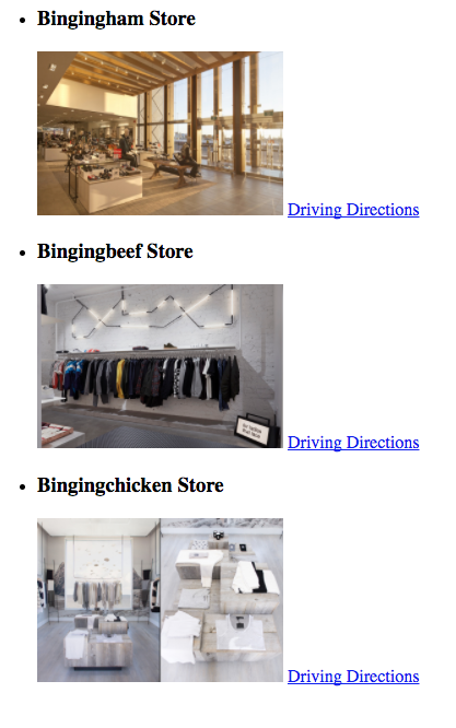
From this, you would get a page that looks like the image below:

As a sighted user you would imply that the Driving Directions link would take you to directions to the three different stores. As an AT user, you would hear the list of links the same way, with no idea of what the driving directions were for. The AT would simply read out three links that just said driving directions with no context.
Using meaningfully described links to improve the browsing experience with AT:
For a better alternative to the code above, you would want to code the page this way:
<div id=”store”>
<ul>
<li>
<h3>Bingingham Store</h3>
<img id=’store1" src="store1.jpg" height="150" width="auto" aria-hidden="true" ></img>
<a id="directions_store1" href="direction1_store1.html" aria-label="Driving directions to the Bingingham store">Driving Directions</a>
<br>
</li>
<li>
<h3>Bingingbeef Store</h3>
<img id=’store2" src="store2.jpg" height="150" width="auto" aria-hidden="true"></img>
<a id="directions_store2" href="direction2.html" aria-label="Driving directions to the Bingingbeef store">Driving Directions</a>
<br>
</li>
<li>
<h3>Bingingchicken Store</h3>
<img id=’store3" src="store3.jpg" height="150" width="auto" aria-hidden="true"></img>
<a id="directions_store1" href="direction3.html" aria-label="Driving directions to the Bingingchicken store">Driving Directions</a>
<br>
</li>
</ul>
</div>
As you can see from the above code, I have added two new parameters, aria-hidden=”true” and aria-label=”description of link”. The aria-hidden=”true” parameter will cause the AT to ignore the image completely. It will not be a tab stop, and the screen reader will skip over the image. (I have done this because the image adds no value. It is meant to attract the eye.) Secondly, I added a detailed description of the link. Now the screen reader will read that label instead of the original text of ‘Driving Directions.’ There are other ways to make the page accessible, this example is just one way you could do so.
Conclusion: Meeting Accessibility Success Criteria
With parts 1, 2 and now 3 of this technical guide to web accessibility, we have now addressed three different WCAG success criteria. Be aware that the examples shown do not fully illustrate the success criteria, but rather, only describe a three major items within the full scale of success criteria. Generally, opening up code is not the best place to start. Get a third-party like Usablenet to do an audit of your website to show you all the accessibility issues you may have and work your way through them.
For a free consultation on how Usablenet can help, reach us at accessibility@usablenet.com.


