If you spend any time around digital accessibility, you have seen the various numbers around how much accessibility can be covered by an automated scan.
The percentages turn up in sales presentations, on LinkedIn, and in the accessibility reports that land on your desk.
Here’s the problem. A percentage on its own tells you almost nothing. Most importantly, a big number is not automatically a good one. To use any of these figures well, you first must understand how they were produced.
Using real data from 100 UsableNet audits, I’m going to walk you through the numbers. We will look at why numbers mislead, what our own audits reveal, and how to build a picture of accessibility that no single score can give you.
If you take away one thing from this article, let it be the one in the title: don’t trust the number, understand the number.
Why the same idea produces different numbers
Let’s start with one of the most familiar questions. How much of accessibility testing can be automated?
- You will hear twenty to thirty percent as a common industry estimate.
- You will also see marketing claims of fifty-seven percent, and occasionally eighty percent or more.
How can one concept produce such a wide range?
The answer is that “automated coverage” is not really a property of the platform or tool. It is a property of the methodology behind the scan. Here is the simple formula behind most of these claims:
Automated coverage = automated issues found ÷ total issues found
Look closely at that denominator of total issues found, because it’s determining what the final number is.
Imagine two audits of the same site, using the same automated tool, on the same scope. Both find 100 automated issues. But the first audit is thorough and finds 400 manual issues on top of that. The second is a more superficial audit and finds only 100 manual issues.
- Audit A: 100 automated + 400 manual = 500 total, so 20% automated coverage
- Audit B: 100 automated + 100 manual = 200 total, so 50% automated coverage
Nothing changed about the automation. The deeper, more rigorous audit reports a lower automation percentage, simply because it found more of the issues that require a human review.
In this case a higher automation number points to a weaker audit, not a stronger automation tool.
And the denominator can depend on different variables, including:
- What the automated tool actually detects
- How many manual issues the audit finds
- How deep the manual testing goes
- Who performs the audit and what their expertise is
- What testing methodology is used
- How issues are defined and counted
- Which testing rules are included in the automation
- How granularly issues are reported
The coverage percentage describes the entire testing process, not the automated tool by itself. That leads to a practical rule: comparable numbers require comparable methodologies. Within a single, consistent methodology, a coverage percentage can be useful to show trends over time. Across different tools, it is not a reliable way to compare anything.
What 100 real audits show
The dataset is 100 recent accessibility audits, all performed by UsableNet’s auditors and assessed against WCAG 2.2 at Level AA. When we say “audit,” we mean a full manual assessment, not the output of an automated scan. Each audit takes on average between 40 and 80 hours.
We also break every success criterion down into individual, atomic checks, and we record not only what fails but also what passes. That gives us a far more complete picture of what was actually evaluated. Across these 100 audits, that adds up to more than 371,000 individual checks, of which roughly 91,000 were flagged as issues.
So, how are these issues found? Here is the approximate breakdown:
- 29% are found automatically
- 67% are semi-automated
- 4% are fully manual
“Semi-automated” is the category people rarely talk about, so it is worth explaining. These are issues the platform flags as potential problems and reports to an auditor to confirm.
- For example, take an image with an empty alt attribute. Automation can see the empty attribute value and identify the image as possibly decorative, but it cannot know the author’s intent.
- If the image is informative, it needs meaningful alternative text, and the auditor marks it as a failure.
- If it is genuinely decorative, the auditor marks it as a pass.
UsableNet AQA, our accessibility testing platform, does not propose a generic check to assess whether an image is appropriate. Instead, it proposes a narrow and specific check based on the type of image and its context. Despite this level of specificity, the final decision still requires human judgment.
That example falls into the 67% of issues that are semi-automated. Add the 4% that are fully manual, and you get roughly 70% of all issues requiring a human in the loop, whether the tool is guiding the auditor or not.
The same data, honestly measured, tells different stories
Now watch what happens when we take that automation number and measure it different ways. This is where the denominator lesson stops being theoretical.
Same 100 audits. Same platform. We found about 30,000 issues automatically.
- Measured against issues, 30,000 out of 91,000 is about 30%. That lines up neatly with the industry’s twenty-to-thirty percent estimate.
- Measured against checks, 30,000 out of 371,000 is about 8%.
Both numbers are honest. Both describe the same automated detections. They differ only because the denominator changed, and each one tells a different truth.
The 30% tells us how many of the reported issues were found automatically. It does not mean that the auditor’s effort is the remaining 70%.
An auditor also has to evaluate things that ultimately pass. Those checks do not produce an issue in the final report, but they still require someone to assess them and determine that they are working as expected. That effort is not captured by the 30-to-70% split.
This is why looking at checks gives us a different perspective: only about 8% of all the checks were resolved automatically. The remaining 92% still required evaluation by an auditor, whether they resulted in an issue or a pass.
It gets more interesting. Even measuring the exact same thing, the method of calculation moves the result:
- Average the automation percentage across the 100 individual audits, and you get about 29%.
- Calculate it from the aggregated totals across all of the audits at once, and you get about 33%.
Same data, same metric, almost a five-point difference.
If I wanted to sell you a testing platform, I could reasonably say, “we automate around 35% of accessibility issues” and not technically be lying. That is exactly the problem.
For our analysis, we use the average across audits, because it gives every audit equal weight. In the aggregate view, large audits dominate simply because they contain more checks and more issues, which makes the result less representative of a typical audit.
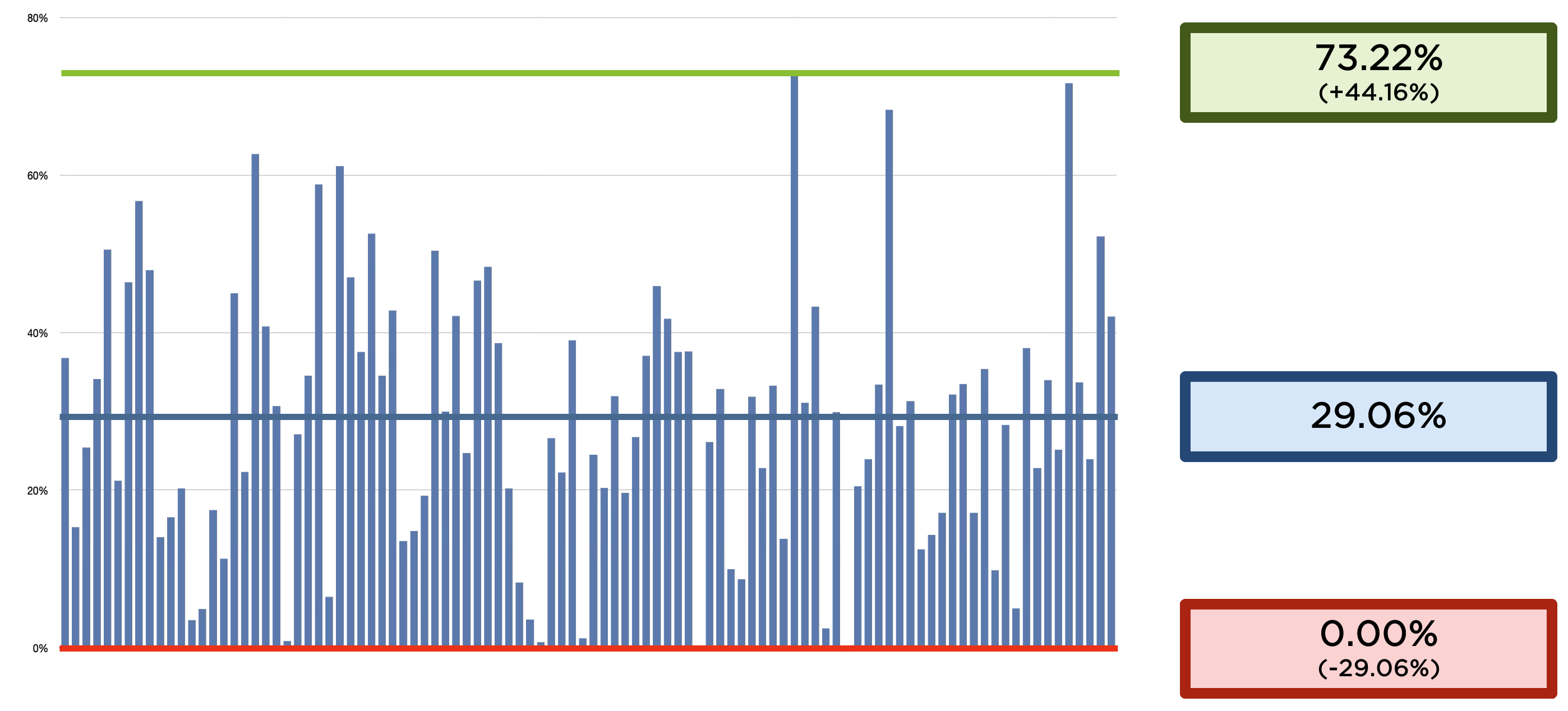
But even the average hides a lot. Across our 100 audits, automated coverage ranged from 0% all the way to 73%. The 30% “average” is really the middle of a very wide, fluctuating distribution, not a value you can expect on any single audit.
This is also where that 80% claim finds its context. A number like that might describe a tool’s theoretical ceiling, but it’s not a fair or representative figure for a real-world audit.
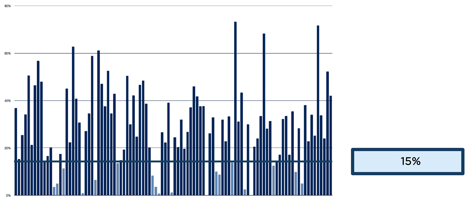
For what it is worth, in almost 80 of our 100 audits, automated issues still made up more than 15% of everything found. That shows that automation can play a meaningful role earlier in the process. Automated checks require very little effort to run and can be run by anyone, so there is a real opportunity to build them into the development process and make sure that issues that do not require manual verification are identified and fixed before going live.
That is where automation can make a real difference: not by replacing the auditor, but by helping teams catch and fix the issues that do not need human judgment before they reach the audit.
Common isn't the same as severe
So far we have been talking about how many issues are automated. Let’s turn to a more useful question for anyone planning remediation: which issues actually matter, and what should you fix first?
Start with frequency. A handful of success criteria show up in almost every audit we do:
- 1.3.1 Info and Relationships: in 100% of audits
- 1.1.1 Non-text Content: 99%
- 4.1.2 Name, Role, Value: 99%
- 1.4.3 Contrast (Minimum): 98%
- 2.4.4 Link Purpose (In Context): 95%
- 2.4.6 Headings and Labels: 94%
It is tempting to look at that list and decide to prioritize the most frequently failing success criteria. But frequency and severity tell very different stories.
For example, contrast appears in 98% of audits, yet it has a severe impact on users in fewer than 10% of those cases. Compare that with 2.1.2 No Keyboard Trap, which appears in fewer than 10% of audits but is high severity in essentially all of them. A keyboard trap can stop someone from using the page at all. A contrast ratio of 4.49 to 1, just under the 4.5 threshold, is a real conformance failure that most users won’t notice.
The lesson is simple. Common does not mean severe, and you need to look at both before deciding what to fix first.
When we zoom out to the full dataset, there are encouraging statistics:
- Severity:
- 13% high
- 70% medium
- 17% low
- Effort to fix:
- 71% easy
- 26% average
- 3% hard
Most accessibility issues are relatively quick to fix. That is good news, and it points to a clear strategy: Remediate issues that are high severity and low effort since those are ones that improve the experience the most for the least work. Clear those first. They show visible progress, and more importantly, they deliver real, immediate improvements to the people using your product.
Consider this as well: If most issues are easy to fix, and many of the high-severity ones are easy to fix, then a lot of organizations could be doing more than they are.
There is significant room to improve.
Whose job is it?
The audit data can also tell you something about where accessibility issues come from inside an organization.
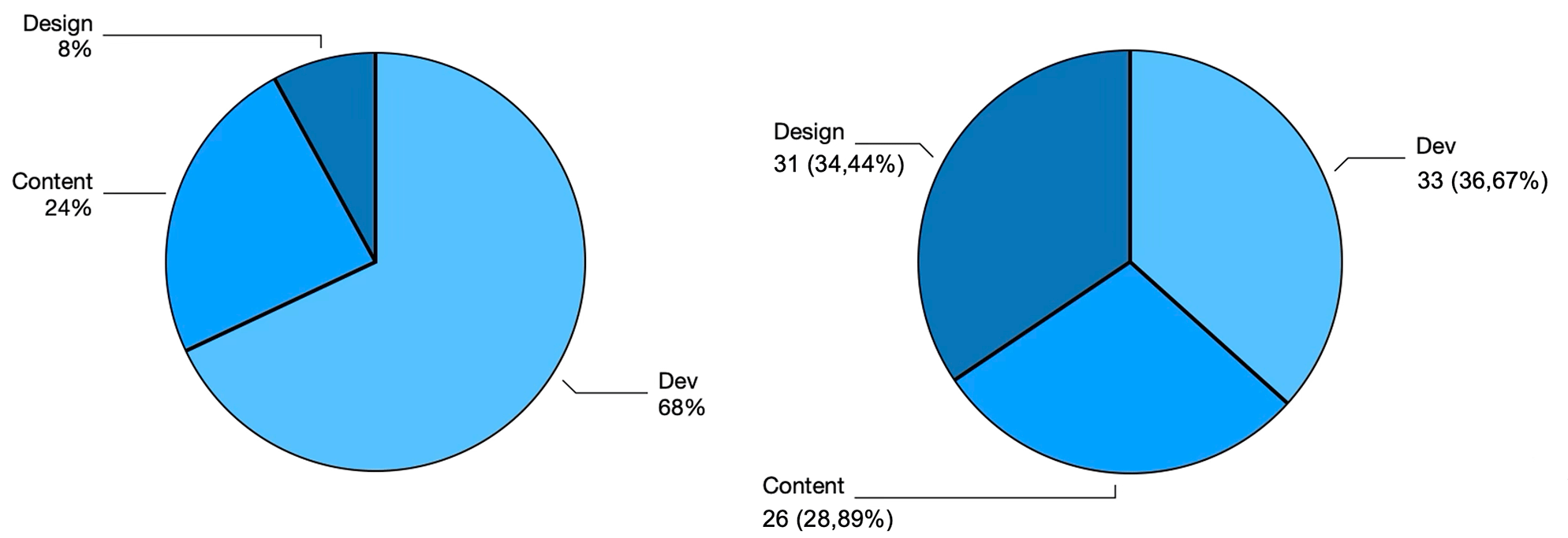
When we map issues to the departments responsible for them, the split is uneven:
- Development: 68% of issues
- Content: 24%
- Design: 8%
That imbalance is not because designers are handed less responsibility. If you count the WCAG success criteria that fall to each area, the load is fairly even: development owns 33, design 31, content 26. Many criteria are shared. An informative image, for example, needs development to include the alt attribute and content to make its value meaningful.
Part of the reason development shows up so heavily is that code is simply more prone to error. But the design number may be telling us something more hopeful. Designers generally aim to create products that as many people as possible can use, and the data suggests a certain natural predisposition toward accessibility in good design.
Three scores, three different questions
Once you start reporting on accessibility, you run into three different numbers that people constantly mix up. They are not measuring the same thing.
First, a distinction that trips up almost everyone: conformance is not the same as compliance.
Conformance means meeting the WCAG specification. Compliance means meeting the law that applies to you. They are related, but they are not interchangeable.
It’s important to know that WCAG conformance is binary.
A page either conforms to a given level or it does not, and a single failing success criterion means the page does not conform.
Because a strict pass or fail is hard to report progress against, the industry invented what is usually called a conformance score: the percentage of applicable success criteria that pass. With 55 Level A and AA criteria in WCAG 2.2, each one is worth roughly 1.8%. It is a convenient way to express progress, but it is not a metric defined by the W3C and it carries no legal weight.
We use a second number internally at UsableNet, which we call the A11y Score. Rather than pass or fail per criterion, it measures the distance to conformance across all those individual checks, weighted by volume. Because we record passes as well as failures, we can say fairly precisely how much has been done and how much is left. A rare failure barely moves this score.
The third number is the one that matters most to your users: perceived quality, which we measure through user testing with people with disabilities. We use the WCAG guidelines as guardrails rather than asking testers to evaluate individual success criteria. Testers are people with disabilities, not accessibility engineers, so the guidelines simply keep the evaluation grounded rather than purely subjective.
Three numbers, three different questions:
- Conformance score: where are we against the WCAG specification, pass or fail?
- A11y score: how far are we from conformance?
- User testing: how good is the experience for a real person?
What predicts the user's experience?
We already know that user testing is the closest measure of the experience for a real person. But if you had to choose between the conformance score and the A11y score, which one would better reflect that experience? Our data gives a clear and slightly uncomfortable answer: neither is a particularly strong predictor of the user experience.
Consider two real products:
- Product 1 scored 91% in user testing, but only 35% on conformance score, with an A11y score of 87%.
- Product 2 scored 36% in user testing, 65% on conformance, and 82% on A11y.
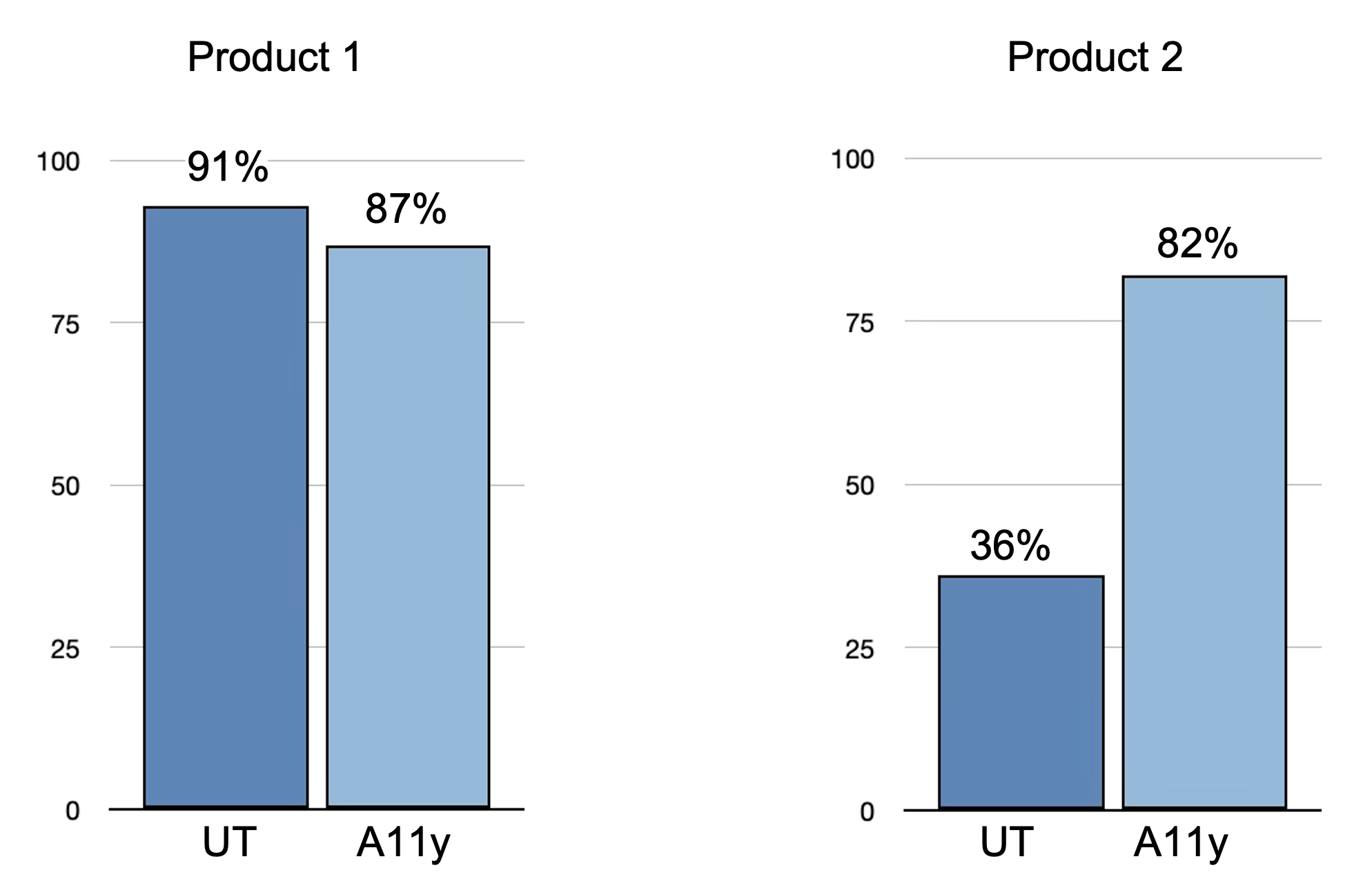
The A11y Score aligns reasonably well with perceived quality for Product 1: 87% on the A11y Score versus 91% in user testing. But for Product 2, the picture is very different: an A11y Score of 82% versus just 36% in user testing.
This difference makes sense when we consider what the A11y Score is designed to measure. It is an operational measure of how far a product is from conformance, rather than a measure of how accessible or usable the experience feels to users.
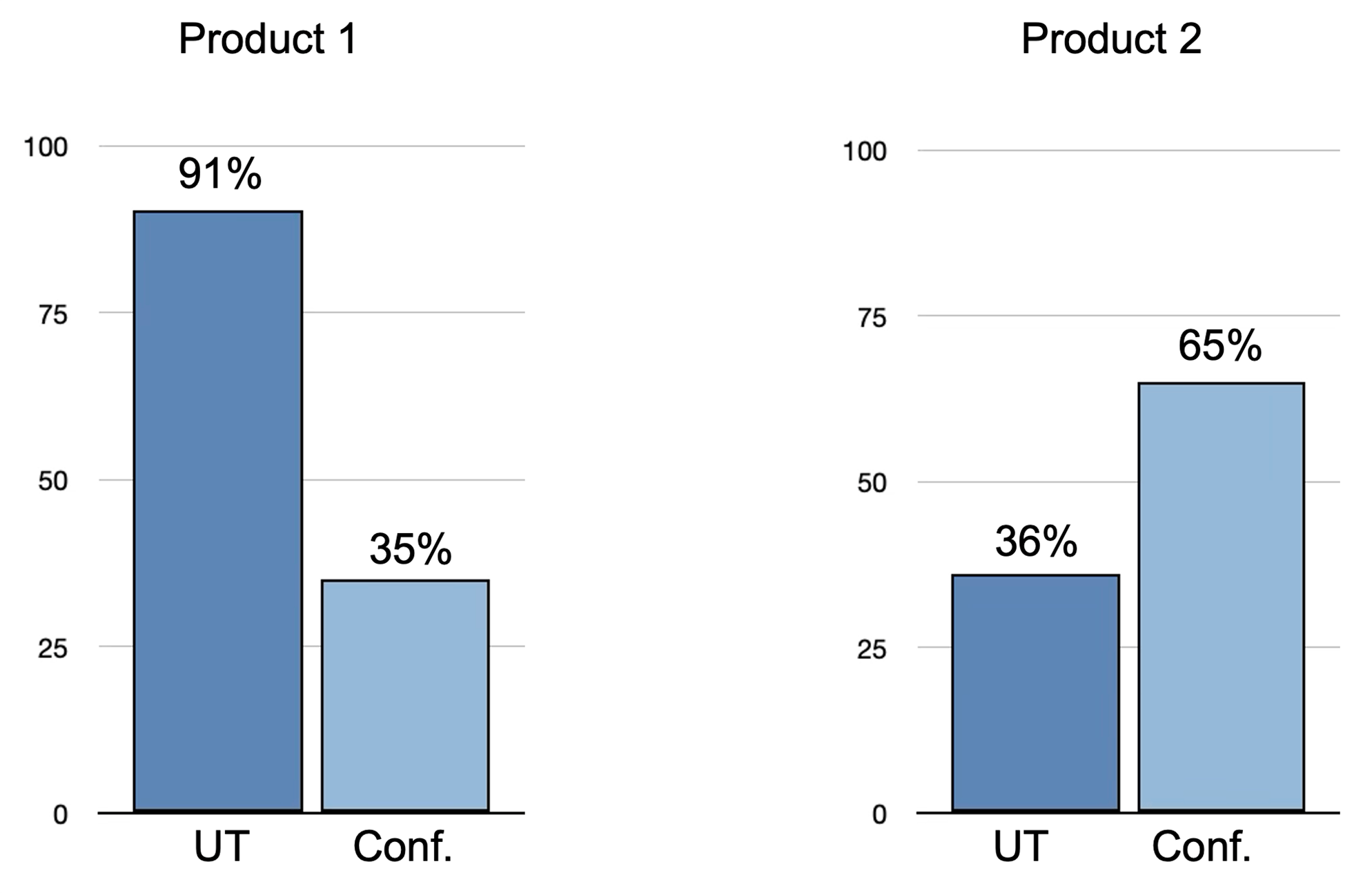
We would therefore expect the Conformance Score to give us a better indication of perceived accessibility. But again, the results don't line up with what users experienced.
For Product 1, we have 91% in user testing versus just 35% conformance. For Product 2, we see the opposite: 36% in user testing versus 65% conformance.
This illustrates an important limitation of the Conformance Score: conformance is binary. A product could have just one relatively minor error for each success criterion and still end up with a zero-conformance score, even though those errors might have little or no noticeable impact on the experience of an average user. Conversely, a product can achieve a higher conformance score while still presenting barriers that have a much greater impact on users.
So, what does track with real experience? Severity.
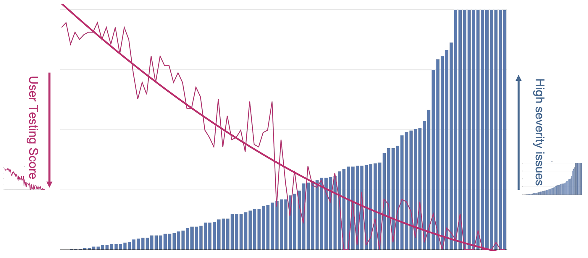
When we plotted the number of high-severity issues in each audit against its user-testing result, a clear trend appeared: as the number of high-severity issues increases, perceived quality tends to decrease. In other words, the more serious barriers a product has, the worse users tend to rate their experience.
This is important because it shifts the focus from simply counting issues to looking at their impact. Two products can have a similar number of accessibility issues, but those issues may have very different consequences for users. A number of low-severity issues may be relatively easy to work around, while a small number of high-severity issues can prevent people from completing an important task altogether.
But it is not a perfect one-to-one match.
User testing captures people's actual experience, which is influenced by factors beyond the issues identified in an audit. There is also some subjectivity in how users perceive and rate that experience. And here we counted only high-severity issues; folding in medium and low-severity, with appropriate weighting, would likely tighten the trend further. But the direction is unmistakable.
No single metric can tell the whole story. But if you had to look at one signal that comes closest to reflecting how well your product actually serves people, our data suggests that high-severity issues may be one of the most meaningful ones to watch.
Stop looking for one magic number
By now the pattern should be clear.
Every individual number we have looked at is true, and each one is incomplete on its own. The way forward is not to find a better single number. It is to stop looking for one.
The more useful approach is to put several metrics side by side and read them together:
- Automation
- Severity
- Effort
- Conformance score
- A11y score
- User testing
Looked at as a set, they start to reveal things no single figure can.
In this first graph, we have a product with a low A11y score, a high number of high-severity issues, and an unusually high automation percentage. Individually, each metric tells us something, but the combination is not simply “inaccessible”; it suggests basic issues are reaching production untested, which tells you accessibility is not yet built into the product lifecycle.
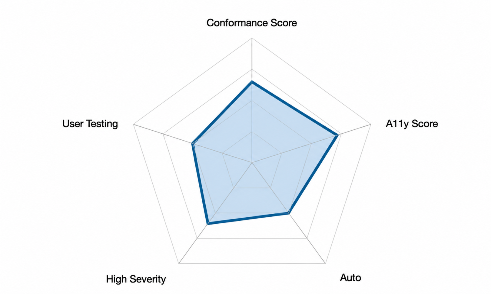
Meanwhile, this second graph reflects a product whose metrics are mostly strong but whose conformance score is low. This is the opposite story: accessibility is being handled well, and the low conformance score is just the binary metric showing some criteria failings.
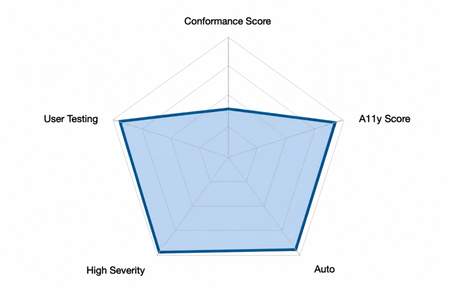
Read this way, the numbers become more than a description of a product. They become operational targets.
- Which teams carry the most issues?
- Where are the most severe problems concentrated?
- Where would training or a process change pay off most?
- That is a far more actionable picture than any single score can offer. It also points toward two bigger questions:
- When can we reasonably say a product is accessible enough?
- When has an organization reached a sufficient level of accessibility maturity?
Those are the questions that accessibility maturity models are built to answer, and they are where this kind of measurement naturally leads.
Three things to take away
- A percentage means very little without context. Before you trust any accessibility figure, ask what is being measured, what the denominator is, and how much variation is hidden behind that number.
- No single number tells the whole story, but several read together tell you a great deal, not only about the product but about how an organization manages accessibility.
- Looking across all this data, one thing is clear: we still have real work to do to make the web truly accessible. The encouraging part is that most of that work is well within reach.
The same 100 audits gave us automation rates of 8% and 30%, depending on the denominator. They also showed us a product that users loved despite its 35% conformance score.
Every number was true, and none told the whole story. Read them together, ask what each one measures, and focus on the high-severity issues your users actually feel. Don't trust the number. Understand it.