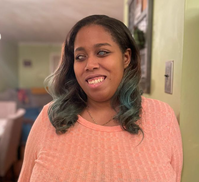
Editor's Note: We are delighted to share this post in our series by UsableNet's Marketing Intern, Lily Mordaunt. Read more of Lily's posts, including how she navigates the web as a blind screen reader user here. Or subscribe and never miss a post!
On Friday, March 18, 2022, the Department of Justice (DOJ) published their new guidance on web accessibility and the Americans with Disabilities Act (ADA).
In the guidance, the DOJ noted examples of web accessibility barriers. All are key barriers and common accessibility issues. I've chosen to write about 3 examples of web barriers that impact me every day when I use the web as a blind person relying on a screen reader.
The web accessibility barriers are:
1) Only using color to provide information
2) Lack of meaningful alt-text on images
3) Using mouse-only navigation
This blog explains how and why each web accessibility impacts me and trips up my screen reader when I visit websites.
1) Only Using Color to Provide Information
When signing up for a website, there are often guidelines to follow when creating a password. Coming up with a password on its own can be frustrating.
As a blind person, an additional layer of frustration is added when my passwords aren't accepted, but I don't know why. If my mistakes are highlighted, my screen reader has no way to alert me to the problem.
There should always be another way, in addition to the visual, for users to get information on a website.
2) Lack of Alt Text on Images
Sometimes, when writing articles or blog posts, writers will add images to their piece. Usually, it provides some kind of context—like a chart or other information graphic—and other times, it's just for fun. As a blind user, when my screen reader interacts with an image that doesn't have alt text, it will just announce "image". Or it will read out the file name, numbers, and random symbols included. Instances like this take me out of the text. Or frustrate me in situations where the image included is context that I need to understand the article.
Including alt text on your images is a way to keep a blind user as informed as a sighted user. It also provides a way for consumers in areas where the Internet is slow to know what's happening if the image won't load.
3) Mouse Only Navigation
When filling out a form, I will use the tab key to jump to the different fields to determine what information I need to input. But I'm not always able to skip over the field.
Sometimes, a site won't allow me to tab or shift-tab forward or backward unless I've input the data. Depending on how intricate the form is, I want to know everything I need beforehand. Or maybe I'm trying to get to a different text field.
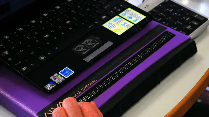
As a screen reader user, I also like to navigate a website by links, buttons or other clickable elements. If I know exactly what link I'm looking for, or as a way to skim the site, this is a convenient (and fast) way to navigate, instead of scrolling through the entire website. When a website is only navigable with a mouse, I can't do that.
Sometimes I will find an element that I can't click on. Or, my screen reader will completely skip over important links because the app was not designed for keyboard navigation.
(This is also important for apps since keyboard accessible sites are also used by screen readers on both mobile devices and computers.)
AccessibilE Design Helps Everyone
With 1 in 4 Americans having some form of disability, designing an accessible website ensures that all users can access your product.
Having a keyboard-accessible website, for example, helps visually impaired people who use a screen reader or someone with a mobility disability who cannot use a mouse to navigate.
Using the proper color contrast ratio ensures that a color-blind user does not struggle to read the text on your app or website, but also that aging populations aren't straining their eyes. In addition, the right contrast ensures that your app or website can be read at various screen brightnesses or lighting situations (in a dark room vs a sunlit area, for example).
Though disabled people are particularly disadvantaged when a website is inaccessible, digital accessibility impacts everyone. But hopefully, with the DOJ taking an official stance, the number of inaccessible websites I and my fellow disabled people encounter daily will slowly begin to dwindle.
I want to spend my money on your product or read your content. The first step toward allowing me to do that is to check how accessible your existing website is. And then, taking measures to fix what's broken and continue to stay on top of guidelines. Accessibility is an ongoing process.


