Originally written on Dec 13, 2022. Content was updated in September 2023.
When I wrote about Black Friday and Cyber Monday, I discussed my accessibility experiences with retail giants like Amazon and Walmart. In this post, I share my experience with web accessibility on e-commerce websites for small to medium size retailers, including the most common accessibility challenges I face, and six ideas for businesses that want to improve web accessibility.
Because I am a blind online shopper and will focus primarily on screen reader accessibility. Yet, it should be noted that different disability groups have varying accessibility needs.
Why collect light bulbs?
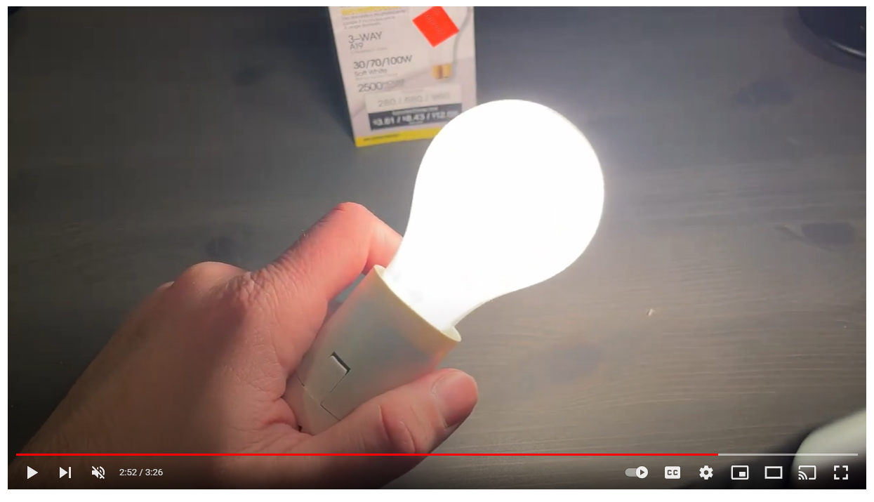
One of my favorite hobbies is collecting light bulbs. At first glance, this may seem like an odd statement from a visually impaired person. Though I do not have much usable vision, I have decent light perception. If I turn on a light bulb and hold it in front of my face, I can see it with some semblance of clarity. When I look around a room, the only things that stand out to me are lit items like lighting fixtures.
I hope this helps illustrate that blindness and visual impairment exist on a spectrum.

Because they are one of the only things that I see clearly, light bulbs intrigue me. Over the years, I have built an extensive collection of bulbs of all shapes, sizes, colors, wattages, and brightness levels. I enjoy pulling a bulb or two out of my collection and recording an informational review video about the bulb in my free time. Before making a video, I show the relevant bulb and its packaging to a sighted person so I can learn what information is presented on the box or bulb itself. I use this information in the video to provide detail. When watching one of my videos, it is only sometimes evident that I have a visual impairment.
My experience shopping online as a blind customer
Though my collection has grown, I am always searching for new bulbs to use as video material. This is where small online stores come into play. There are a plethora of small e-commerce sites that sell all sorts of exciting light bulbs. Some are wholesale distributors, while others are small businesses that operate primarily online. In some rare cases, I even order directly from a particular light bulb manufacturer. Though light bulb purchases are only some of the transactions I make with small online retailers, they are the ones I do most frequently.
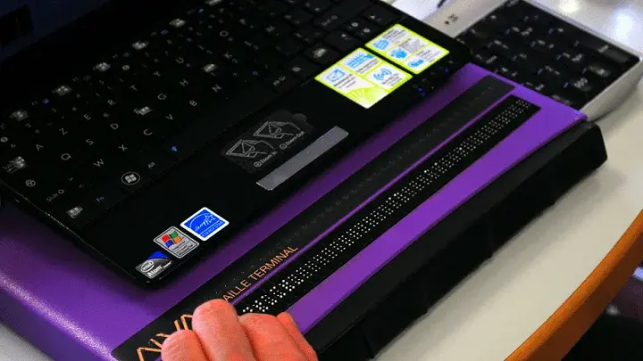
When I navigate or shop online, I use assistive technology called a screen reader. Read more about my preferred assistive technology in this blog post. My experience with accessibility on small to medium e-commerce sites has been mixed. Some sites do an excellent job with web accessibility. In contrast, others are, unfortunately, unusable for someone like me who depends on my assistive technology.
Don't overlook the checkout experience on your e-commerce website
I run into the most accessibility shortcomings on small e-commerce sites in the shopping cart and beyond. I generally have an easy time browsing product, reading reviews, and adding items to my cart. The trouble begins when I proceed to checkout. So, I repeat, don't overlook the checkout experience.
Entering my shipping address is a particularly frustrating struggle. When attempting to type my street address, a list of possible suggested addresses appear on the screen. While I can detect the address suggestions with my screen reader, I cannot select one.
Furthermore, the list of addresses covers the remaining text fields, so I cannot manually enter my address. The only method I have found to get around this problem is to type my address as fast as possible to try and beat the suggestion algorithm. This only works a fraction of the time. I have had this same issue on four sites in the past month.
I run into similar problems when trying to enter my credit card details. The picker wheels for the card expiration month and year often need to be screen reader detectable or actionable. In one extreme case, I could not locate the "Place Order" button with my screen reader after entering all my shipping and payment details and was forced to abandon my order.
How ads impact my e-commerce shopping experience
Smaller online shopping sites often display more ads on their websites than big-box retailers. Unfortunately, these ads are usually not designed so that a screen reader user can easily dismiss, close, or move past them. Often, the only thing my screen reader allows me to do is click on the subject of the ad. This presents a major barrier when trying to order items from smaller sites.
Challenges with product customization
Many websites allow consumers to design a custom product, such as a shirt or blanket. I have had nothing but trouble with these sorts of small e-commerce sites. For example, I recently wanted to order a custom shirt for a rock concert I attended. None of the color options for the shirt material had label descriptions, making it impossible for anyone who cannot see the color wheel to select a color.
Furthermore, the buttons for "undo," "Upload Image File," and "Add To Cart" were not screen reader detectable. Unfortunately, this is only one of my poor experiences with online product customization. To this day, I still have not been able to order any custom items from the internet independently.
The dreaded "Join Email List" pop-up
I get the "Join Email List" pop-up on almost every smaller online retail site I visit. The issue here is that in most cases, the tiny "X" button to dismiss the pop-up is not screen reader detectable or actionable. The only way to proceed at this point is to reload the page and hope that the dialogue box does not reappear.
6 pointers to improve web accessibility on your e-commerce website
I want to end by providing a brief set of pointers to keep in mind when considering the accessibility of a given site.
1. Always include alternative text image descriptions on product detail pages. I have mentioned this before in other posts. Still, it is essential to consider on small retail sites because product descriptions can sometimes lack detail.
2. Ensure that image-only buttons have proper labels. For example, many sites utilize a small graphic of a shopping wagon to represent the cart. This only works for screen reader users if a relevant text-based button label is in the site's code.
3. Never rely solely on automated accessibility testing software. This software is useful but limited. It often misses major accessibility bugs. Manual and user testing are necessary components of any accessibility initiative. User testing may be more critical for smaller sites if you are looking to manage limited resources effectively.
4. If resources and development capabilities allow, consider creating a mobile application. Screen reader users like myself often prefer mobile devices' touch screen environment.
5. Listen to feedback from your customers with disabilities. Real-world users are often the best individuals to detect and report accessibility problems.
6. Do not be afraid of accessibility. To a small company, accessibility can be intimidating. Any company can participate in the accessibility game, whether big or small. For some support and guidance, consider engaging an external accessibility partner.
My light bulb collection hobby has brought me to many small online shopping sites, and the quality of accessibility is mixed. This list is by no means exhaustive, but it should supply some helpful guidance. If you're a small to medium size retailer wanting to improve web accessibility on your site, I hope this provides some inspiration or what one might call a "light bulb moment."
Editor's Note: This is a guest post from our marketing intern, Michael Taylor. This post reflects his opinions and experiences. Read more about Michael in his introductory post here.


