I come from a "foodie" family. I've never had the chance to be a picky eater; as a kid, my two favorite foods were broccoli rabe and smoked salmon. Yes, I was strange.
Along with my appreciation for food, comes my (pricey) love of scoping out new places to eat. Diners, delis, pubs, pizzerias, bakeries… I'm a fan of them all! However, as someone with a visual impairment, I'm not a fan of inaccessible menus.
So often, I walk into a deli for a quick bite with friends and face the dreaded wall menu. It’s even worse if the options are written on a chalkboard. This leads me to a) ask the cashier if they have a print menu, b) awkwardly lean over the server’s heads to take a picture of the menu or c) (the easiest option) check to see if they’ve posted an online menu.

Is My Restaurant's Website Menu Accessible?
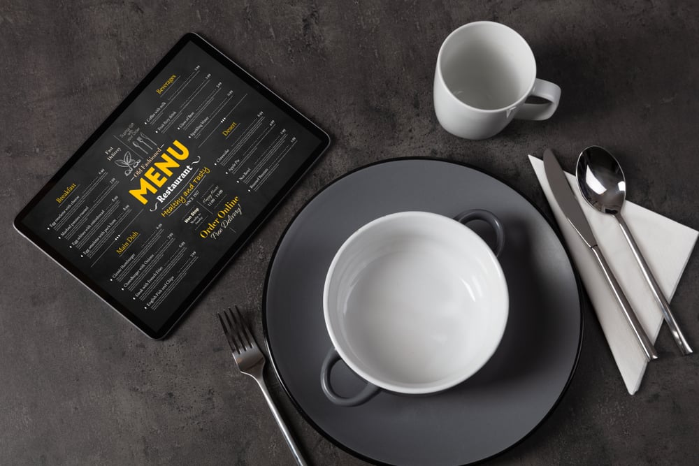
Digital menus haven't always been the norm. When Covid-19 happened, restaurants were suddenly forced to rely on e-commerce more than ever before. Online ordering was no longer a perk, but a must-have for businesses interested in staying afloat.
Since then, customers expect restaurant websites to be complete, navigable, and appealing. This includes having an updated, accessible menu.
Not sure whether your online menu is accessible? Here's a tip – it's not enough to upload a picture of the physical menu on your website and call it a day.
After coming across many unhelpful websites, I compiled my top tips for accessible restaurant menus. When creating a digital menu for your restaurant, be sure to ask the following five questions.
-
Is my menu complete and updated?
Most importantly, your menu should include all the same items listed on the current print menu. If there is a separate drink or dessert menu, your website should include those too. After all, people of all abilities like after-meal treats!
Pro Tip: All prices should appear near their corresponding order items. In my experience, it's easiest when the prices are listed close enough to the food item, so that the name and price can be seen at once. This contrasts with menus that push prices all the way to the other side of the page. I sometimes find it hard to easily follow the dotted lines between the meal and the correct price.
Another good rule of thumb is to update your online menu whenever there is an adjustment to the physical menu. This might include new items, discontinued dishes, specials, or coupon deals.
Just yesterday, I went out to eat and noticed that the restaurant's online menu listed winter dinner specials instead of the current summer specials.
While this isn't the worst mistake in the world, it shows that your website is outdated, and it hinders customers from seeing your current specials. Avoid these easy-to-fix errors by staying on top of your digital menus!
-
Can assistive technology easily read my menu?
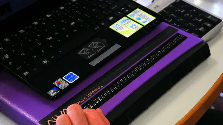
For screen reader accessibility, a quick snapshot of your printed menu won't suffice as a digital copy.
Your menu should be typed out with properly labeled headings for each section. Headers streamline the process for a user by allowing them to skip to the part of the menu they'd like to read, such as appetizers or seafood dishes. This is much easier than being forced to read every line of text in the digital menu.
For accessible buttons and links, make sure they are all coded to include a description of their function. For example, a button that says "Click to read" is essentially useless to a screen reader user. Instead, it should be labeled according to its purpose, such as "Click to view dessert menu."
Finally, test the accessibility of your online menu by trying to navigate it with only your keyboard. If you can't do this, then neither can a screen reader.
Even better, test your digital restaurant menu with customers who have disabilities. Gather feedback, note issues, and fix accordingly.
-
Do all images on my menu feature alt text?
For blind users, pictures of mouthwatering meals are difficult to enjoy without alt text! Be sure to include appropriate descriptions below images, especially if they are included in the online ordering process.
-
Does my menu feature accessible color contrast?
One common issue I see with digital menus is when text is placed over a background image.
While this may sound like a fun idea, it can lead to inadequate contrast levels and a hard-to-read menu. This is a classic case in which aesthetics overshadow accessibility. It's great to have a pretty website full of vibrant colors and images – but can all users read it?
It's certainly possible to have a visually pleasing digital menu that doesn't forego accessibility standards!
Strong color contrast is a crucial element of an accessible digital menu and restaurant website. This keeps buttons and text from blending in with the website background too much. The WCAG 2.2 guidelines suggests that text has a contrast ratio of at least 4.5:1 against its background.
-
Is my menu mobile-friendly?
Did you know that over 60% of all digital restaurant orders occur via mobile smartphones and tablets? As more restaurants offer online ordering systems and apps, this percentage is only expected to grow.
One simple way to keep up with this digital transformation is to implement an accessible digital menu onto your restaurant's mobile website. While you're at it, explore the option of designing an accessible app for your business.
By maintaining a mobile-friendly presence, your company shows its commitment to convenience, accessibility, and innovation.
Accessible Digital Menus are Necessary
As I type this, most of my favorite local restaurants currently list a digital menu. However, at least half of them aren't incredibly accessible. Luckily, as explained above, making an accessible online menu is a simple, quick task that holds considerable long-term benefits.
Firstly, you will improve your businesses’ reach by making menu information accessible to all customers. In turn, you will make every website visitors' experience more seamless.
Overall, accessible digital menus give customers like me the ability to control our personal dining experiences.
Bon Appetit!


