With online traffic peaking for the holidays, many shoppers are landing on retail homepages at the same time regulators are evaluating those same journeys. In Sweden, the Post and Telecom Authority (PTS) has started its first round of accessibility supervision under the new Act on the Accessibility of Certain Products and Services, which transposes the European Accessibility Act for private-sector products and services, including ecommerce. The first wave focuses on larger e-commerce providers and reviews three parts of the shopping experience on websites: the homepage, a product page, and the search function.
For a broader overview of who is covered and what is required, see our European Accessibility Act (EAA) guide for businesses.
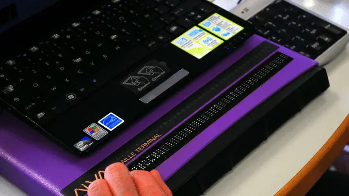
Like always, my discussion here will focus on screen reader accessibility.
Search Filtering
Modern retail websites often return hundreds, if not thousands, of products for a single search. Trying to manually sift through all those results to find the item that fits a shopper’s needs would be exhausting. To help with this, most e-commerce websites offer search filters that let customers narrow results and view only items that match specific criteria.
I rely on search filters all the time when I shop online. Unfortunately, the filter experience is often poor.
One of the first problems appears before I even open the filters. The button that opens the filter menu is not always easy to locate with a screen reader because it lacks or has weak text labels in the code. Every website also places this button in a slightly different area on the page. On unfamiliar sites, I usually need to explore manually to find what I want, which slows the experience.
Many large online retailers now add a horizontally scrolling list of popular filters directly above the first search result. I can usually find and move through this shortcut list with my screen reader. The trouble starts when I try to activate a filter. In many cases, nothing happens. The options visually appear to be checkboxes, but the screen reader treats them as plain text. For me, they are not interactive at all.
There are more issues inside the main filter menu. Most of the time, the filter options are standard checkboxes. On a surprising number of sites, the screen reader does not report the correct state of these checkboxes. I cannot tell whether a filter is selected, which prevents me from reliably adjusting the criteria.
At other times, I experience a strange kind of focus bleed-through between the filter menu and the page behind it. As I move through the filter list, the screen reader starts to read a mix of items from the filter panel and elements from the main results page. The audio becomes a jumbled stream of unrelated information. In that situation, the filter menu is not just inconvenient. It is unusable.
Finally, many filter menus require shoppers to activate an Apply button near the bottom of the panel to lock in their choices. I often struggle to find this button, even when I try both element navigation and manual exploration. Labeling problems and the same focus bleed-through issue make it very easy to miss. If I cannot find the Apply button, I cannot use the filters, no matter how nicely they are designed for sighted customers.
If you want a quick way to see how your own search results and filters perform, you can use UsableNet’s AQA to run a free scan of key pages like your homepage and search results. Test with UsableNet AQA now.
Price Problems
This next problem may sound simple, but it is surprisingly common. I will be browsing a search results page and discover that I cannot hear the prices of the items I am exploring. As you can imagine, this makes it very difficult to make good shopping decisions.
This issue is especially common during promotions or sales. In those cases, the interface often shows two prices below the product title in the results list. The original price usually appears as plain text. Screen readers handle that part with no trouble. Beside it, the new discounted price is often displayed in a larger, more decorative style to catch the eye.
That design choice creates problems for screen reader users. The sale price is sometimes rendered using a graphical font or as part of a graphic, so it does not appear as text for the screen reader. In some cases, the entire price section is a graphic, such as an image of the original price with a visual slash through it and the new price beside it.
When this happens, the screen reader might say nothing, or it might read a generic word like “Graphic” or “Icon.” It does not give me the information I need. If I cannot easily hear an item’s price as I scroll through search results, I am forced to leave the site and shop elsewhere. The best holiday promotion in the world does not matter if I cannot access the prices.
For smaller retailers and Shopify-based stores, the same problems often show up during big sales events. I wrote more about that in my blog on Shopify accessibility and Small Business Saturday
Navigation Flow Issues
Many large online retailers display search results in a grid rather than a simple list. This layout can cause major accessibility and usability problems for screen reader users.
For example, imagine a results screen that displays products in a 3x4 grid. Each product tile includes a square product image, a text title, a price, and a summary of customer reviews.
In general, a screen reader moves horizontally before it moves vertically. On some sites, when I begin manually navigating the results grid, the reader moves across the first row and then across the next group of similar elements. I might hear three product titles in a row, then three prices, then three review summaries, and so on. The screen reader follows the visual layout, but it treats each type of information as its own row.
This is a very clunky way to navigate a search results page. Unless I can remember every detail perfectly, which is unrealistic, it becomes almost impossible to match a product title with its price and rating. I spend more time trying to keep track of information than actually shopping.
I have seen two approaches that work much better. In the first, the site detects that a screen reader is active and automatically switches the layout from a grid to a single-column list. In the second, each product tile is coded as a single element. When the screen reader lands on that element, it reads the title, price, and rating in one pass. When developers implement either of these approaches well, the visual grid does not hurt accessibility for screen reader users.
For more examples of how retail journeys can break for screen reader shoppers, you can download Accessibility Insights: A Screen Reader User’s Guide.
Why Search Accessibility Matters Now
Holiday shopping is here, and many consumers are visiting their favorite retail sites to finish their lists. Screen reader users like me are doing the same thing, but we are also paying attention to which sites allow us to search, filter, and compare products independently.
If a search results page includes any of the problems I have described, the site is not inclusive of blind shoppers, no matter how popular the brand is or how strong the seasonal promotions are. For retailers, this is not just a usability issue. Under laws implementing the European Accessibility Act and similar regulations, inaccessible core journeys such as search, product discovery, and checkout can also pose a real compliance risk, especially when regulators are actively reviewing those experiences.
Now is a good time for teams to review how their search results behave with screen readers, fix issues that block independent use, and ensure the experience is ready for both holiday traffic and regulatory scrutiny.
If you want to see how inaccessible shopping journeys are showing up in real legal actions, visit our ADA Website Compliance Lawsuit Tracker and pre-register for the latest year-end digital accessibility lawsuit report.
This is a guest post from our marketing contributor, Michael Taylor. It reflects his opinions and experiences. Read more about Michael and some other posts on his experience online here.


