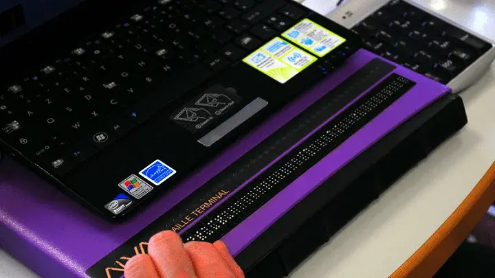
Black Friday and Cyber Monday are considered two of the most significant shopping events of the year. As a blind shopper, I try to take advantage of as many deals as possible, often with mixed results.
In this blog post, I will share three, mostly positive, web accessibility examples from my experience on Black Friday and Cyber Monday 2022 and a few takeaways that e-commerce businesses of all sizes can keep in mind to create a more inclusive online experience for shoppers.
Before we start, I have a note on my shopping habits. I gravitate toward big box stores. I am a male in my early 20s and have particular shopping needs on Black Friday and Cyber Monday. I want the latest and greatest technological devices or gifts for my friends and family. The big box stores generally offer the biggest discounts. This is important to me because I have a budget.
All three of the web accessibility examples that I discuss have an accessibility statement published on the website. This lets me know that these companies are working on web accessibility and care about my business as a customer with disabilities.
For Black Friday and Cyber Monday, I shop websites where I already have accounts. My contact information, shipping address, and payment card are already in place for one-click ordering. Shopping with smaller online retailers can require the creation of new accounts and passwords. I encounter the most accessibility issues on a site when entering shipping and payment information. Web accessibility on smaller sites is also critical. I want to cover some web accessibility examples from smaller stores in a future blog.
Web Accessibility Example #1
It is said that one can find almost anything on Amazon. From clothing to household essentials to electronics, I turn to Amazon for most of my online shopping needs. Amazon offers one of the best experiences for screen reader users.
- Navigation elements are properly labeled and easy to detect using both keyboard and touch navigation.
- Product detail pages are free of clutter and easy to navigate.
- The cart, checkout experience, and user account menus are well-optimized to work with screen readers on desktop and mobile systems.
- Everything works as it should. In my opinion, the most accessible and usable websites are those that I can use without even thinking about it, just as a fully-sighted user would.
Yet, even Amazon can be challenging for a blind shopper at times. For example, when a screen reader user completes a purchase, my screen reader freezes on the order confirmation page. Not only is this page completely unreadable at this point, but the only way to return proper screen reader functionality is to close the site and relaunch the home page. I have replicated this behavior on a few different devices running different operating systems.
Another thing that Amazon could improve is the label for various call-to-action buttons across site menus. In most cases, buttons such as Add to Cart, Continue, Cancel, or Update, are all read by my screen reader as "Submit." While this might seem minor to a sighted person, it can be frustrating and sometimes confusing.
Web Accessibility Example #2
Walmart is another retailer that I turn to frequently for my online shopping needs. I have had an overall positive experience with Walmart's web accessibility.
Walmart includes a skip navigation link on all pages that helps screen reader users jump directly to the relevant content of the page when using keyboard navigation.
Walmart also has done an excellent job with its mobile application. The app includes:
- alt-text image descriptions
- clear but concise button labels
- direct links to specific spots on product detail pages, such as item descriptions or customer reviews.
These sorts of optimizations make the blind user experience as friendly as possible.
However, Walmart still has work to do in terms of accessibility. One example I found, the date/time picker for scheduling delivery orders is not accessible. Also, adding and removing payment methods and shipping addresses is always tricky. So, account management can be challenging for me.
Web Accessibility Example #3
I like the Target mobile application because it has a special mode for screen reader users that eliminates irrelevant clutter and focuses on just the basics. This approach is refreshing.
Unfortunately, Target's desktop accessibility experience is miles behind the mobile app. While I prefer to shop online on mobile apps, some users still prefer the traditional keyboard-only navigation method. Based on my experience, Target has not devoted the same level of resources to serving those customers.
In addition, Target's marketing and account service emails are not screen reader accessible. This makes it very difficult for me to use coupon codes or change my password. So while the app is excellent, Target falls short of delivering a fully accessible customer experience.
Points to Keep in Mind for an Inclusive, Accessible Website
- Always include alternative text descriptions for images. This is particularly important on e-commerce sites because product pictures often provide necessary details to customers not found in the text description of the item.
- Always include "Skip Navigation" buttons so that assistive technology users can jump directly to the main content of a page when using keyboard navigation.
- Ensure that mobile applications comply with accessibility standards to the same degree as desktop sites.
- Do not rely solely on automated scans to determine if a site or app is accessible. Manual and user testing are necessary components of a proper accessibility evaluation. For example, consider hiring an external accessibility partner if accessibility testing cannot be effectively handled in-house.
- Gather and consider user feedback. Real-world assistive technology users may be the best to detect accessibility flaws that can often be missed or overlooked in a lab-like testing environment.
- Publish an accessibility statement. Each of the three website accessibility examples has an accessibility statement. I can read about efforts the company is making to be accessible. I can report issues I face. I can get in contact with a representative for help.
My E-commerce Shopping Experience (And my Hope for Next Year)
I took advantage of great product discounts and holiday deals this Black Friday and Cyber Monday. The website accessibility examples I've given here are based on my experience as a regular blind shopper and user of a screen reader.
Why point out the negative if I had mostly positive experiences with these companies? Because even for the most prominent companies that do a lot of accessibility things right, accessibility is an ongoing initiative.
Some websites and mobile applications are great, some are horrible, and others are in the middle. I hope that by sharing my real experience as a shopper and some takeaways, I can inspire e-commerce companies to make their websites and apps accessible in time for next year.
Editor's Note: This is a guest post from our marketing intern, Michael Taylor. This post reflects his opinions and experiences. Read more about Michael in his introductory post here.


