The holiday travel season is in full swing. Now is the perfect time to discuss app and web accessibility on travel websites.
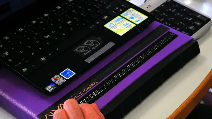
As a blind assistive technology user, I'll focus this blog on screen reader accessibility on websites and apps I use when planning a trip, whether booking flights, lodging, or visiting local attractions. I can only share my experience. If you are an airline, hotel, or other travel business, you'll want to consider and test with people from other disability groups too.
Researching for my trip with a screen reader
The first step when booking a trip is selecting a destination. A wide variety of online sites allow users to browse catalogs of potential vacation spots and optional all-inclusive trip packages. I have tried to use these sites several times, but accessibility issues have repeatedly gotten in my way.
The biggest thing here to address is the use of images. So many travel destinations advertise with photos. Most valuable information about a travel location is presented with pictures. If text is available, it generally serves a supplementary role only. Furthermore, alternative text image descriptions are not included in most cases. As a result, a blind traveler like myself has a tough time learning about a given travel destination's features and unique characteristics.
How I find lodging online as a blind traveler
Once a traveler selects a destination, the next step is exploring lodging. This blog will only cover the accessibility of websites and apps instead of whether physical accessibility requirements are listed on travel websites. Listing and considering physical accessibility is critical but a little different than where I'd like to focus.
My experience with third-party travel apps
I often use third-party sites, like Expedia, that list many hotels to find where to stay. My preferred third-party app is optimized for touch-based screen readers, my assistive technology of choice. There may be some accessibility bugs in these apps. Yet, on a travel app, the accessibility issues are the same across each hotel listed. This makes it easier because I'm not encountering unique accessibility problems with each new hotel listing.
All of this being said, travel apps are far from perfect. The biggest issue I face is limited information on a given hotel room. Again, the problem comes from an over-reliance on images to convey important information.
Why sites and apps with more text descriptions are best
Most hotel listings have little to no text description. As a result, blind users like myself can only access basic information about the hotel listing, like price, the number of beds, and address. It is hard to choose one hotel over another based on this scant information. Meanwhile, my sighted peers can select by referencing images that show the room's design, age of construction, and cleanliness.
An example of a positive web accessibility experience
I have found that Airbnb addresses some accessibility problems associated with booking a hotel. Airbnb properties tend to have much more detailed text descriptions about the location when compared to hotel sites. This is likely because Airbnb listings compete on the property's unique qualities and attributes, making specific details even more important. I have had much success using the Airbnb mobile application. The app is well-designed, focusing on digital accessibility and usability.
How will I get there? Online flight booking while blind
Once I choose a trip destination and book a place to stay, I consider transportation options. In most cases, a flight is my preference. Similar to hotel websites, I find that the accessibility of most airline sites is hit or miss. Some are great, while others leave a lot to be desired. To avoid the annoyance and frustration of sifting through a bunch of individual websites with varying accessibility experiences, I gravitate toward all-in-one booking applications. Like hotel listings, these apps aggregate flight choices from all airlines into an easy-to-browse list.
In most cases, I can browse, select a flight, choose the number of tickets, and complete my purchase by entering payment information, all with relative ease.
My most common web accessibility challenges with airline bookings
The problems begin when I am prompted to choose my seat and luggage type. I need help selecting a seat because the seat chooser is usually a visual map of the plane with each seat marked with a number. When I book through a third-party app, these seat maps seldom work correctly with a screen reader.
I also face challenges when checking in 24 hours before my flight. Unfortunately, this process always gives me trouble. This happened on two airline sites this year alone. The issue in both cases was with the text-input field to enter the relevant flight number. No matter what I did, I could not get my screen reader's cursor to enter the text field.
How and why I use a map app to pick attractions
I often use the internet while traveling to explore restaurants, tourist attractions, and other fun activities. When doing this, I have come to rely heavily on the built-in Apple iOS maps application. While I do not use it for navigation, the maps app is an excellent resource for finding restaurants and other local amenities. If the user enters a search term such as "museum," the application will return an easy-to-navigate list of results organized by location.
Activating a search result will bring the user to an informational screen that includes the hours of operation, a link to the relevant website, a phone number, and a brief description of the establishment. Often, helpful Yelp reviews are also displayed.
The accessibility and intuitive design of the Apple Maps application make it an invaluable tool for searching for local businesses of any type. From an accessibility standpoint, I have far more success doing it this way than trying to sift through many internet results that offer mixed usability experiences. However, I will not discuss my observations about different types of sites like museums and restaurants. However, if you're interested in reading more, check out my post about digital accessibility on restaurant sites here.
To conclude, I would like to give my list of five best practices. This should provide helpful accessibility-related guidance, whether you are a small hotel or a sizeable online travel agency.
My 5 web accessibility best practices for the travel industry
- Always include alternative text image descriptions. This is necessary on any site. On travel sites, vacationers select their destination based on the qualities and characteristics of a location depicted in the images. If text descriptions are not provided, blind users like myself cannot obtain this pertinent information and will therefore be lost as potential customers.
- Consider launching a mobile application. As an assistive technology user, I prefer mobile-based screen readers. Ensure that this mobile application complies with accessibility standards to the same degree as the desktop site.
- Focus on your main user flows. When designing a site, pay particular attention to areas that require user interaction, such as selecting a ticket seat location or entering a travel date. I have found that these tasks are especially prone to accessibility challenges.
- Frequently perform an accessibility check-up. Your check-up can combine automated scans, manual evaluations, and user testing. Consider engaging an accessibility partner to make these tasks more manageable.
- Gather and consider real-world user feedback. I'm not an accessibility expert, but I use my assistive technology on websites and apps constantly. User feedback from people with disabilities can help you positively impact the accessibility and usability of your site or app.
As a blind person that uses assistive technology, I have had many positive experiences, but I also encounter significant app and web accessibility and usability challenges. If you manage a travel website, I hope you have read this because you want to improve the experience for your customers with disabilities. Many people book travel online, including people with disabilities.
As a traveler with a disability, when I know that a company offers a more accessible online experience than others, that site or app becomes my preference, one that I revisit and recommend to others, no matter where my travels take me.
Editor's Note: This is a guest post from our marketing intern, Michael Taylor. This post reflects his opinions and experiences. Read more about Michael and some of his other posts on his experience online here.


