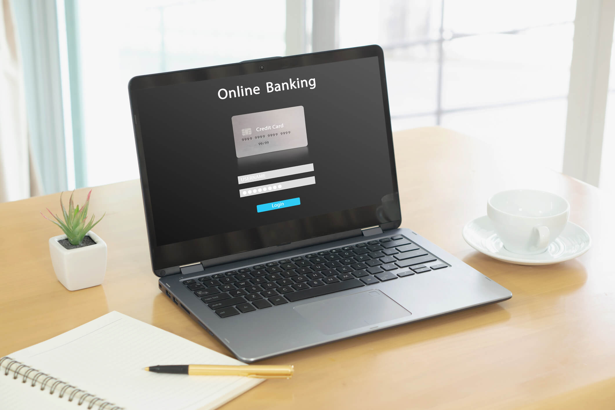
The popularity of online banking has grown significantly in the past couple of years. It can be a time saver for someone with a busy schedule or the only way of accomplishing those tasks for someone who can't travel around easily.
In 2020, banks encouraged customers to take advantage of online, mobile, and phone banking services instead of branch visits. While businesses and bank lobbies have reopened, some behaviors are sticking. Now more than ever, banking customers want to manage finances and do their banking online.
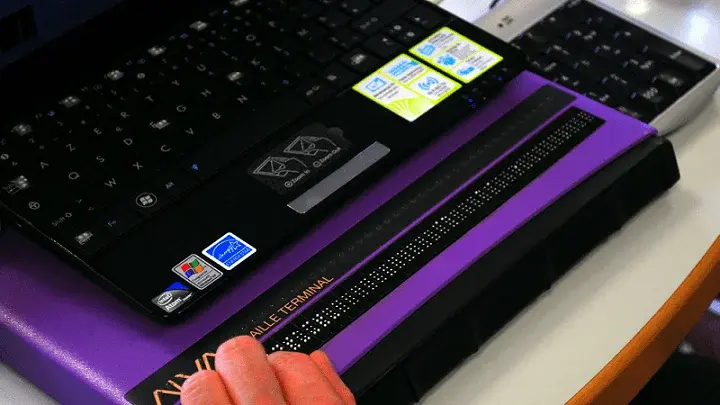
Here are some tips, written by an actual screen reader user, of things you can do to make your banking website accessible.
1) Alert Messages Shouldn't Be Timed
Suppose there are alerts, such as a new message from the bank or an inactivity notification. In that case, they should remain on the screen until the user closes it themselves. Messages that only last a few seconds are inaccessible for someone with memory impairment or who struggles to focus.
2) Images Should Have Alt Text
For a blind consumer using a screen reader, there's no way to know what's happening in a photo. So providing descriptive alt text can give them as complete an understanding of the website as their sighted counterparts.
3) PDFs Should Be As Accessible As The App or Website
If, for example, a bank statement is a PDF, just a picture of the content, it is not accessible to a blind user. PDFs should be searchable, have alt text, and follow the other accessibility guidelines of the app or website.
4) Check your links
When it comes to links, always double-check to ensure they lead to the correct live pages. Broken links can be a navigational nightmare for a blind person using a screen reader. When a page is empty, and there is nothing for the screen reader to read aloud, your blind customers are left confused and unable to navigate your website.
Links that have an image but need to be labeled can also be confusing. For example, a person using a screen reader will either find themselves on a webpage they did not want or need to know where the link is leading.
Does the law require your site to be accessible?
It seems that the Department of Justice (DOJ) believes that the publicly available pages of a banking website must be accessible under the Americans with Disabilities Act (ADA). In March 2022, the DOJ issued guidance that said, "A website with inaccessible features can limit the ability of people with disabilities to access a public accommodation's goods, services, and privileges available through that website."
The same guidance gives examples of businesses open to the public that need to provide accommodations. These businesses include:
Retail stores and other sales or retail establishments;
- Banks;
- Hotels, inns, and motels;
- Hospitals and medical offices;
- Food and drink establishments; and
- Auditoriums, theaters, and sports arenas
In short, if your banking website is not accessible, you could receive an ADA lawsuit for digital accessibility. The financial industry typically ranks in the top 10, often the top 5, for receiving the most ADA-based lawsuits for digital accessibility.
Accessible Online Banking Benefits Many
An accessible website ensures a better overall experience for people who are not disabled. Sustained alert messages can be good for someone with a cognitive disability and someone who happens to be a slow reader. Making sure your website's link is fixed is beneficial to people who use screen readers and those who don't. Finally, broken links or typos in those links can also negatively impact your SEO rankings.
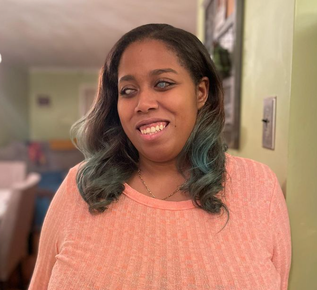
As I mention in my last post on banking, I am one of the 78% of Americans who does their banking online. I also happen to be one of the. 1 in 4 with a disability. For my peers and me, accessible banking means independence. To learn more about what it's like to bank online as a blind person, read this post.
Not sure how accessible your website is? Run a free, automated accessibility test with UsableNet AQA now.


