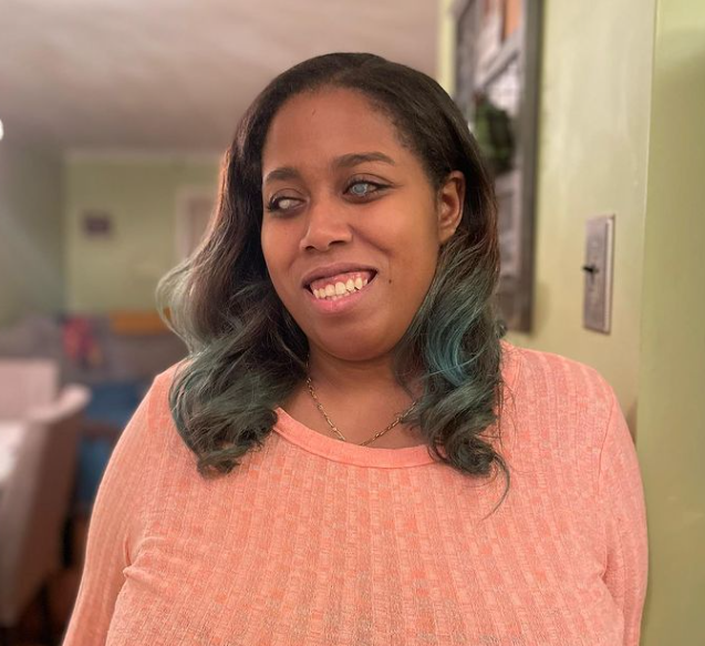
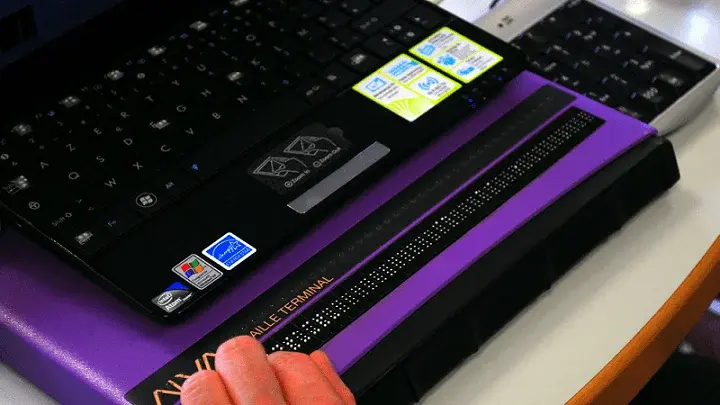
I am one of the 78% of Americans who does their banking online. I also happen to be one of the. 1 in 4 with a disability. I have been fortunate to have had, for the most part, accessible banking experiences. But, with 58% of banks being inaccessible as recently as 2018, my positive experience may be in the minority.
Read on to learn what 4 common banking experiences are like as a blind person, how these experiences can be accessible, and why accessibility on websites and apps is important to banking customers with disabilities like me.
1) Logging In or Signing Up
When logging into a banking app or website, the text fields need to be clearly labeled so that I and other blind customers know what information is expected to be input. This applies to all text fields. There should also be clear instructions on formatting requirements, such as passwords should be 8 characters and include at least 1 capital letter and 1 number. It should tell me how to format the date If anything is filled in incorrectly, there should be more than one way to inform the user. So, if the mistake is highlighted, there should also be a written explanation for what went wrong. For example, my screen reader should read, "password is too short."
I have had instances where I can't log in or sign up for a program because I can't tell the guidelines. I sometimes go off what is expected on other websites, and I've had to ask friends or family to help me figure out the problem. Often, my errors are highlighted for sighted users but not specified in a way that helps me.
2) Checking Bank Statements
Once I've logged in or signed up, my next step is to check my account balance and maybe my purchase history.
In theory, checking my bank statement is important to protect against fraudulent charges. In practice, this can be impossible if the document, usually in PDF form, is inaccessible. If, for example, a bank statement is a PDF just a picture of the content, it is not accessible to a blind user. It's not useful to me at all.
PDFs should be searchable, have alt text, and follow the same standard of WCAG (Web Content Accessibility Guidelines) as the website.
3) Making a Transfer
In addition to checking my transaction history, I might want to transfer money to a friend or pay a bill. The way to access these parts of the apps is through buttons. For example, suppose the button only has an image and no text. In that case, my screen reader will only read the word "button," leaving me with no idea if I'm about to open Zelle or my account settings.
All buttons, links, and radio buttons should be clearly labeled for me to use them. For example, ensure you use the correct text attribute so my screen reader can detect the purpose.
4) Checking Alert Messages
If I've gotten distracted, my bank app will send me a helpful notification that it is logging me out for my protection. These alerts are great when they are up long enough for me to review them. Alerts that go away too quickly or alerts that do not allow people to dismiss them make apps difficult for me to use. A blind person needs time to be able to scroll through and listen to a message in its entirety.
Accessible Banking means independence.
Being able to bank online provides blind people with a way to handle their money independently. Beyond blindness, the ability to easily bank online allows people with mobility impairments to access their financial accounts without worrying about physically getting to a location. It is also just convenient, regardless of one's disability. Making banking websites and apps accessible gives everyone the same level of independence, experience, and service.
Get started planning your digital accessibility initiative to make your website and apps accessible; download our Web Accessibility Checklist.


