With summer here, many people are starting to make and finalize their vacation plans. A major part of this process is browsing for and purchasing flight tickets. As mobile devices become more capable and powerful, people use these portable computers to book and manage their travel plans through mobile websites and apps.
In 2023 alone, over 850 million travelers utilized travel apps, with 48% of U.S. mobile users comfortable planning entire trips exclusively via smartphones (Business of Apps).
In this blog, I delve into airline website accessibility, shedding light on prevalent challenges touch-based screen reader users face on mobile devices. Given their expanding use and appeal, the significance of accessibility on smartphones and tablets cannot be overstated.
Addressing Seat Selection Accessibility
In preparation for this blog, I explored several prominent airline websites using my tablet. While much of what I encountered was positive regarding accessibility, the seat selection phase within the ticket purchase process presented notable hurdles. The interfaces for seat selection varied across platforms, none proving particularly accessible. A common approach involved presenting a simulated physical plane diagram, with each seat designated by a row letter and seat number. However, my screen reader often announced seemingly random numbers and letters when navigating these images through direct touch or manual swipe navigation.
These announcements lack contextual clarity, making it challenging to discern the specific section of the plane. An ideal solution is providing text-based context alongside graphical representations to facilitate seamless navigation for screen reader users like me. An example could be "Row F, Seat 3, Window Seat, Forward Left Part Of Economy Cabin."
An alternative seat selection interface uses a table grid to show row and seat numbers; this presented similar issues. Navigating specific tables with a touch-based screen reader is difficult. After all, the locational accuracy of direct touches is challenging to maintain consistently. Hearing random items in the table that are not necessarily in chronological order is not helpful.
Overcoming Pop-Up Dismissal Challenges
During the checkout process for airline reservations, the website presents customers with optional trip protection insurance, typically in a pop-up box. However, dismissing these pop-ups poses significant difficulties for screen reader users, primarily due to the small "X" button for closure. The button was often only locatable via direct touch, with manual swipe navigation proving ineffective.
Related Reading: Pop-up Accessibility and How to Make Pop-ups More Accessible [Blog Post]
To close the pop-up, I had to learn where the button was on the screen, which meant a lengthy exploration session. Because the touch target for the button seemed to be particularly small, I had a frustrating experience as I tapped around the screen in a tiny area in search of the one spot that would focus the screen reader on the "Close" button. This accessibility flaw makes for a clunky and jolting speed bump in the airline ticket purchase process.
Enhancing the accessibility of pop-up dismissal mechanisms, perhaps through increased touch target sizes or alternative navigation options, would make the experience better for everyone.
Ensuring Accessible Digital Boarding Passes
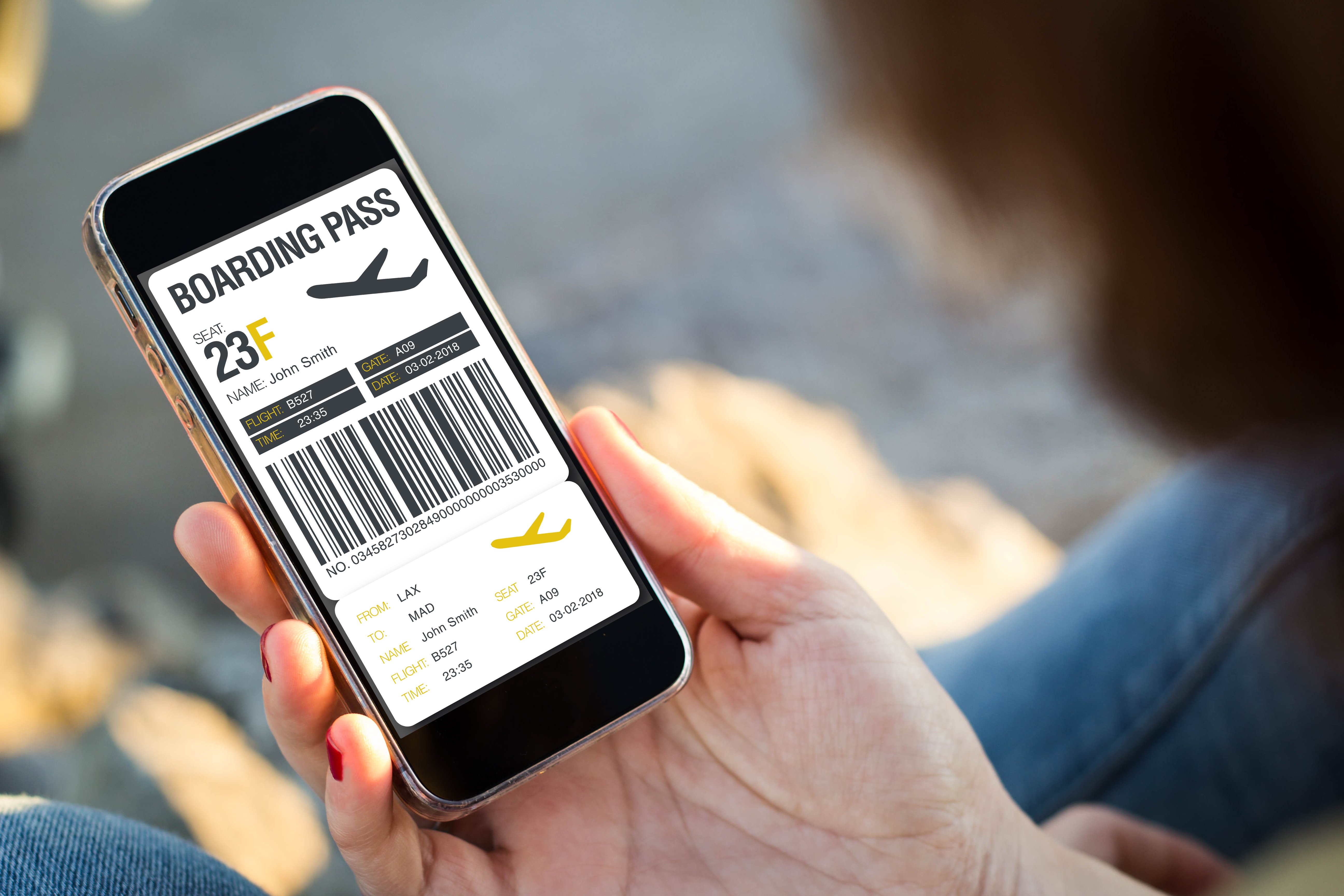
A staple feature of nearly every modern airline website is the ability to download a digital boarding pass onto a mobile phone for later use during flight boarding. Unfortunately, these electronic passes often fall short regarding screen reader accessibility.
I've written about the lack of accessibility for digital boarding passes in the past. In my blog titled "Airline Booking: Navigating an Inaccessible Experience." I cover a particularly challenging experience.
Unfortunately, my mobile screen reader will typically say nothing when trying to interact with the contents of the downloaded pass. Neither direct touch nor manual swipe navigation works, which is problematic because it is often necessary to reference information presented in the boarding pass document, such as flight numbers and arrival and departure times.
Fixing this issue by implementing accessible document structures or alternative presentation formats would empower screen reader users to access essential flight information independently.
I experienced this issue last year when checking my luggage at the airport. The desk attendant asked me for my flight number, but I needed help from a sighted friend because the boarding pass on my phone was inaccessible.
Related Reading: Traveling When You're Blind: The Importance of Digital Accessibility [Blog]
Advocating for Mobile Accessibility in Airline Ticket Booking
Screen reader accessibility on mobile airline ticket websites and applications is paramount. As portable devices like tablets and smartphones continue to shape the technological landscape, ensuring inclusivity for all users, including those with disabilities, is essential. By addressing and fixing accessibility issues, independence in travel can become more achievable for everyone.
I hope I've shown the importance of addressing accessibility challenges in airline ticket booking on mobile devices. By advocating for enhanced accessibility measures, we can work towards creating a more inclusive digital landscape.
Editor's Note: Our frequent contributor, Michael Taylor, wrote this post. This post reflects his opinions and experiences. Read more about Michael and some other posts on his experience online here.


.jpg)
