When I was initially asked if I was interested in writing about my accessibility experiences for UsableNet, my first thought was "But I'm not blind enough."
As silly as that seems, I've always struggled to explain my condition to others and not for lack of trying!
There's this misconception that blindness is black and white, no pun intended. When people hear that I'm legally blind, they assume I must use a cane and only see pitch black. Imagine their surprise when I stroll in with no physical signs of bad vision!
Blindness is a Spectrum
Too often, blindness is synonymous with unusable eyesight. Lots of people aren't even sure what it means when I use the term "visually impaired." "Why won't she just wear glasses like everyone else?" they wonder.
For those people, I like to explain my visual impairment by comparing myself to a person on crutches. Someone with a sprained ankle still has their legs, and they can walk around, just not perfectly. I still have my vision, it's just not up to par with people who have normal vision.

The reality is that there are countless forms of sight! Out of the estimated 253 million people that live with "moderate to severe visual impairments," only about 5% of these people cannot see at all.
Most blind and visually impaired individuals have some visual perception, whether that be light, color, shapes, etc. It's important to remember that even those who use braille and screen readers usually still have some eyesight.
Flexibility is key for web design that accounts for every user's unique needs. An accessible website benefits customers of all different vision types. Below, I've explained a few elements of vision that web developers should pay attention to.
Website Accessibility: Things to Consider for Users with Low Vision
Everyone sees differently, whether they have a diagnosed visual disability or not. Believe it or not, only 35% of the age 18+ population has normal (20/20) vision. That means more than half of adults have some degree of vision loss.
Regardless of the details of someone's condition, all people with vision loss can benefit from certain digital accessibility measures. Universal design principles provide a great blueprint for developing an accessible website.
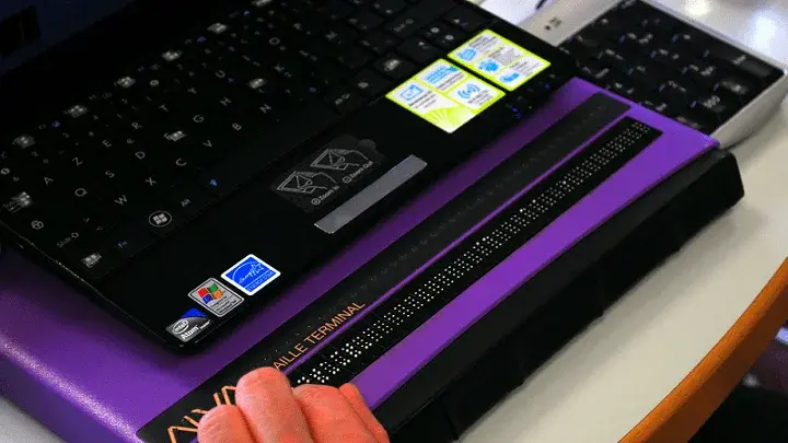
When designing your site, don't forget that not every "blind" person uses a screen reader. In my first blog, I wrote about the different accessibility tools I use as someone with limited vision. Exploring assistive technology other than screen readers can give web designers an idea of common accessibility needs.
It's also important to consider how people use vision. Visual acuity, color vision, depth perception, and peripheral vision are four helpful ways to measure eyesight. Understanding these aspects of sight can help web designers create more accessible sites.
Visual Acuity
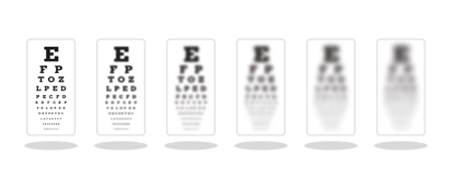
Visual acuity is the ability to depict the shapes and details of what you see. Normal vision is 20/20 acuity.

My acuity is 20/200 in both my left and right eyes. This means that I have to be twenty feet away from an object to see it, while someone with normal vision can see the same object from two hundred feet away.
Your visual acuity normally develops around six months of age. People who are nearsighted lack perfect acuity. They often discover this around age eight, however, my nearsightedness was apparent from childhood. I remember sitting in my kindergarten classroom, unable to read the words on the chalkboard.
Color Vision
Color vision is a bit more self-explanatory; it represents a person's ability to detect color. A more in-depth definition would say that color vision occurs when the cones in your eyes recognize different colored light based on their wavelengths.

I was born colorblind; people often mistakenly think this means I only see in monochrome. It might surprise many to know that very few people who are colorblind see no color. Instead, they have trouble differentiating between certain colors. The most popular form of colorblindness is red-green.
With achromatopsia, I am missing a majority of the cones in my eyes. I mainly see with my rods, which are designed for nighttime vision. Therefore, I am extremely sensitive to light. When I go outside, I need magenta-tinted eyewear in order to see.
My world is full of blinding bright light. Colors are sort of washed-out and less saturated. I struggle to discriminate between colors that appear “dark” to me. These include purple, brown, blue, green, and black.
Depth Perception
This term inspires frustrating childhood memories of gym class kickball; I always had such a hard time judging the distance of the ball!

Depth perception is the ability to see the world in three dimensions and accurately note how far away things are. Accurate depth perception usually requires balanced, two-eyed vision. Interestingly enough, it's been found that color vision also has a significant effect on one's depth perception.
Peripheral Vision
Peripheral vision is what you see outside of your central focus when you're looking straight ahead. A lack of peripheral vision is usually termed "tunnel vision."

I have normal peripheral vision thankfully. However, when I use my magnification software, there is almost a "digital tunnel vision" effect, since I'm zoomed in on a specific part of the screen. This is something to remember for web designers who decide where to place website elements.
Make Your Website More Accessible
My achromatopsia isn't terribly apparent in everyday life. I look physically "normal," and I rely on auditory clues when needed. However, if you put me in front of a computer, the act will be up. I need digital accessibility as much as someone who is totally blind! My needs are simply different.
At the end of the day, every person, regardless of their eyesight condition, should be able to rely on inclusive digital accessibility!
By learning about different types of vision loss, web designers can better understand and adjust digital experiences to be more accessible. For more insight, take a look at my other blogs where I supply tips and anecdotes on web accessibility!

.jpg)


