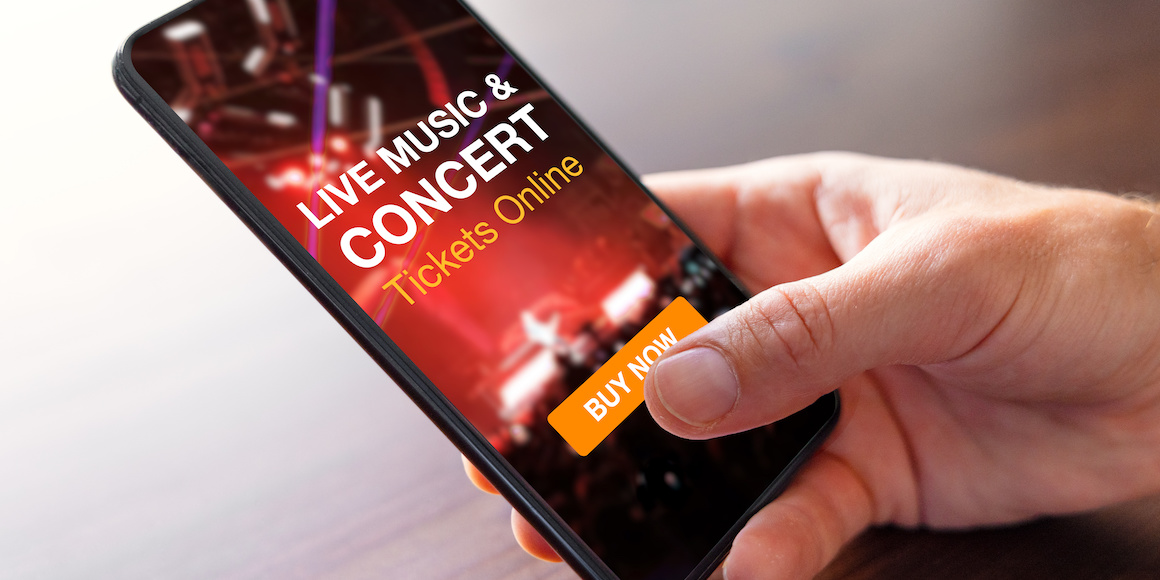
After a hot summer, fall is the perfect season to enjoy the beauty of the outdoors. Attending a concert in the park, catching an evening game, or enjoying a local festival are great ways to pass the time before the weather cools down.
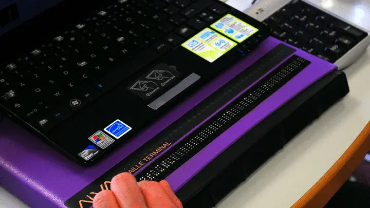
As I’ve been browsing event ticket sites searching for that perfect activity, I feel motivated to share my experience as a blind person and concert-goer who truly enjoys live events.
First, I'll discuss some common issues that blind internet users like myself frequently encounter when visiting event ticket sites. Next, I’ll talk about some of the positive things I found when searching for tickets on several websites-focusing on what these websites are getting right about accessibility. Finally, I'll share a few helpful accessibility tips for website owners and designers who plan events or use electronic tickets.
Accessibility for Events: Common Challenges Blind Shoppers Encounter on Ticket Websites
There are a number of common areas where ticket websites often fall short of full accessibility:
The challenge of choosing a seat location.
One of the most valuable features of the digital ticket booking experience is the ability to choose a seat that’s based on price and location. For example, a person who wants to purchase tickets to a concert can select their desired seats on the main level or upper balconies of the venue.
Unfortunately, this feature is generally not accessible to screen readers. Common design practice often uses a visual diagram of the venue showing each seating section, the number of seats available, and the ticket price that corresponds with each seat. When a screen reader encounters one of these diagrams, it usually announces vague, meaningless terms like "image" or "graphic."
When this happens, I’m forced to abandon my browsing session or select the most basic ticket option, which is usually chosen by default. This process should be more friendly to assistive technology users and adjusted to include an alternative text-based seat selection method.
Image-based event calendars don’t work well with screen readers.
Another experience I encountered while browsing venue and wholesale ticket websites involved event calendars. I noticed that many places—especially smaller venues—uploaded their event calendar for the entire season as a single image. Web managers likely take a photo of a physical event calendar and then add it as a raw image file to the site.
Website owners likely do this to save time or money, but this method of adding the event data makes a website inaccessible to screen reader dependents like me. Screen readers don’t interact well with images. They either ignore the picture entirely or say meaningless terms like "graphic."
Alternative text image descriptions are usually the best way to make a picture screen reader accessible. However, because of the dynamic nature of schedules and calendars, they’re impractical in this scenario. Instead, include a plain text list that details all upcoming events, along with their corresponding dates and times.
While virtual tickets may be convenient, they’re not accessible.
Paper tickets have largely disappeared in favor of digital versions that can be downloaded after purchase. While it may seem like this method eliminates any accessibility problems associated with paper tickets, the opposite is true. None of the digital tickets I’ve used have worked correctly with my screen reader.
The main problem involves ticket activation. Modern digital tickets usually include a moving bar code or other motion feature that’s activated by clicking a button. This procedure was created to reduce fraud by preventing attendees from using screenshots of old or inactive tickets.
However, when an attendee reaches the ticket validation checkpoint at a concert venue, they’re required to activate the digital ticket using their mobile device. Unfortunately, the activation button is rarely screen reader detectable. The screen reader generally can’t read any element of the digital ticket, since they’re usually images or inaccessible PDFs. I can only activate my ticket for admission into the event with the help of a sighted person. I hope that with awareness, this can change.
Common Design Practices That Can Improve Accessibility for Events
Now that we’ve talked about a few of the shortcomings on different venue websites, here is what some are doing right:
List-Based Search Results Filtering
Some ticket websites use an image-dominated interface to display search results and featured events. For visual appeal and space conservation purposes, results are often organized in rows and columns. This lets more information fit on one page.
For example, searching for rock concerts in the metro New York area returned a three-by-three grid of concert listings on four of the five sites I visited. Each listing contained a square image with the concert's name directly below it. A sighted user informed me that the images displayed the band or musician playing onstage.
Unfortunately, these search results aren’t very screen reader-friendly. The grid-like layout presents a challenge during manual and more advanced jump navigation. The screen reader's focus tends to skip around randomly as users move through the search results. Furthermore, having to circumvent all the images just to hear the name of the artist playing slowed down the browsing process and led to a clunky experience.
The good news is that three out of four sites that used this design provided a practical and accessible solution to the problem. In the search, the "filter menu" option allows users to organize the results as a list, rather than a grid view.
The list view was far easier for me to navigate. This view scaled images down and deprioritized them. Each listing displayed the name of the concert, the artist or artists playing, and the time of the event. I could move through the options with a simple press of the up or down arrow keys. When it comes to accessibility for events, adding an alternative list view option shows a conscious effort to design a universally accessible digital experience. On one of the websites, there was even a short disclaimer that advised the user to enable this option to improve the page's accessibility.
Skip Navigation Links
Each one of the five event ticket sites I tested included skip navigation links on all its web pages. Skip navigation links allow screen reader users to bypass the top heading of a website and jump directly to the page's main content.
These links allow users to move past persistent web elements on every page. While these skip navigation links are super important on all sites, they are especially handy on event ticket websites. Event websites often have persistent web elements at the top, such as featured events and advertisements for ticket discounts and deals. If I had to manually navigate past these items every time I visit a different site page, the experience would become extremely slow and inefficient. The consistent inclusion of skip navigation links on event ticket websites represents a conscious effort to prioritize accessibility and usability.
How are websites making seat selection easier for people with disabilities?
As I mentioned before, one of the most popular features of modern event ticket websites is the ability to choose a specific seat location. Traditionally, this process uses a visual diagram of the physical venue. Seats that are not available are generally marked and cannot be selected. Due to the visual nature of these diagrams, this process is not accessible. Traditional accessibility strategies, such as alternative text descriptions, do not work because of the dynamic nature of the images.
Two major ticket retailers have implemented a partial solution to this problem. The approach allows the user to filter search results by seat type and location in the venue. Applying the filter will return all available seat ticket options in the selected section.
For example, when browsing for tickets to a baseball game, I could choose “Main Level First Base Line'' as a search filter option. When I did this, I discovered that there were only eleven seats left in that section. While this feature enables screen reader users to browse and select seats in a specific venue, it does not permit us to choose a particular seat. However, this design is a significant improvement over traditional image-only seat selection websites. It positively represents progress toward better overall web accessibility.
Takeaways and Tips for Better Accessibility on Your Event Website
Using tickets at your next event? Own or operate an event ticket website? As a user with visual disabilities, I want to share a few brief tips for event ticket site designers and owners:
- Avoid uploading text-based data—such as event calendars—to the site as an image. They will not be screen reader accessible.
- Develop an alternative text-based solution to the seat location selection feature, which combines plain text and drop-down menus to replace images and diagrams.
- Remember that digital and accessible are not synonymous. To be considered truly accessible, make sure to optimize all your digital experiences to work properly with assistive technology.
- Pay particular attention to digital tickets because they are especially susceptible to accessibility flaws and may be missed during routine audits. An accessible digital ticket is essential for someone like me and will ensure that I have the best event experience possible.
- For help with digital accessibility, consider partnering with a trusted, experienced partner such as UsableNet.
Working Toward Website Accessibility on Event Websites
People of every ability want the convenience of buying tickets and experiencing live events. Though I struggled in some places, the event ticket industry is definitely making strides toward full accessibility. I hope I highlighted a few issues to avoid, while also showcasing some of the great work and progress that venues and ticket sellers are making. It’s refreshing to know that more websites are putting in the work to offer a universally accessible experience to everyone. Explore how web accessibility testing can make all the difference in digital experience by reading our free guide.


