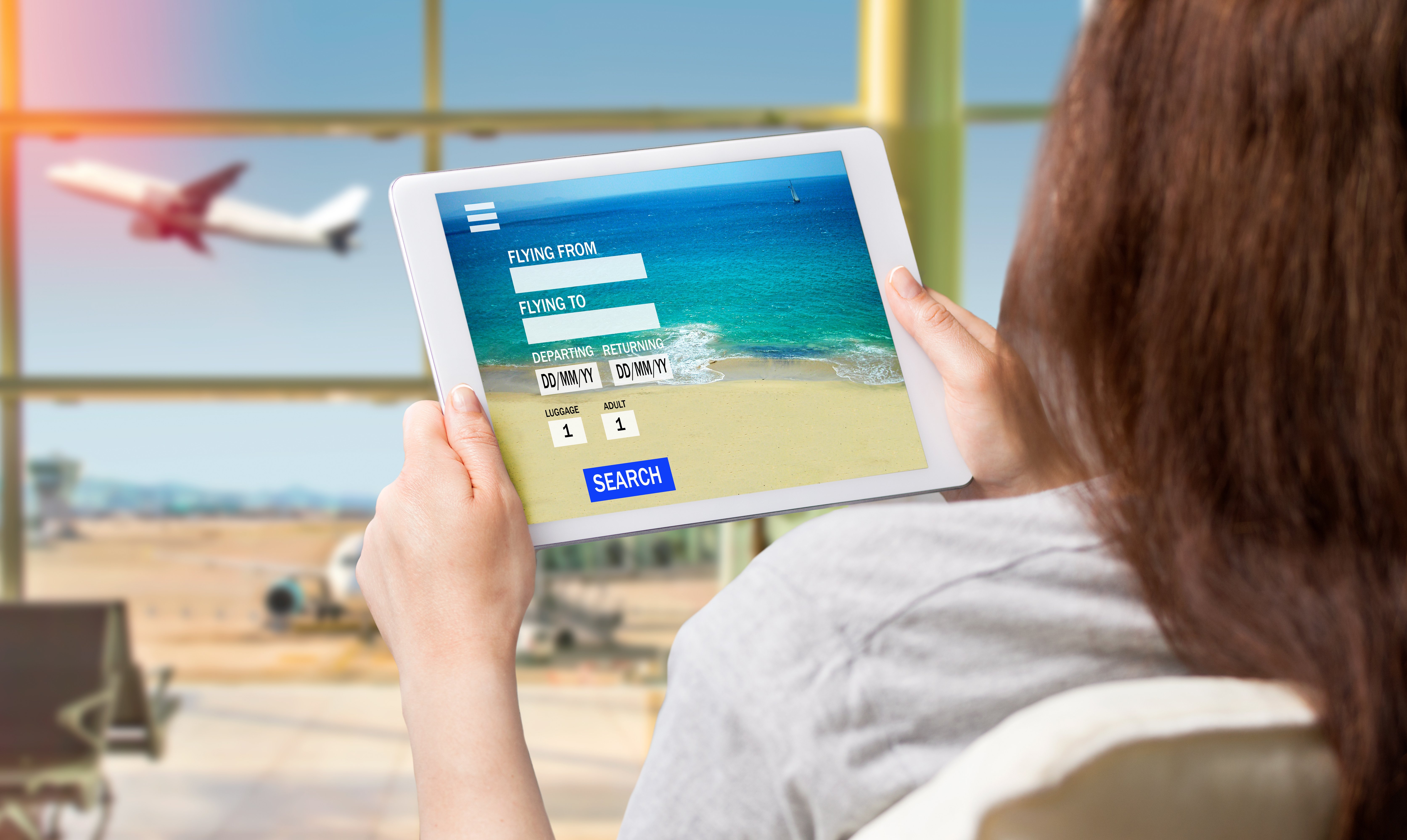
With summer travel in full swing, I recently booked a stay at a small resort using my tablet's mobile browser. I expected the usual frustrations: unlabeled fields, broken date pickers, or inaccessible buttons.
To my surprise, this was one of the best digital booking experiences I've had in a while.
Editor's Note: Michael Taylor is a blind screen reader user and a regular contributor to the UsableNet blog. He shares firsthand experiences navigating websites and apps to highlight where digital accessibility succeeds—and where it still needs work.
In this post, I'll walk through what went right (and the few things that didn't). I'll focus on mobile touch-based screen reader navigation and share why this simple experience worked when so many others don't.
A Clean and Clear Homepage
The homepage of the resort's website listed multiple room types, from standard guest rooms to private villas. Each room name was marked as a heading level 2, followed by images, a detailed description, and two clearly labeled buttons: "Learn More" and "View Pricing and Availability."
One flaw stood out right away: the images didn't have alt text. That's an accessibility miss. But in this case, the rich text descriptions gave me enough context to understand the room options without relying on the visuals.
Using both swipe navigation and direct touch, I had no trouble reviewing the listings and activating the "View Pricing and Availability" button for the room I wanted.
A Surprisingly Accessible Date Entry
The next screen asked me to enter my travel dates. At first, I was confused. There were just two fields labeled "Stay Start" and "Stay End." No dropdowns or calendar widgets appeared when I tapped them.
Then I found a short note below the fields explaining the expected format: two-digit month, two-digit day, and four-digit year.
Once I understood that, it all made sense. I used the virtual keyboard to enter the dates and pressed "Continue manually." The process was quick, straightforward, and—unlike most calendar widgets—accessible.
I hadn't expected this interface, but it worked. And sometimes, the simplest solution is the best one.
A Price Display Issue That Almost Derailed Me
On the pricing screen, I ran into a small but important issue. The site listed the room at $239.76 per night, but my screen reader ignored the decimal and read the price as "$23,976."
That moment gave me a bit of sticker shock before I realized what had happened. A stylized font or a formatting quirk made the decimal unreadable to the screen reader.
That one detail turned an accurate price into a confusing experience—proof that even minor design choices can create real accessibility problems.
Check out That Gets It Right
I added the room to my reservation and triggered a pop-up asking if I wanted to complete the booking or keep browsing. I chose "Checkout Now."
The pop-up included a clearly labeled dismiss button that worked with both touch and swipe navigation. That small detail put this experience ahead of many others.
The rest of the checkout process went smoothly. All form fields were labeled, and the site accepted my payment. Declining trip protection was also easy.
What Travel Teams Can Learn from This
This experience was not with a major hotel chain with a big design team. It was a small business with a simple website, and that simplicity worked in its favor.
The more complicated a site becomes, the more accessibility work is needed to make it usable. But clean code, straightforward navigation, and good structure go a long way.
If your team is struggling to make a complex site accessible, it might not be your testing process that's the problem. The interface itself could be getting in the way.
I noticed a pattern across this trip: simpler digital tools were more accessible. The more features or visual layers an interface had, the harder it became to use independently.
Accessibility Checklist for Hotel Booking Pages
If you're responsible for a hospitality website, here are some key elements to include to support travelers using screen readers and other assistive technologies:
- Use clear headings to structure content. This practice helps screen reader users quickly find room types, pricing, and policies. Read How to use Headings for Website Accessibility
- Label all buttons and form fields. Generic labels like "button" or "click here" don't offer enough context for non-visual navigation.
- Avoid inaccessible date pickers. Use native HTML fields or provide a fallback like manual date entry with clear formatting guidance.
- Ensure assistive technology can read prices correctly. Stylized fonts or hidden characters can confuse screen readers—especially when it comes to decimal points.
- Include alt text for room images. Visuals help set expectations and sell the experience. Descriptions make those visuals meaningful for everyone.
- Confirm forms and checkouts are screen reader compatible. Confirmation messages, error prompts, and pop-ups should all be accessible.
Small changes can turn a frustrating process into a smooth and inclusive experience.
Build Accessibility Into Booking—and Beyond
If your website is someone's first impression, accessibility matters more than ever. Small details—like headings, labeled fields, and accessible date formats—can make the difference between a seamless booking and a lost customer.
Want help improving digital accessibility across your website?
UsableNet Assistive gives your team expert support to identify and fix real-world accessibility issues like the ones described here. Learn how Assistive works.


