UsableNet recently did a webinar where a full-time screen reader user demonstrated interactions with websites to show sighted individuals how blind technology users navigate the internet. In this post, I will attempt to answer several of the audience's questions. As always, I will speak from the perspective of a proficient screen reader user. My answers will reflect my opinions and experiences with assistive technology.
1: How frustrating are redundant links? In other words, when multiple items in a location are linked to the same place, such as an image, button, and heading?
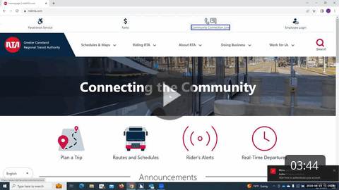
I encounter these sorts of redundant links all of the time when browsing websites of all kinds. While they can be frustrating when navigating manually using the tab key, redundant links can be beneficial when moving through the page using an attribute filter such as buttons or headings. While they can sometimes be frustrating, I don't take a huge issue when a website has redundant links. Click below to watch a video example of redundant links on a website.
2: Do accessibility widgets help screen reader users navigate websites?
No, I have found that accessibility widgets hinder my ability to navigate a website with a screen reader effectively. These widgets try to solve the problem of digital accessibility by including their own proprietary screen reading software. Not only are these widget screen readers incredibly primitive and clunky, but they also compete with the main screen reader for stage time, which leads to a jumbled mess of speech that is utterly useless and sometimes even laughable. Accessibility widgets are not a cure-all to digital accessibility, and it is best to avoid them.
3: How can a blind person move the visual cursor arrow on the computer screen?
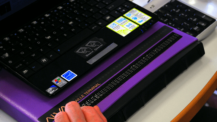
The screen reader allows the user to change the position of the visual on-screen cursor. Most screen readers have a cursor that is often invisible. However, a screen reader's settings options will allow the user to enable a control that makes the visual cursor follow the screen reader cursor. Therefore, navigating around the screen with the screen reader will also move the visible cursor or pointer.
4: Are the methods shown in the webinar the only ways to test a website for accessibility?
Accessibility testing occurs in several ways. Automated scans can help detect code defects that may lead to an accessibility flaw. Manual testing is crucial because automated scans can potentially miss significant accessibility problems. Additionally, user testing performed by real-world assistive technology users is vital because these individuals are often best poised to uncover accessibility shortcomings.

5: What is the worst example of digital accessibility you have ever encountered?
For me, this occurred in college. The university switched hosting companies for the online student portal system. An update intended to enhance the portal broke all digital accessibility. When entering the portal, my screen reader would only say "Web Area." I could not even hear a hint of an on-screen element. This lack of accessibility was a significant issue because students relied on this portal for everything from making advising appointments to checking and submitting assignments.
6: Would short tutorials or guides explaining the accessibility features of a website be helpful, or is it better for each user to explore on their own?
Your site should not need a tutorial or guide for use. When you bake in accessibility as part of your process, standard navigation methods should function just the same on that site as on any other site.
7: Do the following interactions, pop-ups, sliders, and forms frequently challenge screen reader users?
Unfortunately, the answer is yes. Pop-ups are often problematic because the screen reader cannot find the pop-up window contents after the button is activated. I have a lot of trouble with sliders because using the keyboard to adjust the value usually only allows for jumps of ten percent or more, eliminating the granular control possible when using a mouse to move the slider. Forms can sometimes be plagued with unlabeled text fields, leaving me clueless about what information should be entered in each box.
8: What is the best way to handle alternative text for purely decorative images?
Suppose an image is genuinely decorative and provides no additional meaning. In that case, leaving the alternative text blank or null is acceptable, which will tell my screen reader to skip over the photo. The critical thing to remember here is that alternative text descriptions are supposed to work in tandem with the content around the image. If a picture appears decorative but provides meaningful contextual information, including a description may be a good idea.
9: Can graphs, charts, and tables be screen reader accessible?
Yes, so long as you follow accessible design practices. Charts and tables need proper column and row heading markers and labels in the code. Graphs are a bit more complicated, but accessibility is still possible. For example, the Voiceover mobile screen reader for iPhone offers a feature that uses changes in pitch of a sound to represent the path of a line on a line graph.
10: What are some of the most frustrating accessibility issues you regularly encounter?
Two issues in particular frustrate me. The first is unlabeled buttons on websites. It is only possible to use a website if I hear and activate call-to-action buttons and navigate through menus.
The second problem that aggravates me is poor mobile accessibility. Plenty of sites offer an excellent experience for screen reader users on desktop but a lackluster one on the mobile version of the site. I cannot understand this because so many people use their smartphones to access the internet.
Editor's Note: During the August webinar, How a Blind Person Uses a Website, we received a lot of solid questions. Some questions Michael was able to cover in the blog. Others require more significant explanation, so we'll share more blogs over the next few weeks.
In case you missed it, one such blog is Michael's "Web Accessible Button Design for Screen Readers." This blog includes Michael's experience and a video of our Sr. UI/US Designer discussing how designers should design buttons to be accessible for screen reader and keyboard users.
Interested in seeing the live demonstration that prompted these questions? We've posted this webinar on-demand. Register and Watch "How a Blind Person Uses a Website," the 1-hour webinar here.

