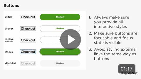
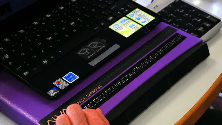
Buttons are an essential element of any website, program, or mobile application. They allow visitors to navigate the site, move back and forth between pages, and complete tasks. Though buttons may seem relatively simple to sighted users, accessibility flaws can make buttons unnecessarily complicated for blind assistive technology dependents like me.
Web accessible button design is important to understand to ensure everyone has reasonable access to content and capabilities on the web. As always, I will be focusing exclusively on my experience as a screen reader user.
Web Accessible Button Labels Help Screen Readers Find Buttons
For a screen reader to meaningfully locate a button, a corresponding text label must be in the code that identifies the button. As an example, consider a generic ecommerce website. Across the site's top navigation bar are the menu, search, and shopping cart buttons.
The shopping cart button, for example, is denoted by a small graphic of a physical wagon. If no button labels are present in the site’s code and I were to navigate to the top bar using my screen reader, I would hear the term “button” three times as my screen reader finds the three unlabeled buttons. Depending on the specific screen reader and the types of button graphics used, the software may also announce the term "image" or "graphic."
In other less common but certainly possible scenarios, the screen reader will not detect unlabeled buttons and skip directly past the navigation bar. As a result, buttons without corresponding text labels in the code serve no valuable purpose for screen reader dependents. Vague terms like "button" or "graphic" neglect accessible button design, significantly delaying my shopping experience and making the site virtually unusable.
How to Create the Perfect Accessible Button Label
Not all button labels are created equal. The key to developing a practical label for accessible button design is to convey the button's function in as few words as possible. Watch a video on accessible button design with our Sr. UI/UX Designer. Click here.
 Let's revisit the shopping cart tab example from the generic website in the previous section. Attached to this button in the code should be a text-based label. An appropriate label for a shopping cart button can include "cart," "shopping cart," or "cart (followed by a number representing the number of items in the cart)."
These short and sweet labels convey the button's meaning and purpose to improve web accessibility. Though keeping labels as concise as possible is essential, you should not do this at the expense of clarity. For example, if the button label for the site's main menu has the text "navigation" instead of "navigation menu," it may leave the user uncertain about what the button does. Will the button serve as a skip navigation link? Will the button navigate me to a different point on the page? Will the button take me to a tab bar? These are all valid questions when encountering unclear button labels.
On the flip side, long and drawn-out button labels are equally problematic. Unfortunately, I have witnessed multi-sentence labels that are not only annoying but also unnecessary.
Here’s an example from a retail site I recently discovered while shopping: When navigating to the cart button with my screen reader, I heard, "This will take you to the cart. The cart has a list of your potential item purchases." The fact that the word "Cart" was the seventh word means this label is too lengthy and frustrating. It was encouraging that the web designer tried to use detailed button labels, but unfortunately, they missed the mark.
What Not to Include in Button Labels
Several labeling characteristics can make buttons futile or inaccessible—and thus useless. Therefore, do not include the following descriptors in your button labels:
- File attachment names
- Complicated punctuation
- Links
It’s crucial that links never appear on a button label. If proper syntax is employed, the link will appear in a different part of the button's code.
How to Ensure Button Label Consistency
Each button on a site should be appropriately labeled. It is irritating to browse products, add them to my cart, proceed to checkout, and then find that the site designer forgot to mark the "place order" button, causing me to abandon my purchase. These experiences occur all too often in the lives of assistive technology users.
Persistent Buttons
Ensure labels appear on all pages for persistent buttons, such as "back" and "forward" page navigation, search fields, and navigation menus. For example, one popular ecommerce site labels the static shopping cart button correctly on the home page only. On every other page of the site, including the product detail pages, the cart button has no label and is therefore announced as “image.” Verify that buttons have substantial touch targets on mobile screen readers. Test for label and button functionality during routine accessibility audits.
Pay Particular Attention to Repeat Or Redundant Button Labels
Most screen reader users utilize functionality that allows them to filter by web element and then navigate through a list that displays only items relevant to the selected type of web element. For example, let’s take a search results page of a generic ecommerce site. The site displays products in a list with an “add to cart” button under each item. If I only navigated the page using buttons, I would repeatedly hear the “add to cart” announcement. Out of context, this makes very little sense.
To fix this, include the name of each product with the “add to cart” button label associated with that particular item. For example, a random button on the list may read “add to cart, 16-piece ceramic dinnerware set, gray.” Whenever a list of redundant buttons is part of the navigation experience you should include specific details in the label that separates individual buttons from the rest.
Encouraging Web Accessible Button Design
Buttons are an integral part of any website. Luckily, it is relatively easy to ensure that a website's buttons are screen reader accessible through text-based labels best practices. These labels should be short and sweet while still retaining clarity. If all call-to-action and navigation buttons are adequately labeled, the website can significantly improve its accessibility and ADA compliance.


