I've encountered many people in my life who have an almost mystical perception of blind people. Having the hearing of a bat and the heart of a saint, we don't concern ourselves with material matters. Why should we care about the way things look when what truly matters is what's on the inside? Well, dear reader, I'm here to dispel that myth for you. Not the part about inner beauty, that should definitely matter more than the physical. But the first part. Society cares which means.. blind or not, so do we.
This care can take many forms; from the fashionistas who are up on the latest trends, to just wanting to make sure you match, regardless of what you wear. This means that we too were probably spending 36% of our shopping budget online in 2018. Or, at least, we were trying to. It can sometimes be hard to impulse buy when a website is inaccessible. It often forces us to get sighted help. Or, for those with other disabilities, someone who can more easily navigate around whatever the deterrent was. For me, that sometimes dampens my desire to shop at all. I might just decide to go to the physical store—if I'm able. There's nothing complicated about feeling clothes and swiping a card. But I also want to bask in the convenience too.
Sometimes the problems are a simple fix: adding more description to your website so I can actually get an idea of what I'm buying or making sure buttons are accurately labeled. I have definitely clicked on Heather green only to discover that it was actually deep coral. Luckily, my distrust of e-commerce sites has taught me to be cautious and always get a pair of eyes to check over my buy. But other fixes get a bit more technical. Let's dive into those.
Keep your menu navigation visible or available.
If it’s available then it’s accessible.
I have found myself unable to easily navigate around a website because my screen reader could not consistently detect where the menu was. So I would have to find workarounds. Maybe going back to the home page each time I wanted to search a new category or section of the site.. As I'm sure you can manage, that grows tedious.
Use breadcrumbs as a secondary navigation aid.
Breadcrumbs help the user feel in control.
I like order. I appreciate categories and subcategories. So when a site I am shopping has, for example, "shoes" and then there are subcategories of "boots", "sandals", etc, it's much more manageable. Since I can't visually scan the site and click on the category I want next, it's more convenient to be able to back out of "sandals" and still be in "shoes" instead of having to start the process anew each time.
Audio and video
Videos should be automatically muted. And if they are longer than five seconds, users should be able to pause and play as they like.
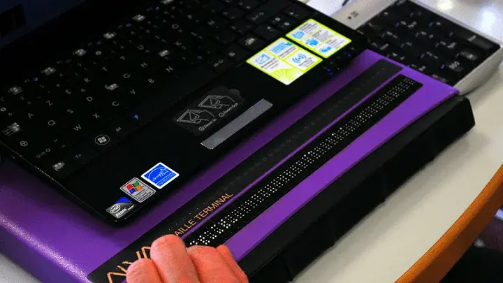
I am a screen reader user, which means when navigating a website my computer talks to me. It's frustrating, and occasionally disorienting when all of a sudden there's extra audio happening. I first have to figure out how to pause it, if I can pause. And the busier the video: loud music, multiple people talking, the harder it sometimes is to hear and navigate with my screen reader.
Slider for Pricing
If there is a slider, there should also be an option to manually input the information. For people with certain mobility disabilities, they can be hard to navigate. Even just for someone with big fingers on a tiny smartphone screen. And, as a blind user, it can also just be faster. I'm in control of inputting my information instead of having to figure out why, when I tried to select one thing, the slider continues to display another. It seems convenient, but I often find it to be more hassle.
Accessible Design is for everyone
If accessibility is kept in mind from the beginning, a website does not have to sacrifice an aesthetically pleasing design for an accessible layout. And with employees trained in digital accessibility, they can ensure that both the content and accessibility guidelines are updated and properly maintained. Large company or small, you never know if a potential customer is disabled. And a poorly designed site could not only leave them out but turn away potential customers. Whenever I've found an inaccessible website, I always tell my friends, hoping to spare them from any frustration I went through. I also often find that my sighted peers are just as frustrated. When a site is accessible to the disabled, it's accessible for everyone. No one likes having videos blaring at them unexpectedly. Or have to redo an entire form because there is no "back" button.
From the impulse shopper to the meticulous budgeter, everyone needs clothes, there's nothing magical about that. Just a mutually human experience. Many of us want to give you our money, and with an accessible website, you're indulging that desire. How can I be this creature of myth and legend if I'm not dressed for the part?
Interested in learning more about Accessible Design? Register to watch our new On-Demand Webinar on Accessible Design in E-Commerce. Recorded live on March 24, 2022.

