Originally written on Nov 21, 2017. Content was updated in October 2023.
Even today, mobile app accessibility continues to be a challenge. Users with disabilities often face barriers when trying to shop, research or complete tasks on mobile apps. Those with auditory impairments often require captions or transcripts of video. Those with visual impairments need web pages to be appropriately labeled and explained in order to properly navigate as they listen to the web page content using assistive technology. More often than not, these key accessibility options are not available or not properly implemented. Users with disabilities are frequently forced to abandon a site, app or task, or are charged with call center fees if an online property is inaccessible. In fact, in the UK alone, 86% of disabled users who use screen readers find the average website or app difficult to use with their software.
Previously, we've reviewed designing for small screen size and focusing on color contrast, Today, we walk-through four other fundamental techniques for mastering inclusive design for mobile apps: touch targets, mobile touchscreen gestures, layout consistency and data entry.
-
Mobile App Accessibility - Get Touch Target Size and Placement Right
The high resolution of mobile devices means that many interactive elements can be shown together on a small screen. But these elements must be big enough and have enough distance from each other so that users can safely target them by touch.
Best practices for touch target size include the following:
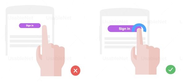
- Ensuring that touch targets are at least 9 mm high by 9 mm wide.
- Ensuring that touch targets close to the minimum size are surrounded by a small amount of inactive space.
Note: This size is not dependent on the screen size, device or resolution. Screen magnification should not need to be used to obtain this size, because magnifying the screen often introduces the need to pan horizontally as well as vertically, which can decrease usability.
Since human fingers are a very imprecise pointing tool, tap targets within an app should be big enough to help people interact with precision and confidence, even when they have to perform tasks in a hurry.
See below for a visual example of what to do and what not to do when designing with a focus on touch target size:
Mobile app accessibility tips for touch target placement include the following:
-
Place buttons where they are easy to access. Mobile sites and applications should position interactive elements where they can be easily reached when the device is held in different positions.
-
When designing mobile web content and applications many developers attempt to optimize use with one hand. This can benefit people with disabilities who may only have one hand available. However, developers should also consider that an easy-to-use button placement for some users might cause difficulties for others (e.g. left- vs. right-handed use, assumptions about thumb range of motion). Therefore, flexible use should always be the goal.
See below for a visual example of what to do and what not to do when designing with a focus on touch target placement:
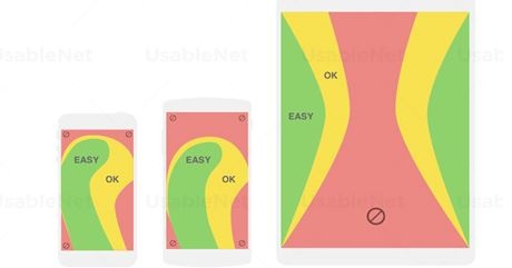
Different screen sizes require different handholds. Between phones and tablets the regions of the screen we can comfortably reach with our thumbs change enormously. The green thumb zone identifies the areas where our thumbs can perform accurate tapping. The red zones instead are those most difficult to reach, so touch targets placed within these areas should be much larger than usual.
-
Mobile App Accessibility - MINIMIZE CUSTOM GESTURES AND Properly SUPPORT them
Many mobile devices are designed to be primarily operated via gestures made on a touchscreen. These gestures can be simple (such as a tap with one finger), or very complex (involving multiple fingers, multiple taps and drawn shapes).
Some (but not all) mobile operating systems provide work-around features that let the user simulate complex gestures with simpler ones using an onscreen menu.
Some best practices when deciding on touchscreen gestures include the following:
- Gestures in apps should be as easy as possible to carry out. This is especially important for screen reader interaction modes that replace direct touch manipulation by a two-step process of focusing and activating elements. It is also a challenge for users with motor or dexterity impairments or people who rely on head pointers or a stylus where multi-touch gestures may be difficult or impossible to perform. Usually, design alternatives exist to allow changes to settings via simple tap or swipe gestures.
- Activating elements via the mouse-up or touch-end event. Using the mouse-up or touch-end event to trigger actions helps prevent unintentional actions during touch and mouse interaction. Mouse users clicking on actionable elements (links, buttons, submit inputs) should have the opportunity to move the cursor outside the element to prevent the event from being triggered. This allows users to change their minds without being forced to commit to an action. In the same way, elements accessed via touch interaction should generally trigger an event (e.g. navigation, submits) only when the touch-end event is fired (i.e. when all of the following are true: the user has lifted the finger off the screen, the last position of the finger is inside the actionable element, and the last position of the finger equals the position at touch-start).
See below for a visual example of options for how to design with mobile gestures in mind:
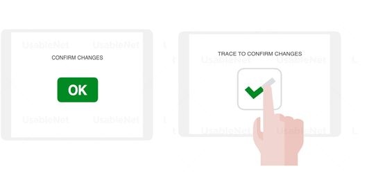
Customized gestures are sometimes used as an effective replacement for annoying confirmation dialogs. However, users with disabilities may still benefit from the latter, so app designers should implement them as an alternative feature.
UI elements supporting touchscreen gestures such as banner carousels or article sliders, should sport visual indicators for browsing feedback and changing content.
3. Mobile App Accessibility - Focus on layout consistency
Components that are repeated across multiple pages should be presented in a consistent layout. In responsive web design (where components are arranged based on device size and screen orientation), web pages within a particular view (set size and orientation) should be consistent in placement of repeated components and navigational components. Consistency between the different screen sizes and screen orientations is not a requirement under WCAG 2.0.
For example:
- A website has a logo, a title, a search form and a navigation bar
at the top of each page; these appear in the same relative order on each page where they are repeated. On one page, the search form is missing but the other items are still in the same order. When the website is viewed on a small screen in portrait mode, the navigation bar is collapsed into a single icon but entries in the drop-down list that appears when activating the icon are still in the same relative order. - A website, when viewed on the different screen sizes and in different orientations, has some components that are hidden or appear in a different order. The components that show, however, remain consistent for any screen size and orientation.
The WCAG 2.0 success criteria that are most related to the issue of consistency are:
- 2.3 Consistent Navigation (Level AA)
- 2.4 Consistent Identification (Level AA)
See below for a visual example of best practice when designing with a focus on touch:
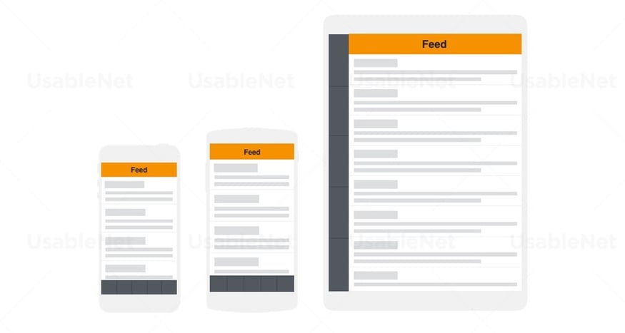
Consistency is key to creating seamless and cross-channel user experiences. It helps the user feeling comfortable and in control while starting a task, which may start on mobile and get completed on tablet or desktop.
4. Mobile App Accessibility - Provide easy methods for data entry
Users can enter information on mobile devices in multiple ways such as on-screen keyboard, Bluetooth keyboard, touch, and speech. Text entry can be time-consuming and difficult in certain circumstances. Reduce the amount of text entry required, by providing select menus, radio buttons, check boxes or by automatically entering known information (e.g. date, time, location).
See below for a visual example of best practice when designing to provide intuitive and easy methods for data entry:
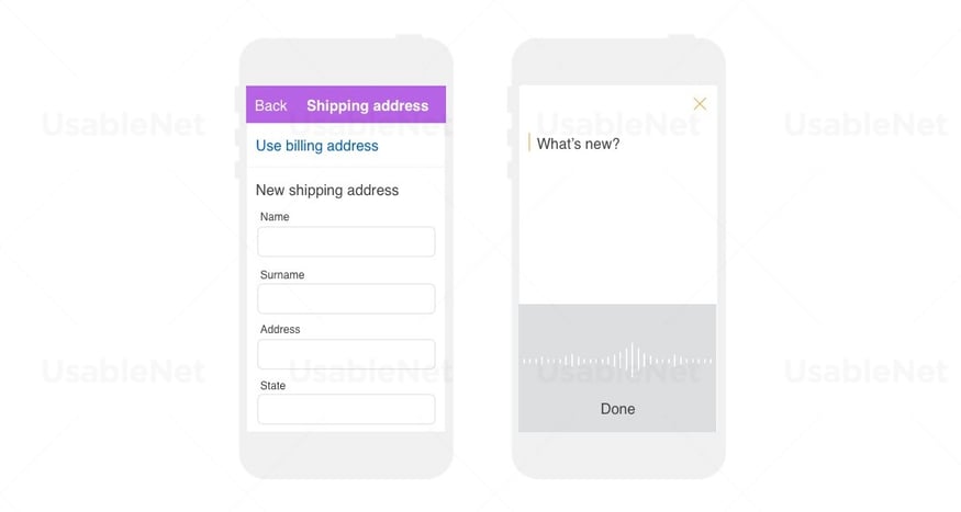
Typing is proven to be a slow method of data entry. Providing alternatives such as autofill, data sharing between apps or dictation improves the overall app experience and prevents errors.
In Conclusion: Executing Inclusive App Design
Though websites largely remain the focus for brands on the path to accessibility, mobile apps are also a crucial channel to consider. They drive more engagement, boost customer loyalty and give brands much more options for personalization of their experiences.
In this post we have now shared tips on the major techniques to use to successfully make a native app accessible. When looking to execute your digital accessibility strategy, be sure to keep both website and app channels in mind, and implement the best practices shared here regarding screen size, color contrast, touch targets, mobile gestures, layout consistency and data entry. A commitment to design ensures a truly accessible site or app that offers users of all abilities the same level of interaction, the same ease of use, and the same access to content. You may find a mobile app accessibility checklist a useful resource.
At UsableNet, we help clients review and develop accessible Native apps to ensure they are usable by people of all abilities. We do this by applying both the broad principles of the WCAG 2.0, along with the W3C's draft Mobile Accessibility Guidelines. This represents around 25 specific technical and design criteria. Native apps are different to websites in many ways, including accessibility. However, the core principles of inclusive design run throughout and the key aspects of accessible native apps are found in the importance of UX and design of the interface.
Unclear of where to begin in your digital accessibility journey? Use our Digital Accessibility Initiative Checklist for a comprehensive and actionable plan regardless of where you're at in your journey.

