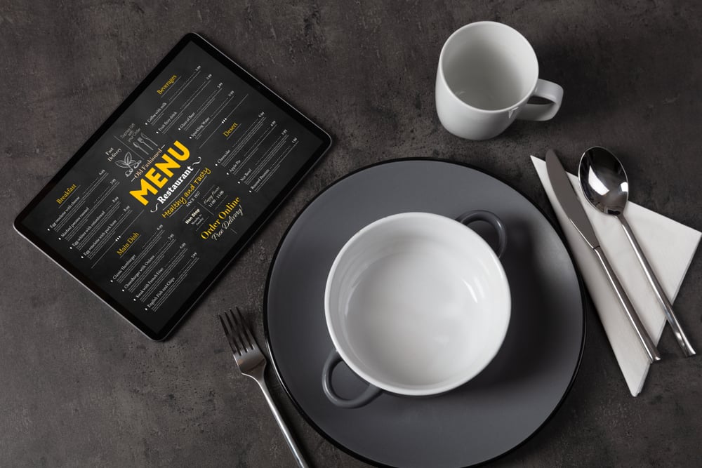
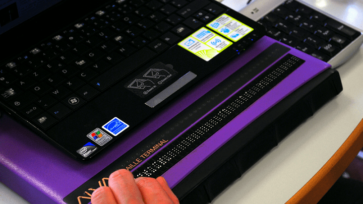
Recently, I had the opportunity to dine at a popular national chain restaurant with friends. I wanted to be prepared with my order ahead of time, so I used my smartphone to review the online menu.
Unfortunately, I encountered several accessibility and usability issues that made the process challenging. In this blog, I'll narrate my experience navigating the online menu on my phone. I'll share both the good and the bad aspects and give practical advice on making your website and online menu more accessible to all customers.
As a blind screen reader user, I aim to show how mobile accessibility best practices directly impact my experience. I hope this blog is helpful to everyone, but especially to restaurant owners, web developers, designers, and accessibility advocates. More than 60% of restaurant customers prefer browsing menus or placing orders on their smartphones, so mobile accessibility is critical.
----If you're wondering how accessible your website or menu is, try UsableNet's Website Accessibility Checker.----
Accessibility Issues When Navigating a Restaurant Website Menu
First, I visited the restaurant's website, where I wanted to read the menu. When the homepage launched, I searched for the link or button to bring me to the menu. I set my screen reader to filter by link only using the navigation rotor and began to swipe through the links on the page. I easily found the "View Our Menu" option.
Once the menu screen loaded, the menu content was readable to my screen reader- a fantastic accessibility win!
Expand/Collapse Menu Issues for Screen Reader Users
As I explored the menu options using manual swipe navigation, I learned that the layout followed an expand/collapse tree structure. In other words, the website started with the menus collapsed by default. It expanded to show the enclosed options upon user activation.
In theory, this is a good accessibility design because users can quickly and efficiently move to the option they want without navigating the other menu listings before the desired menu category. It also should be predictable to most users- another accessibility win.
However, I had trouble with this site's expand/collapse interface, which I'll explain. First, I could hear each menu category and its "Expanded" or "Collapsed" state. I used manual swipes to find the "Starters" section of the menu and performed a single-finger double tap to expand the section.
After further navigating the page, I discovered that the menu section never opened. When I navigated back to the "Starters" marker, my screen reader still announced the section as "Collapsed." I tried expanding the section again but had the same negative results. For whatever reason, the menu did not respond to my screen reader.
I began exploring using direct touch navigation. I again found the "Starters" section and activated it. My screen reader announced that the menu had expanded. I used manual swipes to navigate. My screen reader only announced the seven collapsed menu sections, to my dismay. This should not have been the experience because I had just manually expanded the "Starters" portion of the menu.
I found and expanded the section again using direct touch. I placed my finger in the center of the screen. My screen reader announced, "Boneless Or Traditional Wings, 6, 8, or 12 Count."
So, the "Starters" menu section had expanded after all. Fortunately, the touch targets were large enough for me to activate easily—another accessibility win!
Still, I could only make this happen via direct touch navigation, not through screen reader commands —a significant challenge for me as a blind person who relies on my screen reader as my preferred technology for the web.
----For a more in-depth look at inclusive mobile design, watch our on-demand webinar, Inclusive ADA Principles for Mobile App Accessibility, to learn how to prioritize and optimize UX for mobile apps.----
Price Display Problems for Screen Reader Users
After wrestling with the menu navigation, I decided to get a sense of the restaurant's price ranges. However, another issue arose: my screen reader announced every menu item's price as "$0.00."
At first, I thought that something was wrong with the website itself. However, a sighted person checked and confirmed that the actual price of the food was accurately displayed with each menu listing. So, the restaurant website had prices coded and structured so that my screen reader could not process and speak the numbers.
As a blind customer, being unable to determine my meal's cost was frustrating and disappointing.
----Want to avoid accessibility mistakes like this? Check out our Mobile App Accessibility: The 6-Step Checklist for best practices in creating an inclusive digital experience.----
Applying WCAG Principles to Restaurant Menus
So, how can restaurants create accessible experiences for blind diners? This website and menu have some accessibility wins but could be improved. To understand how to look at the Web Content Accessibility Guidelines (WCAG). WCAG provides four essential principles: perceivable, operable, understandable, and robust. Applying these principles ensures that users with disabilities can effectively access all content.
- Perceivable: All content—text, images, and icons—should be perceivable by users with various disabilities. For example, menus should have sufficient color contrast between text and background to help users see and read them in all lighting conditions.
- Operable: Touch targets, like buttons and links, must be large enough for users with visual or motor impairments to interact with. Alternative ways to navigate, like swipe gestures, must also be provided for customers using screen readers.
- Understandable: The content's layout should be simple, with consistent design elements across the menu. Screen readers can only interpret what you properly code, so interactive elements must be clearly labeled.
- Robust: Menus should be compatible with various assistive technologies, including screen readers and zoom features. The main issue with my experience was that while the menu was compatible with touch navigation, it needed to be compatible with screen reader interaction. By testing the menu on different devices with different types of assistive technology, you can ensure your menu and website are accessible.
----For a comprehensive guide to accessibility testing, check out Accessibility Testing: The Ultimate Guide from UsableNet.----
By applying WCAG principles and following mobile accessibility best practices, you can make your restaurant's mobile menus more user-friendly and inclusive for all customers, regardless of their abilities.
Restaurant website accessibility is essential everywhere. However, it is even more significant on mobile platforms because many people turn to their smartphones and tablets for simple tasks like browsing restaurant menus and ordering online. Over 58% of global website traffic comes from mobile devices, and 83% of adults use smartphones to look up restaurant menus, make reservations, and order food.
As mobile usage in the food industry continues to grow, all restaurant websites must comply with accessibility standards to create a welcoming experience for everyone.
Is your restaurant's website as accessible as it should be? Make sure every customer can easily navigate and enjoy your online menu, regardless of their abilities. Test your website with UsableNet's AQA today and identify areas for improvement. Ensure your menu is not only easy to use but inclusive for all. Start your free test now!
Editor's Note: Our frequent contributor, Michael Taylor, wrote this post. This post reflects his opinions and experiences. Read more about Michael and some other posts on his experience online here.


