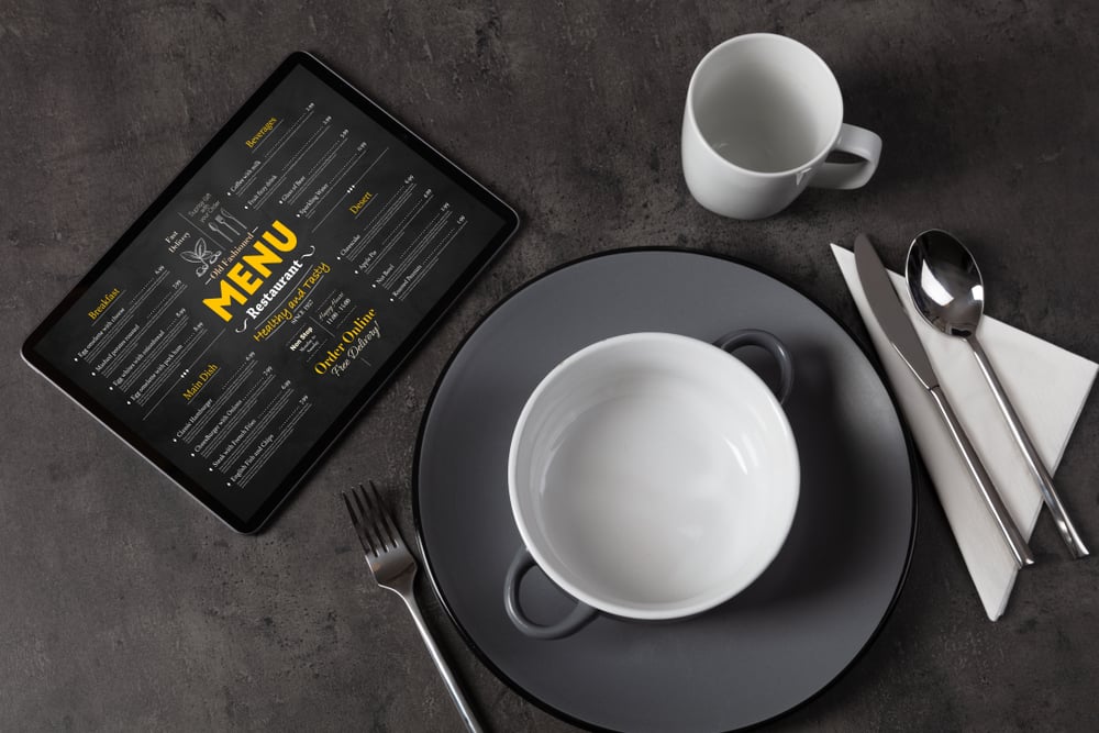
Many restaurants, both local spots and national chains, allow customers to reserve a table online. I recently tried to make a reservation at a popular restaurant in my area but, unfortunately, had a poor experience in terms of accessibility and usability. I will narrate the reservation process in this blog, highlighting positive and negative design characteristics.
The goal is to illustrate how the accessibility points I have discussed affect real-world browsing experiences. Like always, my focus will be screen reader accessibility.
Navigation Menu Problems
Upon launch of the restaurant site in question, I quickly discovered a slide-over navigation menu containing quick links to the site's different sections. I activated the menu with a correctly labeled button in the top navigation bar. At first, I appreciated this design choice because it eliminated the need to manually move around the page in search of the reservations section. However, I quickly became aware of a significant problem.
While my screen reader easily found and spoke each option in the menu, activating any of the links did nothing. I tried several times to select the option labeled "Reserve Your Table" but was unsuccessful. I had to close the menu and navigate the page by heading until I found the reservation booking section. Luckily, moving around the homepage gave me no trouble at all.

Accessible Date and Time Selectors
After activating the "Reserve Your Table" button, the website brought me to a page that prompted me to select my desired date and time for the reservation. I was pleasantly surprised that the site used a drop-down menu interface for this task instead of the infamously inaccessible calendar grids commonly found on other websites.
The first drop-down asked me to choose a day for the reservation.
Though the drop-down list was long because it contained dates for the next month, I could easily find and select my day of interest.
Pressing the tab key moved me to the following drop-down menu, which contained time slots in 15-minute intervals.
After selecting, another tab key press brought my screen reader's focus to the "Continue" button.
Once the next page loaded, the overall accessibility of the experience took a significant turn for the worse.
Major Accessibility Blockers
I first encountered three unlabeled text fields on the next page, a significant accessibility defect that will stop screen reader users and cause them to abandon their browsing session. However, I decided to proceed anyway. Experience told me that there was a good chance that the three text fields were for name, email, and phone number. I entered the data and continued down the page. The following heading was labeled "Choose Your Party Size."
There appeared to be nothing below the heading.
The next thing my screen reader's cursor encountered was the "Confirm Reservation" button. I was baffled.
Thinking I missed something, I started from the top of the page and moved to the "Choose Your Party Size" heading.
Again, my screen reader jumped directly to the "Confirm Reservation" option. At this point, I can't move forward.
Even if I had guessed correctly for the three unlabeled text fields, booking a restaurant reservation is possible by inputting the number of people dining.
I turned to a sighted person to help me figure out what was happening. The person informed me that below the "Choose Your Party Size" heading was a series of small images showing different-sized restaurant tables with varying chairs. Selecting one of these images would indicate to the restaurant the number of people in the reservation party.
My screen reader completely missed all of this. Even the sighted person admitted that this design feature needed to be more intuitive.

The Bottom Line: Accessibility Fell Short
The bottom line here is that in its current state, the reservation booking feature of this restaurant's website needed to be more usable for visually impaired individuals like myself.
My experience described above will help show a point that I have stressed in the past. Even if a site has generally good accessibility, it only takes one major defect to break functionality for assistive technology dependents and make it virtually unusable.