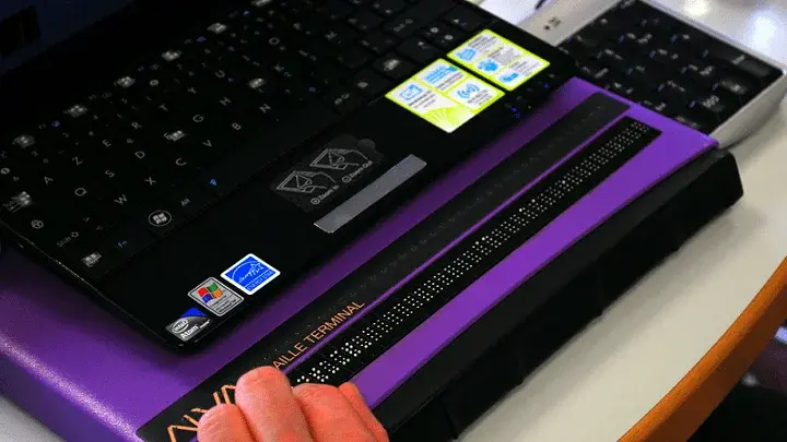
From watches to TVs to your car dashboard, mobile technology now goes well beyond phones and tablets. Your audience expects a product or service that connects fluidly across platforms.
A key component of that potential customer base is the community of users with disabilities. An accessible app that conforms to WCAG 2.0 standards is essential in order to provide excellent customer service, cast a wide and inclusive net, and avoid potential legal pitfalls.
Be Inclusive
Before writing a single line of code, it’s crucial to first understand who will use your accessible app. The following is just a sample of potential users:
- Those who aren’t able to hear, see, move, or process certain kinds of visual or audio inputs
- Those who can’t follow multiple screens, color palettes, or themes
- Those who struggle to read and understand text
- Those who have a small screen, a slow internet connection, or a screen that reads only text
In addition to users with chronic disabilities, the aging baby boomer population will need apps that conform to WCAG 2.0 standards by providing assistive technology to access content and services. Indeed, one in five U.S. residents will be of retirement age by 2030—it makes business sense to meet this group’s changing needs.
Meet (and Exceed) Accessibility Standards
UsableNet’s UX team provides a three-part, comprehensive outline of the key design aspects that are needed to follow WCAG mobile guidelines.
Below is a quick checklist:
- Supply text alternatives for any content that doesn’t contain text. Users with a text-only interface or visual impairment may not be able to see your photos, videos, and GIFs. A text alternative allows those who require text-to-speech technology to fully access your app.
- Allow an uninterrupted flow of content whether the user views the page in portrait or landscape orientation.
- Provide captions for time-based media. Audio and video content should have assistive text synced for playback.
- Make your navigation visually accessible. Use a variety of characteristics, such as color or font treatments, to allow users to distinguish links and buttons from other text. Separate the background from the foreground and incorporate colors that color-blind users can see.
- Extend (or get rid of) time limits on forms and other user-generated pages. Some users may need more time to read instructions and fill out fields without losing their place in the queue.
- Give them the chance to fix mistakes. Some error messages may not be readily apparent to users with disabilities. Color perception, field of view, and assistive technology may all play a role in this.
- Above all, look down the road at where assistive technology is going and start to prepare for how your site can accommodate it.
Reduce Legal Risk
With ADA web accessibility lawsuits at a record high in 2018—2,285 cases, representing a 181 percent increase over the 2017 high of 814 cases—an accessible app is not only important to serve more customers, but a self-preservation tool as well.
This risk affects companies large and small. Tax giant H&R Block paid $100,000 in damages and penalties to settle a class-action suit by the National Federation of the Blind.
The best defense against an accessibility lawsuit? Make your app accessible. But where to start?
Take the First Step
UsableNet can be a valuable partner in creating an accessible mobile app that meets WCAG 2.0 standards. Some basic areas of focus for you to consider: :
- Design for all screen sizes, including small ones.
- Remove complex gesture patterns and keep operations simple.
- Make sure you have good color contrast.
- Place your touch targets where anyone can access them, and make sure they’re big enough.
- Make your layout responsive and consistent.
- Cut down on the need for text entry and focus instead on check boxes, radio buttons, and pre-populated information that the app already knows.
Want to read more on mobile accessibility? Check out our e-book, Your Roadmap to Digital Inclusion. Or contact us and one of UsableNet’s accessibility experts can help.


.webp)

