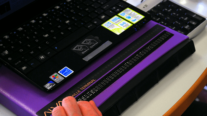
During a recent UsableNet webinar, attendees had the unique opportunity to witness a blind screen reader user navigating a website in real time.
This interactive session sparked insightful questions about screen reader experiences and best practices for digital accessibility. In this blog, I'll share my responses to some of the most common queries from the perspective of a full-time screen reader user. These answers reflect my experiences and aim to help developers, designers, and accessibility advocates improve their digital platforms.
1: If a website wants to include an email address listing for accessibility bug reporting, where is the best place to add this option?
This is an excellent way to facilitate user feedback and recommendations. I have found such an email option on most websites in an "Accessibility" section in the website footer. Many sites design this menu to be expandable and collapsible so that it can be easily found by screen reader users but does not occupy too much screen real estate on crowded sites. You might also include an accessibility department telephone number and links to accessible versions of downloadable items on the site.
2: Is tabbing the primary method of website navigation for screen reader users?
It depends on the site in question. I often rely solely on tab key navigation on unfamiliar sites for which I do not understand the page's layout and structure. It allows me to move one web element at a time, ensuring I do not miss anything important.
However, other screen reader web navigation methods differ based on the specific screen reader and operating system. Almost all screen readers support filtered navigation, a technique that allows users to specify a web element category, such as buttons, links, or text fields, and then move through the site, hearing only the selected type of web element.
For example, if I know that I am looking for the search entry text field on an e-commerce site, I can set my screen reader to filter by text field only to move through the site swiftly and efficiently compared to tab key navigation. I frequently use this method on sites I visit and know what I need to navigate to the on-page launch.
3: How does using a screen reader differ from desktop systems to mobile devices when navigating a website?
The main difference here is the method of screen reader control. Desktop systems require keyboard input, while mobile screen readers are touch-controlled. While accessibility problems on desktop sites can potentially exist on mobile devices, mobile accessibility issues are usually very different in how they affect the browsing session.
For desktop screen readers, users can either navigate a page one item at a time with the tab or arrow keys or move through by filtered categories.
On mobile devices with touch-based screen readers, manual one-finger swipes left and right or filtered category swipes are the navigational equivalents to the above-mentioned desktop methods; however, mobile screen readers allow for one additional mode of screen reader control, direct touch. Since mobile device users can touch any part of the screen at any time, mobile websites and screen readers must be programmed correctly to handle this incredible precision and fine control.
My mobile accessibility blogs can help showcase these differences in much better detail. I've selected a few blogs below.
Grocery or Retail - Mobile Grocery Shopping Accessibility: Challenges for Blind Shoppers
Healthcare- Navigating Accessibility Challenges on Mobile Healthcare Websites
Banking - Enhancing Mobile Banking Accessibility for Screen Readers
Airlines- Accessibility Challenges in Airline Ticket Booking on Mobile
Hotels- Navigating Hotel Apps as a Blind Traveler: Accessibility Challenges
As you can imagine, the accessibility of mobile sites and apps for these industries can significantly impact my independence. So, I'm glad this blog lets me resurface some of those, in case folks missed it.
4: What is the most common accessibility issue encountered on websites that developers and designers should pay particular attention to?
Screen reader-related accessibility issues vary significantly between different types of websites, so I cannot necessarily speak to the most common accessibility problem overall. However, I want to share an excerpt from my ebook, where I discuss issues that can significantly impact my experience.
Navigation Menus
Navigation menus are vital because they allow users to browse a site by product type and category without performing a direct search. Unfortunately, these menus often lack accessibility. I have used too many navigation menus that either have unreadable entries or are impossible to close once opened.
Lack of Skip Links
Skip links allow screen reader users to bypass the persistent content at the top of a page, such as company logo banners, search fields, and button icon bars. Navigation is often slow and clunky when not present because I must move past all the fluff before proceeding to the page's main functionality.
Keyboard Traps
Keyboard traps occur when the screen reader's focus cursor becomes stuck on a particular web element. Drop-down menus, dialogue boxes, pop-ups (such as email sign-up forms), quantity pickers, and even links are typical culprits. They're especially prevalent on sites with many interactive elements. When trapped, users can't move past that spot on the page using accessible methods. Usual commands like the tab key won't exit the trap.
Any web element requiring users to exit the main page surface can become a trap. Pop-ups, overlay menus, text fields, and value adjustment sliders need manual testing. Your site must provide a screen reader-accessible way to dismiss these elements. Navigation commands like tab or arrow keys should work consistently inside these elements. Testing for and eliminating keyboard traps significantly improves navigational accessibility.
For a deeper understanding of how to make e-commerce sites more accessible according to members of the disability community like me, check out my free e-book: Digital Commerce Without Barriers: Perspectives from the Disability Community - Download now.
5: Do you have a favorite and least favorite strategy or feature a website has used to try and improve accessibility?
What excites me most when using an accessible website is when all web elements and content denominations, such as buttons, links, headings, tables, lists, and text fields, are correctly marked in the code for screen reader recognition and categorization. When implemented correctly, filtered navigation works best, allowing for a speedy and efficient browsing session.
By far, my least favorite strategy for web accessibility facilitation is the use of off-the-shelf accessibility widgets. As discussed in previous blogs, accessibility widgets do nothing to promote accessibility and can even hurt a website's usability.
6: Can you comment on video player interface accessibility?
Video player interface accessibility is a very interesting topic. The user must be able to quickly control the video without any unnecessary extraneous screen reader speech. The most frustrating thing is when the screen reader speaks for five or six seconds longer than it needs to, talking over the video content and causing me to rewind the tape to hear what I missed.
On many video players, a simple press of the play or pause button causes the screen reader to announce the time elapsed and time remaining in the video, leading to ten seconds of speech interrupting the flow of the auditory content. Run time information should be available on request when navigating the video player but should not necessarily be announced every time a screen reader command occurs.
The best video players I have used allow users to control most actions through the keyboard. Examples include using the space bar for play and pause or the arrow keys for rewind and fast forward.
7: What is your experience with the floating chat widget or help menu activation icons standard on most modern websites?
These buttons are often problematic. One common issue is that the screen reader focus will randomly jump to the floating button for no apparent reason, interrupting the flow of the browsing session and causing me to have to refocus the screen reader. In other cases, the screen reader can't speak the content that visually lies behind the floating button.
Additionally, if I activate the icon to enter the help or chat menu, I often cannot dismiss the floating window and get stuck in a navigation loop.
8: How do you feel about the use of tables on websites?
Tables are fine as long as they are accessible. Accessible tables include properly labeled columns, rows, and heading markers.
The screen reader should announce the position of each item in the table in relation to its column and row number. An example is "Basic Membership, Row 2, Column 1."
If tables are inaccessible, screen readers will speak the content horizontally as it appears, which often doesn't make sense without context. Additionally, the visual organization aspect of a table will be lost on screen reader dependents unless it is clear where an item in a table appears in relation to the rest of the table's data.
9: Many digital experiences require the user to complete both an online and in-person portion. An example is making an appointment for a doctor's visit.
In these cases, do you prefer to use your own device or the technology provided at the physical location for the in-person aspect of the task?
In these situations, my device will always be a better choice. My devices have complex accessibility systems tailored to my specific needs and preferences. The technology at most of these physical locations is often inaccessible or not advanced enough to help me.
Even if the technology is accessible, I can almost guarantee that it does not work as I am used to, meaning I must try to learn a new set of interactions on the fly. Using the technology at the physical location will always make a task that should take five minutes or so require at least four times the time to complete.
10: When a screen reader announces that an image has no description, does this mean that the image is decorative or that no alternative text description was provided?
The answer can depend on the image in question. I have found that most of the unlabeled images I encounter should have descriptions. I can sometimes use context to figure this out. If the image appears at the very top of a page, there is a good chance that it is decorative and provides no necessary meaning. However, if an image appears in the middle of a product description on a shopping site, it likely needs a text descriptor but was not given one due to poor accessibility. Either way, there are code-based methods to indicate that an image is decorative and that the screen reader should skip it.
Enhancing Web Accessibility: Key Takeaways from a Screen Reader User
Screen reader users face various challenges when navigating websites, but it doesn't have to be this way. For a deeper dive into these topics and actionable strategies to improve your website's accessibility, it's essential to stay informed about evolving regulations.
Want to Ensure Your Website Complies with the European Accessibility Act?
Join our upcoming webinar, "The European Accessibility Act (EAA): Requirements for Compliance," to learn how the EAA will impact businesses and how to meet its web accessibility standards. Gain insights on legal requirements and practical strategies to create inclusive digital experiences for all users. Register now to secure your spot!
Editor's Note: Our frequent contributor, Michael Taylor, wrote this post. This post reflects his opinions and experiences. Read more about Michael and some other posts on his experience online here.


