One industry that is becoming increasingly digitalized is grocery shopping. According to a 2024 report by eMarketer, the U.S. online grocery market is projected to reach $187.7 billion, reflecting the growing trend of consumers shifting to online platforms for their grocery needs. Many online grocery retailers allow customers to shop from the comfort of their homes and have their groceries conveniently delivered to their door or neatly packaged for one-stop pick-up at a store.
Due to their portability and ease of use, many people turn to their smartphones or tablets for online grocery shopping. A study by Statista in 2023 showed that over 75% of online grocery shoppers in the U.S. use their smartphones or tablets to make purchases. This shift towards mobile is driven by the convenience and accessibility of shopping on the go, with delivery and pickup options playing a key role—nearly 70% of online grocery sales come from these services, according to data from a 2023 survey.
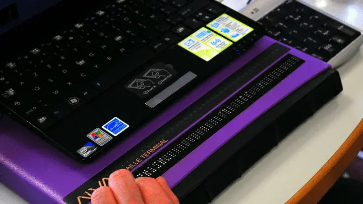
As a result, it's crucial for online grocery platforms to ensure their mobile experiences are accessible to all users, including those with disabilities. In the remainder of this post, I’ll discuss the most common accessibility challenges that blind shoppers face when using a touch-based mobile screen reader to order from an online grocery service.
This blog is useful for developers, UX designers, accessibility consultants, and anyone creating digital experiences for online grocery platforms. By understanding the barriers that blind users encounter, you can help make your grocery site more inclusive, ensuring everyone can shop easily and independently.
Choosing Substitutes
Online grocery stores allow customers to pick substitute items in advance if the primary item is out of stock. However, for blind shoppers like myself using a screen reader, this seemingly simple task can turn into a frustrating ordeal. The biggest issue is that screen readers often do not provide all the necessary information about substitute items during manual swipe navigation—frequently, only the price is announced.
When I navigate through the substitute products page, I typically face several challenges:
-
Limited Information: The screen reader frequently fails to speak all relevant details of a substitute product, such as the item’s name, package size in ounces, and brand, making it difficult to make informed choices.
-
Confusing Navigation: Swiping through the substitutes, I encounter a random assortment of “Select As Substitute” buttons, prices, and quantity pickers that lack context, making it hard to identify which button corresponds to which product.
-
Inconsistent Touch Feedback: Direct touch sometimes reveals additional details like the item and brand names. However, navigating this way is cumbersome and impractical, akin to piecing together a puzzle with missing pieces.
These accessibility flaws highlight the need for better design in substitute selection interfaces, ensuring that all product information is accessible through screen readers so that users can make informed choices quickly and efficiently. For a deeper dive into these challenges, you can explore Common Challenges When Grocery Shopping Online as a Blind User.
Delivery Address Entry
Many online grocery orders are placed for delivery, making entering a delivery address crucial. Most modern grocery websites have adopted interactive address forms that populate suggestions as the user types. Unfortunately, I experienced significant accessibility challenges with these forms on several grocery sites I tested.
Here are the specific issues I encountered:
-
Inconsistent Address Suggestions: As I typed with the virtual keyboard, the screen reader announced the first address suggestion in the list. However, when I moved focus to that first suggestion and used one-finger manual swipes to navigate down the list for my specific address, the entire list would suddenly disappear.
-
Focus Resetting to Text Field: Each time the list vanished, the screen reader focus returned to the address entry text field, which was now empty. This forced me to repeatedly retype my address's beginning, only to have the same problem occur again.
-
Inability to Complete Address Entry: After several attempts, I could not hear beyond the second or third suggestion in the list before the options cleared and the text field reset. This accessibility flaw made entering my address and completing my order on the affected mobile grocery websites impossible.
These issues turn a simple task into an inaccessible and frustrating process, highlighting the need for more robust and reliable design in address entry fields to support users relying on screen readers.
Item Filters
Since food shopping depends on personal preferences, product filters are essential for narrowing down search results based on specific criteria. Most online grocery retailers offer filter functionality, but I encountered a significant accessibility shortcoming on several grocery websites that made the filtering process frustrating and inefficient.
My experiences with filter accessibility included the following challenges:
-
Inability to Scroll Using Screen Reader Commands: On many grocery websites, I found it impossible to scroll down the filter menus using my screen reader’s scroll commands. When I attempted the relevant gesture, the screen reader’s error notification sound would play, indicating a failure to execute the action.
-
Navigating One Item at a Time: The only way to move down the screen was to swipe through each filter option individually. This is extremely cumbersome, especially when filter menus span ten to fifteen pages on small displays. This approach makes navigation slow and inefficient.
-
Applying Filters Requires Excessive Scrolling: The “Apply Filters” button is typically located at the very bottom of the menu, requiring users to swipe past all options, even if the desired filter is near the top. This results in a time-consuming and confusing shopping experience, as users must navigate through a long list of irrelevant options before applying their desired filters.
These accessibility flaws in item filters can make the grocery shopping process overly complicated and frustrating for screen reader users, underscoring the need for better accessibility practices in mobile grocery websites.
Read more about creating a positive online grocery journey, check out Mobile Accessibility: A Positive Online Grocery Journey.
Real-World Solutions: The Peapod Case Study
The challenges mentioned above aren't just hypothetical—they're experienced daily by users who rely on screen readers for online grocery shopping. Peapod, an established online grocery retailer, recognized the importance of accessibility and partnered with UsableNet to address these issues. The Peapod case study highlights their journey in making their website more accessible and user-friendly for all customers, including those with disabilities.
Through their work with UsableNet, Peapod identified specific accessibility barriers and implemented changes to improve the digital experience for visual-impaired users. Their approach focused on enhancing navigation and usability, which aligns with the accessibility challenges discussed in this blog. By prioritizing accessibility, Peapod improved its customer experience and set a benchmark for other grocery retailers aiming to be more inclusive.
For a deeper look at how Peapod tackled these challenges and the steps they took to improve their site, you can explore the full Peapod Case Study.
Key Takeaways FOR Online GRocers (ANd Other E-COMMERCE Merchants)
-
Substitute Selection Challenges: Screen readers often miss key details about substitute items, making selection difficult. Peapod addressed similar issues by working with UsableNet to ensure that all relevant product information is available through screen readers, enhancing the overall shopping experience for visually impaired users.
-
Address Entry Barriers: Interactive address forms can unexpectedly clear entered information, complicating the entry process. By identifying and resolving such barriers, Peapod improved the reliability of its address entry fields, making it easier for screen reader users to enter and confirm their delivery details without interruptions.
-
Difficulties with Item Filters: Long filter menus and ineffective scrolling make the shopping experience cumbersome for screen reader users. Peapod’s commitment to accessibility included refining navigation and usability of filters, ensuring that users can efficiently apply filters and navigate their options without excessive scrolling.
-
The Importance of Accessibility: Accessible mobile grocery websites are essential for independence and convenience, benefiting all users, including those with disabilities. Peapod’s proactive approach serves as a benchmark for other grocery retailers, demonstrating that prioritizing accessibility meets compliance standards, enhances the user experience, and broadens market reach.
Grocery shopping is an absolute necessity. Full accessibility to mobile online grocery stores is required for me and others with disabilities to have the most significant personal independence and freedom. I hope these examples help raise awareness of the importance of mobile accessibility. Portable devices are the way of the future and must be fully accessible to everyone.


