Thank you to everyone who attended our webinar, Accessibility by Design 101, featuring a presentation by Senior UI/UX Designer, Luca Boskin, and Joseph DiNero, Assistive Technology Specialist at Helen Keller Services for the Blind, and Jason Taylor, Chief Innovation Strategist here at UsableNet.
This webinar covered the relationship between accessibility and usability, the 4 broad categories of disabilities, and considerations that each brings to design. We also discussed navigation and interactive design in the context of accessible design.
It was an ambitious agenda, and we got a lot of valuable questions. We weren't able to address them all so we've decided to share them here so that everyone can benefit.
Questions Asked on types of Disabilities and Design Considerations for each
The four categories of disability are visual, auditory, motor, and cognitive. Most of the questions we received were related to design considerations for visual and auditory impairments.
Visual impairments include nearsightedness, farsightedness, astigmatism, color blindness, vision loss. Auditory impairments cover conductive hearing loss and sensorineural hearing loss. Now that we've defined these categories, let's dive into the questions that were asked.
Q. Regarding color contrast, what colors would you recommend? I know high contrast colors like black and white are there any others?
A. Any text should have a minimum contrast ratio of 4.5:1 with the color of the background. However, for large text (above 18pt or bold above 14pt) designers can use a wider range of color options because the minimum contrast ratio requirement is 3:1 with the color of the background. (Success Criterion 1.4.3, Minimum contrast). Also, for user interface components and graphical objects, the minimum contrast ratio with the adjacent color should be 3:1. (Success Criterion 1.4.11, Non-text contrast).
Q. Do web accessibility widgets work well for people with visual disabilities?
A. Widgets make big promises, but they don't deliver. In 2000, there were 200 lawsuits against companies using widgets. The trend of plaintiffs filing lawsuits against companies that have installed accessibility widgets continues in 2021.
We break down 4 big reasons why accessibility overlay and widget solutions fall short on our blog, but one of the biggest complaints from the disability community is that widgets can make it more difficult for users of assistive technology to use your website.
Because widgets do not make websites and apps accessible, Widget/ AI technology for digital accessibility has been widely criticized by the disability community and activists.
To view how widgets make an experience more difficult, watch the following video of one of our presenters Joe attempting to navigate a website that uses an accessibility widget.
Q. Can you please expand on “declaring change on a page”? Are you referring to ARIAS?
A. When something changes on a page without being triggered by the user, you need to provide this feedback in some way. This kind of feedback needs to be visual, but also a blind user using a screen reader needs to be notified that something has changed within the page.
The WAI-ARIA specifications provide live regions, which can be used to provide commentary to screen reader users. This is done without asking them to leave their location on the page. For example, on a PLP page of an e-commerce site, a SORT button is pressed and we can visually show a loading spinner and populate a live region with the message “Please wait. Loading products.”
Q. Do Deaf and Hard of Hearing individuals prefer close captions?
A. We haven't surveyed this. However, we know from our data on ADA lawsuits, closed captions, transcripts, and audio descriptions are most commonly requested in lawsuits for video accessibility. There is a growing trend of more ADA lawsuits for video accessibility in 2021. To help our clients make sure video content is accessible, we created a simple guide on our blog.
Accessible Design: Questions on Navigation
Q. How does heading navigation work? Which keys on the keyboard need to be used for this kind of navigation?
Let's start with a brief explanation of how screen readers work when used for web browsing:
- Your website code provides information to the web browser
- The screen reader user navigates the website using their keyboard tab, arrow, return, up, and down keys. They can also use shortcuts like “list all headers” or “list all links” to quickly find what they’re looking for.
- Keyboard cues or shortcut keys will interact with accessible website code to facilitate navigation. The screen reader will announce what items are available (including items searched for during a product search, for example, or what menu items are available) so that the user can make their decision.
You can view how this works for Joe first-hand with his explanation of what he's doing with which key and why in this video where he has a positive navigation experience on Chewy.com.
Q. Are dropdown sub-menus in the top navigation typically a bad idea?
Not at all, as long as they are well implemented, especially for keyboard and screen reader users.
Q. You referenced hamburger menus, which can confuse non-technical users. What is your recommendation around labeling them with the word “menu” for instance? Are there other navigational elements that benefit from labeling that technical designers may not be considering?
A. The hamburger icon is one of those icons that users may not recognize immediately, so adding the label “menu” next to it, it makes it far more understandable.
On the other hand, there might be icons like the “magnifying lens” used to identify the search feature, or the “shopping bag” on e-commerce sites, which users may be more accustomed to and therefore recognize immediately even in the absence of the textual label.
From the accessibility perspective, every interactive element needs to be properly labeled. Whenever you want to use an icon to identify an action or site functionality, and you think that icon may not be immediately associated by users with the proper label, then you should make that label visible.
Q. Are hamburger menus still an issue? There were apprehensions initially, but gradually, it has been well accepted. What are the disadvantages of the hamburger menu, with respect to accessibility?
A. Typically, the most common issue is that they are not fully operable using keyboard navigation. They may lack the proper labels for expanding and closing the navigation, or, once the hidden navigation is exposed users may still focus on actionable elements placed underneath the navigation list.
Accessible design: Questions on Interaction Design
Q. In terms of hiding content from the accessibility tree, would you also consider hiding an image carousel from a Product Detail Page?
A. It depends on the component's functionality: if the image carousel is for display purposes only (no additional inner functionality) and is not providing any additional information to a blind user it could be removed from the accessibility tree. Instead, if the carousel allows the user the zoom or expands a product detail image then it should be operable for screen reader users too and images should be properly described.
Q. With the map example, in the list view, there is no address or indication of how far away each location is. In other words, the type of relative info someone sighted would get by looking at the map and seeing the locations of the pins. Is this a case of “close enough” to the same experience? What are your thoughts on determining what is “good enough” when it may not be a 1:1 experience?
A. Personally, I will show the exact same content for both map markers and list items, i.e. I will also display the shop address and user's relative distance (if the user's location is enabled) inside the list items. In general, the “good enough” rule applies only after all the crucial information is available to all users, any user can successfully complete the task on the page, and there's no other alternative way of replicating a specific page enhancement or feature, which can still, however, be considered as secondary or nonessential.
Practical Takeaways
Q. When trying to focus on accessibility during designing, where would you start first?
A. The Web Accessibility Initiative has a very useful resource at this link if you are at the very beginning stages: https://www.w3.org/WAI/tips/designing
UsableNet also has some free resources on our website and blog. We also provide more accessibility training for our clients. Read more about our digital accessibility here.
Q. I am following discussions in the disability community about the dangers of using web accessibility overlays since those can negatively impact access. small non-profits, schools, community/grassroots organizations, etc. often don't have budgets to employ Web Access Specialists or similar experts as part of their staff. Are there any "plug-and-play" website creation products that do a better job of incorporating accessibility features from scratch?
A. That's a tough question to answer: for example, from my personal experience I can say both Drupal and WordPress have made huge steps in the last few years in terms of making their Admin and bundled themes fully WCAG compliant where possible. Then there are third-party plugins and extensions: of course, you can add them to your CMS installation, but you have to be aware they may have not considered accessibility in the first place. You'll probably need to do some research, find the ones that suit your projects, tweak them if necessary, and test their functionality towards accessibility.
Q. What are some useful digital accessibility tools to use when working towards ADA compliance?
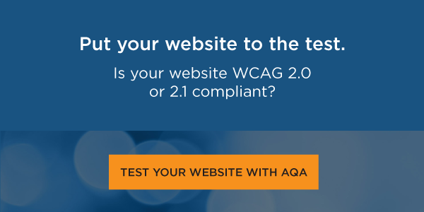
A. You can test as many pages as you would like with our UsableNet AQA free tool. We also have a robust paid version for large teams to work on accessibility in dynamic environments.
If you simply want to review, color and color contrast, this is useful: https://www.getstark.co/
Keyboard and screen reader quick testing: Chrome Dev Tools + VoiceOver
For maintaining accessibility, UsableNet has introduced our ADA Monitoring service.
Q. How can I get more insights from this webinar and presenters?
A. Register to watch the full recording on-demand here.
In our hour-long webinar, we were only able to touch on some of the content covered in our training on Accessible and Inclusive Web Design for UI/UX Designers.
That's right! UsableNet offers accessibility training catered to your teams and digital environments. Read about our digital accessibility training here.