
Thank you to everyone who attended our webinar, Demystifying Accessible Design - How to Apply WCAG 2.2, featuring a presentation by Senior UI/UX Designer, Luca Boskin, and Jason Taylor, Chief Innovation Strategist here at UsableNet.
This webinar covered the new WCAG 2.2 Success Criteria. Our presenter provided real-world examples of the criteria in action. This webinar was presented in the month following the release of WCAG 2.2 and on the eve of World Usability Day 2023.
We got a lot of valuable questions asked during the webinar and were unable to get to them all. This blog exclusively covers questions asked during the Q&A portion of our webinar, Demystifying Accessible Design - How to Apply WCAG 2.2.
If you prefer to read through some of the key points from this webinar, we've included relevant blog links here:
- Accessibility vs Usability: What is the Difference to the Disability Community?
- The 4 core groups of disabilities that you should consider in accessible design
- What's New in WCAG 2.2
Q. I am very interested in the challenges identified under cognitive impairments. The dialogue also covered this complex and diverse category well. My experience has been that web design (as well as any "print" media), does not address this as prolifically as the issues are.
A. Some useful resources on that topic
- - Making content usable for people with cognitive and learning disabilities (https://www.w3.org/TR/coga-usable/)
- Cognitive disabilities and the web: where accessibility and usability meet? (https://ncdae.org/resources/articles/cognitive/)
- Cognitive accessibility (https://developer.mozilla.org/en-US/docs/Web/Accessibility/Cognitive_accessibility)
- UX principles that include cognitive accessibility (https://uxdesign.cc/adhd-dyslexic-perspective-on-cognitive-accessibility-using-cognitive-ux-design-principles-f46349a609d6)
Q. For 2.4.13, do you have suggestions for how to deal with focus on a range of backgrounds? One design might work well over a white/light background, but if the user focuses on a dark element, it may not pass the 3:1 contrast.
Q. If the dashed border were inside the buttons, would that still pass, or does that no longer meet the perimeter requirement?
A. Let's assume you have a 160px by 44px button, which has a perimeter of 408px (2x160+2x44). The 2.4.13 WCAG success criterion requires a 2px thick perimeter of the component so in this case 2x(2x160+2x44) gives you a minimum required area of 816px for a 2px solid outline focus indicator. But if you're using a 2px inner solid outline, which has an area of 2x(2x140+2x24) 656px, this area is smaller than 816px. You would need to increase the inner outline thickness to at least 3px, i.e. 3x(2x140+2x24), to have an area of 984px which is larger than the minimum required 816px. For an inner dashed border, you would need to double the 3px thickness to compensate for the empty gaps, i.e. 6x(2x140+2x24). This criterion requires the focus indicator to have a 2px thick perimeter of the element so in the case of a dashed outline, the empty gaps make the total size of the outline area smaller, hence the need for the thickness compensation.
Q. What determines why someone would aim for AA vs AAA?
A. Level AA is the most widely applied and the most commonly required by accessibility laws across the world. That shouldn't stop organizations and private companies from trying to meet as many WCAG requirements as possible to offer the best possible experience to all their users.
Q. On 2.4.11 - what does "part of it must be visible" mean? What is the cutoff?
The success criterion 2.4.11 requires that the element receiving focus must not be entirely obscured. It should be sufficiently visible for users to recognize it, even if it is partially obscured.
Q. How can we be sure about the visibility (at least partially) of the focus state on an element, if it probably depends on the scroll position on a page? Probably this criteria practically discourages using sticky elements?
A. I don't believe this criterion discourages the use of sticky elements, it just ensures these types of layout features (e.g. a sticky bottom navbar) don't prevent users relying on the focus indicator from easily navigating the page content. The size of a browser window can vary from user to user, hence the viewing region on the screen will vary because of that. Using the property "scroll-padding" can come in handy when a sticky element overlaps the content, by making elements receiving focus move into the viewing region of your screen.
Q. What's the proposed solution for the single pointer alternative?
The proposed solution would be to provide four map navigation buttons, one for each direction (move up, move down, move left, move right). Interestingly, Google Maps used to provide this alternative a few years ago.
Q. Could you have a 5px by 5px radio button but an invisible space around it that meets 24x24? It seems like that is a loophole that passes the letter of the law but not the spirit of it.
A. If you have a radio button you probably have a visible label next to it that automatically increases the hit area of this component. But let's assume you have a 5px by 5px icon-based button with 19px of padding around it, which makes the size of its hit area 24px by 24px large: this is considered a pass.
Q. I would love to learn how these rules apply to apps!
They definitely represent a good reference for native app accessibility testing, although native apps are even more strongly bound to OS-specific design and code accessibility requirements.
Do you know of any PDF remediation tools that work on Mac operating systems?
Adobe Acrobat
Do you have examples of sites that are meeting these standards?
Not sure, but I think this question is related to the one in row 4, i.e. examples of websites meeting AAA standard https://www.usa.gov/, https://www.visionaustralia.org/
Q. I have a question regarding accessible authentication for password requirements or parameters. What are the recommended or minimal accessible requirements for password creation? A system/service that my company uses has a very complicated password requirement that makes it nearly impossible to remember or create new passwords (6-8 characters, 1 number, and cannot have the same character in the same position as previous passwords). I have requested that they update the requirements, but they say it is not possible.
A. Asking users to enter a password is considered a cognitive function test. So, according to criterion 3.3.8 sufficient support should be provided to users to provide that information in the easiest way possible (copy/paste or password manager). If there are password requirements involved to increase password security, then these requirements must be communicated effectively both visually and to assistive software so users can easily fulfill them.
If your site supports a single method of user authentication based on a password request, and you've acknowledged the password creation process is too complicated or not accessible to all users, you should provide an alternative method of authentication that doesn't require entering a password at all.
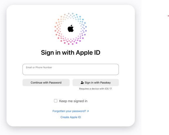
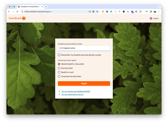
Q. For the captcha, how would the user who cannot process that means of verification know there are alternative means of verification? How is that presented to the user so they know they can use another form? Do you have any examples to share?
A. Yes, I've included examples from Apple iCloud and Swedbank.
 Q. What are the main challenges when the website is implemented with conformance with WCAG 2.1 AA as a whole, without the need to trigger the accessible layer via the "Accessibility" button on the web page?
A. Generally, when a new version of WCAG is released it extends the previous recommended standard, i.e. the new version 2.2 extends the previous 2.1. If your website is already compliant with the 2.1 standards, the fact the 2.2 update has just been released doesn't invalidate the work you've done to conform to the 2.1 standard. It just means you have to be aware of it and start planning how and when you are going to tackle these new requirements.
Q. Should all that states for full-size websites be valid for a responsive version of that website e.g. mobile size?
A. A responsive website can look and function differently depending on the screen size used to view it. This means that any review, testing, or audit for website accessibility should take into account these differences in design and functionality across all screen sizes. It is important to ensure that all users can access and use the website, regardless of their device.
Q. Can you share the source of the bookmarklet circle, as well as any other useful tools to review accessibility on our own?
Test the accessibility of your website for free! Try UsableNet AQA.
https://adrianroselli.com/2022/05/24x24-pixel-cursor-bookmarklet.html
https://codepen.io/ccwilcox/pen/rNqKamK
Q. How can I get more insights from this webinar and presenters?
A. Register to watch the full recording on-demand here.
In our hour-long webinar, we were only able to touch on some of the content covered in our training on Accessible and Inclusive Web Design for UI/UX Designers.
That's right! UsableNet offers accessibility training catered to your teams and digital environments. Read about our digital accessibility training here.
Looking for more accessibility insights? Get your website accessibility test results with any conformance issues, code errors, and recommended fixes via email, free of charge. Just follow the link and enter the URL you want to test. Test now.