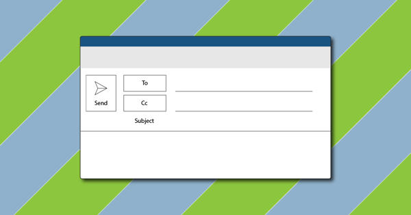
We've heard that crafting the right e-mail means sending the right message to the right person at the right time, but what if the e-mail is inaccessible to the user? We have broken down the best accessibility practices into 2 categories, e-mail structure and e-mail design, to help you create emails that all users will enjoy.
Email Structure:
The structure of your e-mail is important for those using assistive technologies to navigate through the e-mail. A poorly structured e-mail can cause confusion, frustration, and overall disappointment to some users. Here are some things to keep in mind structurally while crafting an email.
Clear Subject Lines
The all-important subject line sets the tone for the rest of the e-mail. Those 1-2 sentences are what drives the audience to open and interact with the content. It’s important that the subject line is clear and descriptive enough that a user who is blind, has low vision, or has a cognitive impairment can understand the purpose of the e-mail and what it is going to be about.
Headers:
Using headers is an important part of creating accessible emails, but it helps those with assistive technologies navigate the page. Be sure when using headers that they are used by the importance of content. This will allow users to get to the most important parts of the e-mail first.
Linking text
Text links are one of the most important aspects of e-mail. We want people to visit the links we send because we believe it offers value to them. But how do we make the text links accessible? For starters, do not use just the word ‘here’ when linking text. Instead, make the link text descriptive. Let the users know where they are going when they click the link. This will not only help those with assistive technologies understand where they are going when they click the link, but it is also a best practice for clear communication.
Clear Language
Rule number one of effective communication is to have clear language. We want everything we write to be easily understood by all audiences. This is also a key concept for writing accessible e-mails. Here are some things to avoid to make e-mail communication more effective for all users:
- Do not use run-on sentences
- Use simple words that everyone understands
- No acronyms unless you spell it out first and put the acronym after it
-
Avoid corporate jargon altogether
E-mail Formatting
Formatting your e-mail not only makes your e-mail look cleaner. It also makes your content easier to understand. Formatting emails can help screen reader users with navigation. Lists, for example, will help those using assistive technologies better navigate the page. Be sure to format emails properly for a structurally sound e-mail that is easy to navigate.
Include a plain text version of email
A plain text version of an email is always nice to have. It strips all the design and everything into a simple, text version that is easier for those with impairments to navigate. Consider adding a plain text version of your emails when you send out e-mails.
E-mail Design
Now that we’ve cleared the Structure best practices, it’s time to focus on the design of the e-mails. Implementing accessible design in your e-mails will help users better understand the content of the e-mail, and make it easier to digest. Below are some of the best practices for designing an e-mail.
emojis

We, as a society, love using emojis to convey how we are feeling. They are a fun way to express our current emotions and how we might feel about a topic, but they may not be readable. While the best design recommendation is to not use emojis, they can be used at the end of an e-mail as long as they do not replace a word. In addition, try not to use emojis in the subject headline. This can create confusion for screen reader users.
Using Appropriate fonts and font sizes
The fonts we use impact accessibility. Avoid using fancy fonts and stick to simple fonts. This will help the readability of your content with low-vision users and those with cognitive impairments like dyslexia. Similarly, do not use fonts that have the characters too scrunched together. This can also impact readability.
Font size is also important. If the font is too small, low-vision users also may not be able to read your copy clearly. The recommended minimum font size for text, whether it’s email or in general, is 14px.
Emphasizing content
We want to make important things stand out when writing an e-mail, and we have different ways we do that. However, some of the ways can impact the readability of your content. Here are some guidelines for emphasizing content:
- Bold, Bold, Bold - The best way to emphasize your content is by boldening it. This is the easiest for the user to read and understand that it is important. Bold when possible.
- Use underlines and italics sparingly - While these are acceptable to use, We don’t want to overdo underlining and italicizing content. These two, especially when together, impact the readability of text. Dyslexic users, for example, can have a harder time reading italicized content
- No all caps - Avoid using all caps to emphasize content. This gives all letters the same rectangular shape, impacting the readability of the words.
- Do not use color - Do not use color to convey the importance of content. Those with low vision and color-blind readers may not understand that color is supposed to matter.
Color Contrast
Like other content, it’s important your e-mails meet the color contrast requirements. This will help low-vision users see your content clearer. If you change your text and/or your background color, use a contrast checking tool to verify that they meet the required contrast. If you haven’t already, make sure your images also meet the contrast requirements.
Alt-TExt
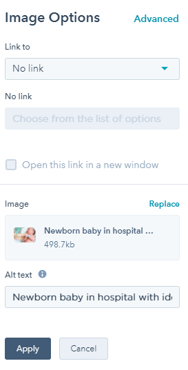
Speaking of Images, one of the most important aspects of an image’s accessibility is alt-text. Adding this text will help users who have low vision or are blind understand what the image means. It is important to incorporate the alternative text best practices in e-mail to make the alt-text meaningful, relevant, and easy to understand.