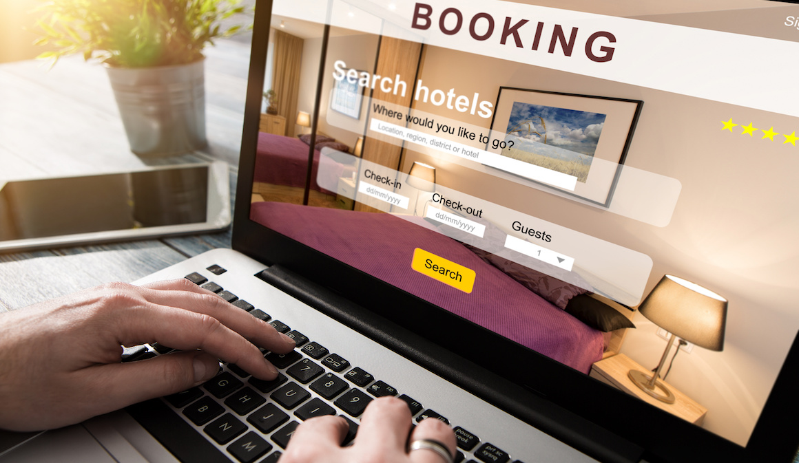
In my last post, I wrote about an accessibility disaster I experienced when trying to help someone purchase airline tickets online. Again, I will be assisting that person with another travel-related task, reserving a hotel room. We settled on one of the major national hotel chains.
In this post, I will bring the reader along as I attempt to complete the task. As I progress, I will point out both good and bad design choices regarding accessibility. Like all my blogs, my narrative will exclusively be my experience as a blind person who uses a screen reader as my technology to navigate the web.
Complete Confusion
Whenever I visit a new website, I begin by familiarizing myself with the design and structure of the user interface. I attempted to do the same when launching the hotel website.
However, as I moved around the homepage, I heard everything from room-type titles to vacation insurance advertisements and random text bits. The website has little or no structure to the information presented on the homepage. However, I quickly realized my screen reader's focus cursor was jumping randomly around the page as I navigated.
This issue took me time to detect, was annoying, and led to a clunky and ineffective browsing experience. The only way I could circumvent it was to use my screen reader to filter by the specific web element I was searching for, including buttons, links, and headings.

Rough Rooms
I finally found the "Explore Our Room Options" button and was taken to the next screen. This page lists all the hotel's different room configurations. I noticed several discouraging things right off the bat. After the title of each room type was a series of images that I had to move through to make my way to the text-based part of the room description.
Some of the rooms had as many as 15 pictures to navigate past. The problem was that not one of the pictures had an alternative text caption to describe the photograph for visually impaired users like myself. My screen reader would only say "Graphic," followed by what sounded like the image's dimensions.
To make matters worse, the text descriptions of the room provided below the images were scant and vague. An example is "Our One Bedroom Deluxe Suite Features Two Queen Beds, A Pull-Out Sofa Bed, Seating Area, And Kitchenette." This description tells me very little about the room's condition, the space's cleanliness, or the furniture's age and quality. All of this necessary data is in the pictures. Alternative text descriptions are so crucial on hotel websites.
The other major problem with the room selection page was an utterly unlabeled button directly under each option. One could assume this button selects that room, but this is still an unacceptable accessibility flaw. Overall, the accessibility of the room selection screen was rough.

Some Smooth Sailing
I found the room option that suited my needs and activated the unlabeled button. Sure enough, I went to the next stage of the reservation process. The site prompted me to input the number of guests and dates of travel. It struck me odd that the site asked for travel dates after the room selection process, not at the beginning.
Still, I should not be surprised because nothing about this site seemed conventional. Choosing dates was easy, accomplished by accessible drop-down menus and scroll wheels. Luckily, The room type was available for my dates. I found a "Continue" button, which was labeled this time. On the next page, the form asked for my contact information, name, date of birth, and preference for trip protection insurance. All text fields were labeled, which made the process reasonably easy.
The next step was payment. The hotel offers several options for payment with varying cancelation policies and dates for the final price in full. The site organized these choices in a table. I found the table very easy to navigate and interact with columns and rows marked. My screen reader announced the position of each table item concerning its column and row placement. The final step was to enter my credit card payment details.
For more on what hotels are getting right with digital accessibility, check out my post from November, How Hotel Websites Are Becoming More Accessible.
Captcha Crisis
One of those infamous anti-robot captcha confirmations was above the "Confirm Booking" button. I always encounter these and usually have a few accessibility problems with them. Most websites use a standard captcha that also offers an audio option, allowing users to listen to a short radio clip and enter some of the words they hear.
However, this hotel website used a proprietary captcha game with no audio version. A text blurb said, "Select All Squares With Windows." Below that were eight unlabeled images announced as "JPEG." There was nothing I could do at this point. Unwilling to give up after getting so close to the end, I decided to play a game of random chance. I chose a few pictures and clicked the "Verify" button. All I got was an error. I selected a different group of images but got the same error. Once I realized there was no attempt limit, I tried random combinations of the eight images.
On the 37th attempt, I broke through. The last two images were the only two without windows. I was verified not to be a robot. At this point, I could activate the "Confirm Booking" button and complete my reservation.
The various accessibility issues on this hotel system's website led to a primarily clunky and frustrating experience. However, I hope as a blog, this journey was informative and engaging for any readers who have never seen a person with a disability navigate the web. I personally use a screen reader because of my blindness, but screen readers are used by others with other or additional disabilities, too.
In case you missed it, you can read about some of the issues I had while trying to book an airline ticket as part of this trip in my post, Airline Booking: Navigating an Inaccessible Experience.
6 Tips for Improving Accessibility on Hotel Websites
1. Alternative Text for Images: Provide descriptive alt text for all images on your website. This is particularly important for people who rely on screen readers.
2. Labeling Interactive Elements: Ensure all website buttons and controls are correctly labeled. Clear labels help your website's functionalities and improve accessibility.
3. Sequencing of Booking Steps: Consider the order of your booking process. Placing the date selection step after room selection may disrupt the user flow. Organize the steps in a more intuitive sequence to enhance usability.
4. Accessible Forms: Accurately label form fields to make it easy for users to provide the necessary information. Properly labeled form fields contribute to a smoother booking process for everyone.
5. Accessible Captcha Solutions: When using captcha challenges, provide accessible alternatives. Incorporate audio-based in addition to visual challenges to ensure everyone can complete verification tasks effectively.
6. Continuous Improvement: Regularly assess and address accessibility issues on your website.
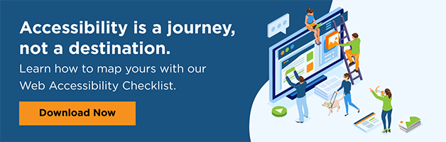
Remember, striving for accessibility can significantly enhance the user experience for all customers, including those with disabilities. If you're unsure where to start, UsableNet created a web accessibility checklist that is a free download that can help. Get the checklist.
Editor's Note: Our frequent contributor, Michael Taylor, wrote this post. This post reflects his opinions and experiences. Read more about Michael and some other posts on his experience online here.