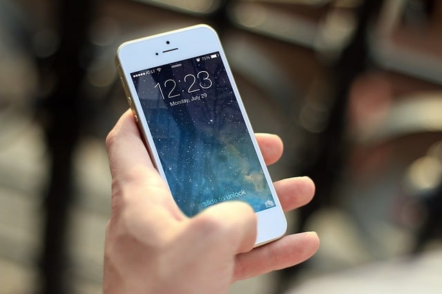
Many resorts now rely on mobile apps for key guest services—like spa bookings, in-room dining, towel requests, and shuttle pickups. These tools promise convenience. But for blind guests who use screen readers, they can create frustrating and unpredictable barriers.
During a recent trip to an all-inclusive resort, I encountered just that. This post is part of my series on accessibility in hospitality. It focuses on how poorly designed mobile apps can impact real-world independence for guests with disabilities.I'm blind and use a screen reader daily. I write about digital accessibility not from a developer's perspective, but as someone who relies on assistive technology to complete everyday tasks.
My goal is simple: to share how digital accessibility, or the lack of it, shows up in real life. If you're responsible for your company's digital experience, I hope my stories help you better understand what's working, what's not, and what you can improve.
Too Many Touchpoints, Not Enough Usability
The resort I stayed at had invested in a polished app experience. It centralized services like shuttle requests, towel delivery, spa appointments, dining reservations, and even bill payments.
However, I ran into issues that made everyday tasks frustrating and confusing.
Navigation Was Inconsistent
Essential navigation elements were either unlabeled or poorly labeled. The layout lacked structure, making it difficult to move between sections with a screen reader. I'd swipe through a page and hear nothing—or hear "button" over and over with no context.
- Related: Watch a 2-minute clip of our blind, Head of User Testing, explain Web Accessibility and Screen Reader Navigation, including a demonstration of Header Issues. Watch now.
- Register to watch the full webinar, How a Blind Person Uses a Website
Visual Design Took Priority
The app looked sleek, but the team had built it around icons, animations, and visual cues that didn't translate to assistive tech. In many cases, I had to guess what I was selecting.
Here are a few examples that stood out:
- A button that launched the shuttle request form had no label. My screen reader announced it as "button."
- The dining menu used only images of dishes—no alt text or screen reader-friendly labels.
- Another icon automatically placed a phone call to the front desk. There was no warning or way to cancel.
This kind of trial-and-error navigation doesn't support independence. It forces blind guests like me to rely on sighted help or risk making mistakes.
Real Stories: What Went Wrong
Towel Troubles
A few days into our stay, we used the app to request fresh towels. I navigated to "Guest Services," found the housekeeping option, and used the text field to request four towel sets.
Later that afternoon, we received a notification about a towel delivery. But when we opened the door, we found a full rolling cart with at least ten towel sets.
I was confused—until my sighted partner discovered that the app had registered my request as 14 towels, not 4.
I had backspaced over the default "1" in the quantity field and typed "4." My screen reader confirmed it. But visually, the "1" never cleared. The app had appended the 4 to the existing 1.
So I unknowingly ordered 14 towels—and got them.
Shuttle Stop
The resort was large, and the shuttle didn't stop at every building automatically. Guests had to request a pickup through the app.
The input field for the room number was accessible. But the button to move forward wasn't labeled. My screen reader said "button." Luckily, it was the only button on the screen—otherwise I might not have known what to press.
The next screen was supposed to show estimated pickup times. But the entire list was inaccessible.
Every element just read as "unselected, button." No times. No labels. There was no way to make a request independently.
Watch a video on accessible button design with our Sr. UI/UX Designer. Click here.
Botched Bill Payment
At the resort restaurants, guests paid by scanning a QR code at the table, which opened a payment screen in the app. That screen lets you charge to your room or pay with a card.
But it wasn't accessible at all.
My screen reader could only announce "null" when I tried to navigate it. There were no readable labels or fields. The entire payment screen had been completely overlooked for accessibility.
I couldn't even confirm the amount due—let alone choose a payment method.
Read more about my experiences with digital accessibility during this trip:
- Making a Hotel Reservation with a Screen Reader: Simplicity That Works;
- Using an Airline Mobile App as a Blind Traveler
- Why Airline Mobile Sites Still Fail Blind Travelers at Check-In
What Resorts Can Do
If your resort relies on a mobile app for core services, it's critical to design and test for accessibility. Here are key steps you can take:
- Label all icons and buttons with screen reader-friendly text
- Use structured layouts with proper headings for easy navigation
- Avoid image-only content—provide text alternatives
- Ensure confirmation messages (like towel delivery or reservation status) are accessible to screen readers
- Test with real users who rely on assistive technology
These steps support WCAG 2.2 conformance and help meet global regulations like the European Accessibility Act, which covers digital service platforms—including hospitality apps.
Inclusive Design Is Guest Experience
Today's resort experience depends on digital tools. But too often, accessibility is treated as a website-only concern.
That's not enough.
If your app isn't usable with VoiceOver or TalkBack, you're excluding real guests—guests who booked a room, arrived at your property, and are now being blocked from basic services.
Accessibility isn't an edge case. It's part of modern hospitality.
Struggling to Close Mobile Accessibility Gaps?
If you’re unsure how accessible your mobile app is, a professional iOS/Android audit is the best place to start.
Just as necessary, include testing by people with disabilities to confirm the experience is truly usable. In many digital accessibility lawsuits, the issues center on real-world barriers that automated tools miss, so even the most sophisticated automation still requires human oversight and judgment.
Need help with your website, too? UsableNet Assistive is our fully managed accessibility solution for websites.
If you would like a mobile app audit or would like to learn more about UsableNet Assistive, contact UsableNet.