As more diners turn to online platforms to browse menus, place orders, and make reservations, accessibility for your restaurant's digital content has become paramount in 2024. Yet, common misconceptions can act as roadblocks on your digital accessibility journey.
In this blog, I cover lessons from restaurant websites that can be applied to any website, three common myths surrounding web accessibility in the restaurant industry, and I share best practices to help you create a better experience for all your online visitors.
Editor's Note: This post has been updated and optimized for companies who want to be more inclusive online in 2024.
Not a restaurant owner or website manager for a restaurant? Here are four takeaways from this blog that you can apply to any website.
4 Lessons from Restaurant Websites that Apply to Other Industries
- Text-Based Content: Ensure that essential content, such as menus, product listings, and important information, is presented in a text-based format rather than relying solely on images or PDFs.
- Descriptive Alt-Text for Images: Provide descriptive alternative text for all images on your website to make them accessible to visually impaired users. Alt-text should accurately describe the content and purpose of each image, allowing everyone to understand its significance, even if they cannot see the image itself.
- Accessible Forms and Interfaces: Design forms and interactive elements with accessibility in mind, using techniques like proper labeling, clear instructions, and logical tab order. Ensure that all visitors can navigate and interact with your website.
- Continuous Improvement: Treat web accessibility as an ongoing process rather than a one-time task. Regularly evaluate and update your website to address accessibility issues, incorporate user feedback, and stay informed about best practices and guidelines. By continuously improving accessibility, you demonstrate a commitment to inclusivity and ensure that everyone can access and use your website effectively.
3 Common Myths: Web Accessibility for Restaurants
- Myth: Image-Only Menus are Adequate
The Real Truth: For accessibility, consider text-based menus or accessible PDF versions. Keep reading to understand why image-only menus are not enough for your customers with disabilities. - Myth: Alt-Text Isn't Necessary for Images
The Real Truth: Provide descriptive alt-text to ensure accessibility for visually impaired users. - Myth: Reservation Booking Systems Can't Be Accessible
The Real Truth: Accessible reservation booking systems are feasible and beneficial for everyone. You can make your online reservation processes accessible to customers who rely on assistive technology like a screen reader.
How to Share Your Menu
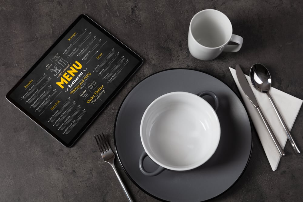
One of the most frustrating things about browsing restaurant menus online is the vast number of menus uploaded to the internet as an image.
When restaurants upload their menus to the site as text-based lists, I can easily navigate the menu using the text navigation commands of my screen reader.
Here's an example of how one restaurant makes this accessible:
- The menu displays categories as clickable checkboxes above the menu item list.
- I can easily select one of the category checkboxes.
- I can then navigate the page to explore the options in that particular category.
The experience is fluid, intuitive, and accessible.
Recently, one restaurant site prompted me to download a menu PDF. At first, I was discouraged, given my past negative experiences with inaccessible restaurant PDFs. However, I was surprised that the site had two menu versions, a standard and an accessible version.
The accessible version was formatted in a very screen reader-friendly way:
- Columns and rows were adequately labeled
- Transitions between menu categories were marked correctly.
Design choices like these help improve the accessibility of my digital experience.
How to Describe Your Menu Items
Some people will say the images are essential to a restaurant menu. Sighted individuals have told me that the words are helpful for clarification. Still, the photos are what makes their mouths water. For blind people, words are all we have unless the menu includes alternative text image descriptions for every item pictured.
The good news is that more restaurants include alternative text captions for the photos corresponding to each dish. Some descriptions are remarkably detailed and give me a solid grasp of how the food will taste. Here is an example of a helpful description of my favorite sandwiches from a local diner.
“Thinly sliced sirloin steak is carefully placed on a garlic bread roll. The sandwich Is topped with a generous portion of perfectly warm and melted mozzarella cheese and is served open-faced on a bed of sweet potato fries.”
This description is excellent and makes me want to dig into the food. In contrast, the word-based menu description of the same sandwich reads,
“Sliced Marinated Steak And Cheese On A Garlic Bread Roll.”
I prefer image captions that describe the food in a way that makes it seem mouth-watering. When I encounter restaurant sites with alternative text image descriptions, I feel more excited to eat at that particular establishment because I know I will get a metaphorical auditory taste of each dish before ordering.
I dive into al-text as a topic in a previous blog, for more on this topic, read Image Alt Text Best Practices For Web Accessibility.
How to Improve Reservation Booking
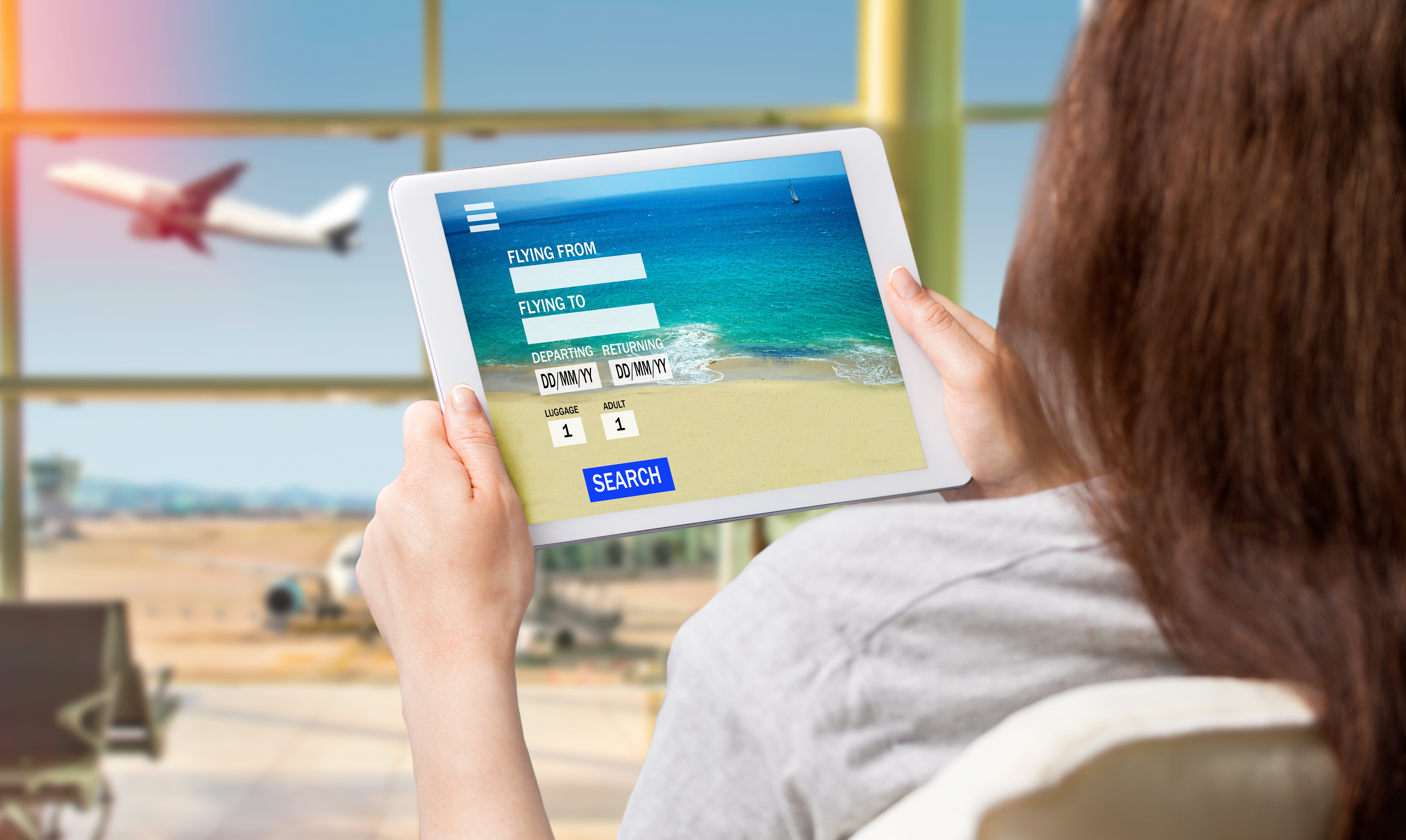
One of the most valuable features on many restaurant sites is booking a table in advance. Lately, I have encountered several accessible reservation booking techniques. They all use a combination of checkboxes and drop-down menus. These are far more accessible than the diagrams, grids, and calendars still standard on many sites.
Here's an example of how one of my favorite local Italian restaurants handles its online reservations:
1) The user picks their desired visit date and party size from a drop-down menu.
2) Next, a list of all available time slots is displayed using clickable checkboxes.
3) Selecting a time slot will bring the user to a short web form asking for a name, email address, and special requests.
4) At this point, I can submit the form, and the reservation is confirmed.
This reservation booking system is intuitive, accessible, and refreshing, given the typical usability issues of reserving almost anything online.
I've written about a negative experience with online reservation systems. For more on this topic, read my blog, Screen Reader Struggles: Navigating Restaurant Reservations.
5 Key Takeaways for Restaurant Websites
- Prioritize Text-Based Menus: Offering text-based menus rather than image-based ones can significantly improve accessibility for screen reader users. Ensure that your menus are in a format that allows for easy navigation and comprehension by all customers.
- Provide Detailed Alt-Text for Images: Including descriptive alternative text for images of menu items can enhance the dining experience for visually impaired customers. Craft detailed descriptions that evoke the flavors and textures of your dishes, enticing your patrons to explore your offerings.
- Implement Accessible Reservation Systems: Streamline the reservation process by adopting accessible booking systems that feature intuitive interfaces and options for users of assistive technology. Dropdown menus and clickable checkboxes can enhance usability for all customers, ensuring a seamless booking experience.
- Offer Accessible PDF Menus: If providing PDF menus, ensure they are accessible to screen readers by properly labeling columns and rows and delineating transitions between menu categories. Consider offering both standard and accessible versions of your menus to cater to diverse customer needs.
- Embrace Web Accessibility as a Priority: Web accessibility is not just a legal requirement—it's crucial to providing exceptional customer service and ensuring inclusivity for all patrons. By prioritizing accessibility in your digital offerings, you demonstrate your commitment to serving your customers of all abilities.
Let's Create an Inclusive Online Experience for your Patrons.
By embracing best practices in web accessibility, restaurant owners can create genuinely inclusive online experiences for their patrons.
With the release of WCAG 2.2, (read about it here) and its focus on improving accessibility for users with cognitive and learning disabilities, there's an increased urgency to prioritize accessibility in digital offerings across industries, especially in food service and e-commerce.
In 2024, let's seize this opportunity to enhance the dining experience for all customers, regardless of ability, and create a digital environment where everyone feels valued and empowered to engage with your restaurant's digital content.
Editor's Note: This is a guest post from our marketing contributor, Michael Taylor. This post reflects his opinions and experiences. Read more about Michael in his introductory post here.


