When you’re looking through the WCAG 2.1, it’s easy to feel a little overwhelmed with the requirements and how they apply to mobile accessibility.
It can help to keep in mind that that the guidelines for web content accessibility are organized around four principles: Perceivable, Operable, Understandable, and Robust (POUR).
In our May webinar, Sr. UI/UX Designer Luca Boskin reviewed these principles with examples of how to implement them on mobile. Luca was joined by our Cheif Innovation Strategist here at UsableNet, Jason Taylor, and special guest speaker, Joseph (Joe) DiNero. Joe is an Assistive Technology Specialist with Helen Keller Services for the Blind (HKS) and a User Tester with UsableNet.
Read on for key takeaways from that webinar including what these four principles mean, how they impact your mobile app accessibility efforts, and real-life examples about how these principles and designs impact users from the disability community, like Joe and his students at HKS.
1. Perceivable
Viewers need to be able to fully “perceive” or access the content properly. If users with low sight can’t zoom in on a phone’s small display, for example, or if there’s no alt-text for screen readers to read, the information isn’t “perceivable” by everyone.
"Does our app or mobile website work with different types of assistive technology devices? Does our app consider a wide variety of disabilities?"
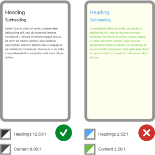
One unique consideration with mobile is that these devices are more likely to be used in a variety of environments including outdoors. Glare from the sun may affect the visibility of the content on the screen. Consider the importance of the use of good contrast for all users to address the challenges that users with low vision have when accessed content with poor contrast on mobile devices.
Joe explained how small changes in an app’s function can impact how perceivable it is for users with different disabilities. He spoke about an app that he personally uses on a regular basis. The app just pushed an update with a new layer of buttons for push-to-talk for different messages. It’s difficult for him as a user to move his finger along the screen to understand who is sending the message and what the buttons are.
Further, the app has become incredibly difficult when there’s a group message. Joe has to spend a significant amount of time trying to determine where he left off in a conversation. The update has impacted the app experience in a negative way even though it was intended to add more functionality to the interface.
2. Operable
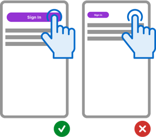
Your mobile app must be operable by all users with reasonable accommodation, meaning they need to be able to actually use it to access key features and functions. If the mobile app has buttons in hard-to-click places, for example, it becomes unusable.
 Joe shared the example of his banking app. In order to transfer money from one account to another, he had to slide his finger on the screen. For a while, there was no alternative to that, which made it impossible for him to interact with the app properly.
3. Understandable
Can users understand what they’re looking at when they’re using your mobile app? Is it easy to understand what they’re viewing and how to use the app in general?
This is where the “understandable” inclusivity principle comes into play.
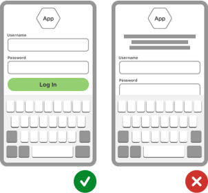
Your app navigation should all be grouped together in a central menu instead of being spread out across the site, for example, and there should be clear design elements (like text in different colors) to showcase that some elements are clickable or actionable.
It's also recommended as part of the understandable principle to position important page elements before the page scroll on mobile.
 When it comes to issues with the ability to understand a mobile app, Joe shared his experience trying to upload a required file for form submission. You had to upload a file from different sources.
One of the buttons was labeled “Choose File,” but it didn’t explain what source you’d be choosing from. He had to deduce later that the button leads to choosing a file from his computer. Sometimes he’s able to connect the dots from surrounding contact when links themselves are missing descriptive text, but sometimes not. This means he isn’t always able to understand what’s needed or how to use the app.
4. Robust
Is the app fully usable by all of your target audience members, including people who do not share your geographical location, currency, browser, device, or assistive technology that your team personally uses? How will your app remain accessible as tech evolves?
The app needs to work not only on the updated iOS device that your team is using but on a screen reader for Android devices that a blind customer will use, too.
A good example of this, Joe explained, is Zoom-related features, which are important to many members of the disability community. Both iOS and Android have accessibility features that allow users to magnify screen content. On iOS, users can apply a three-finger double-tap gesture. On Android, users will execute a one-finger double-tab.
These features aren’t standardized, so developers need to account for both or they could accidentally create an inaccessible app.
What is Mobile Accessibility? Why is it important?
Mobile accessibility is about making sure our websites and mobile applications work for anyone who is using a mobile phone or other mobile devices. This includes users with disabilities.
While WCAG 2.1 is complex with plenty of guidelines to follow, understanding the four key inclusivity principles for mobile app accessibility can play an important role in guiding your team.
The real-life examples from our speaker are excellent reminders of how easy it is for apps to get sidetracked and make a single mistake that could impact the usability of the tool for users in the disability community.
Have a question on how to improve or assess your site’s current accessibility standing? UsableNet offers accessibility audits and support services like user testing with the disability community and mobile accessibility audits to help.

